
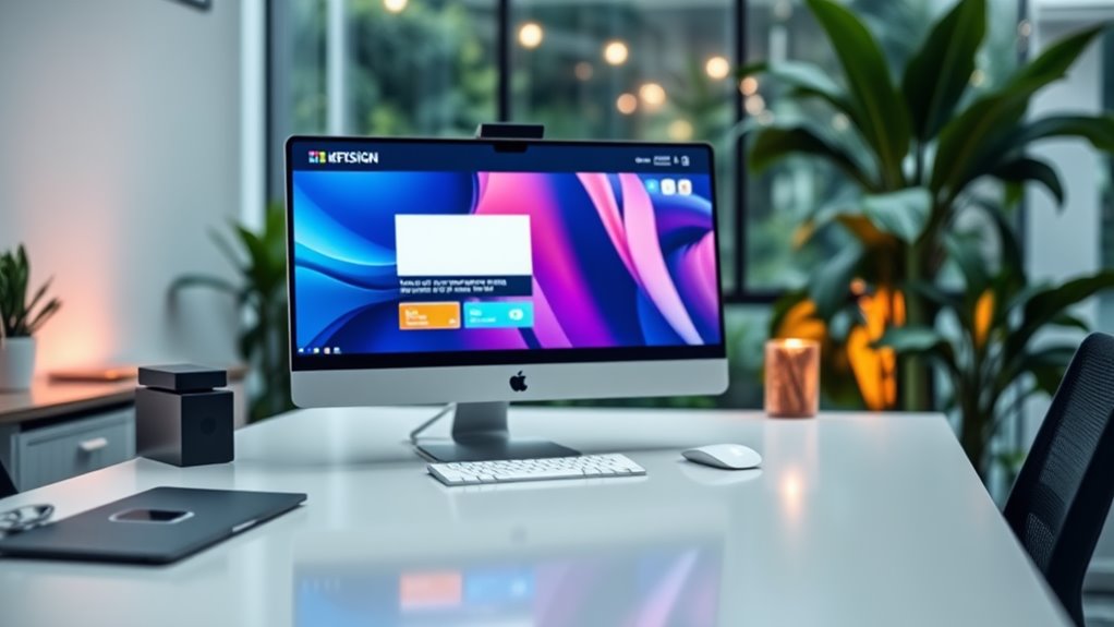

To blend static and dynamic elements in web design, start by establishing a strong foundation with static components like images and text. These elements build your brand's identity and provide consistent information. Next, introduce dynamic features, such as animations, real-time updates, and user-generated content, to improve interactivity and keep users engaged. Aim for a balance that encourages exploration as you provide intuitive navigation. Use design tools like Figma and Adobe Creative Suite for visual quality. Incorporate user feedback to refine your design continuously. You'll discover effective strategies and real-world examples that further improve your approach.
Understanding Static and Dynamic Elements
Comprehending the balance between static and dynamic elements is fundamental for effective web design. You'll find that static content, such as images, text, and layout structures, provides a solid foundation for your website. It delivers consistent information that users can rely on. Think of it as the bedrock of your digital presence; it sets the tone and establishes brand identity. Nevertheless, during static content is vital, relying solely on it can lead to a stagnant user experience.
That's where dynamic content comes into play. Dynamic elements, like interactive features, real-time updates, and user-generated content, inject life into your site. They engage visitors and encourage them to interact, explore, and return. By incorporating dynamic content, you're not just attracting attention; you're nurturing a community around your brand. This interaction can lead to valuable feedback and insights, allowing you to innovate continuously.
Finding the right mix of static and dynamic elements is where the magic happens. You want your static content to provide clarity and structure, while dynamic content should inspire exploration and engagement. As you design, consider your audience's needs. Are they looking for reliable information or an interactive experience? Balancing these elements effectively can enhance your web design from merely functional to truly innovative. So, take the time to understand how static and dynamic content can complement each other, and you'll create a website that's not just visited but truly experienced.
Importance of Balance in Design
Even though balancing static and dynamic elements may seem challenging, it's vital for creating an effective web design. You want your site to engage users while maintaining a sense of stability. Achieving this balance nurtures visual harmony, allowing users to navigate smoothly without feeling overwhelmed by constant movement. When static elements like images or text provide a grounding experience, dynamic aspects, such as animations or interactive features, can captivate attention without detracting from the overall message.
Incorporating both types of elements contributes to design cohesion. You're not merely throwing together random visuals; you're crafting a seamless experience that encourages exploration. When users feel the design is cohesive, they're more likely to stay engaged and absorb the content, enhancing their overall experience on your site.
Moreover, balance isn't just about aesthetics; it's about function. A well-balanced design leads to intuitive navigation. You want users to effortlessly find what they're looking for while enjoying the engaging elements you've integrated. It's vital to guarantee that dynamic features don't overshadow fundamental static content.
Ultimately, aiming for balance means thinking critically about how each element interacts with the others. By prioritizing visual harmony and design cohesion, you create a website that not only looks great but also performs effectively. Embrace the challenge of blending static and dynamic elements, and you'll see how this balance can enhance your web design to new heights.
Choosing the Right Tools
When it relates to web design, selecting the appropriate tools can make all the difference in your project's success. You'll need to evaluate vital design software that suits your style and workflow, in addition to whether to go the code route or opt for no-code solutions. Each option has its advantages, so it's important to assess your needs carefully.
Essential Design Software
Choosing the right design software can greatly impact your web design process, as it influences both your creativity and efficiency. With so many options available, you'll want to select tools that not only inspire you but also streamline your workflow.
Start with versatile graphic tools that allow you to create stunning visuals. Programs like Adobe Creative Suite or Affinity Designer can boost your static elements, giving your designs a polished look. Next, explore prototyping platforms like Figma or Sketch. These tools enable you to bring your ideas to life, letting you simulate user interactions and test flow before moving to development.
Don't forget about collaboration apps, which are crucial for teamwork. Tools like InVision or Miro allow you to share your designs with stakeholders for feedback and make real-time adjustments. This improves the overall design process, ensuring everyone's on the same page.
Ultimately, the right combination of design software, graphic tools, prototyping platforms, and collaboration apps will empower your innovative vision and improve your efficiency, allowing you to blend static and dynamic elements seamlessly in your web design projects.
Code vs. No-Code
The decision between code and no-code tools can considerably shape your web development experience. If you're enthusiastic to innovate, comprehending the strengths of each approach is crucial. Code generation offers unparalleled flexibility, allowing you to create customized solutions that align perfectly with your vision. With coding, you can plunge deep into the technical elements, customizing every aspect of your site to achieve that unique look and feel.
On the other hand, no-code tools are revolutionizing how you build websites. They enable you to utilize the strength of visual interfaces, allowing you to design and implement dynamic elements without writing a single line of code. This approach is ideal if you're looking to quickly prototype or iterate on ideas without getting bogged down in technical details.
Ultimately, the choice hinges on your goals. If you prioritize speed and ease, no-code might be your best bet. Conversely, if you're aiming for a highly customized experience, coding is the way to go. By blending these two methodologies, you can create a web presence that's both innovative and functional, perfectly balancing static and dynamic elements.
Techniques for Integrating Elements
When you're looking to integrate static and dynamic elements in your web design, animation effects can breathe life into your content. Coupled with responsive design strategies, these techniques guarantee that your website not just looks great but additionally functions seamlessly across all devices. Let's explore how you can effectively combine these elements for a more engaging user experience.
Utilizing Animation Effects
How can you effectively integrate animation effects into your web design during user engagement? Start by selecting animation styles that improve your content rather than distract from it. Subtle animations, like hover effects or loading shifts, can guide users seamlessly through your site. These types of animations create a sense of interactivity, making users feel more connected to your content.
Consider using animations to draw attention to key elements, such as call-to-action buttons. A slight bounce or color change can make these elements pop, inviting users to engage. Moreover, micro-interactions—small animations that respond to user actions—can greatly improve user experience. They provide feedback, reinforcing that actions have been recognized.
However, balance is key. Overly complex animations can overwhelm and frustrate users, leading to decreased engagement. Aim for smooth shifts and cohesive styles that complement your brand's identity. By thoughtfully incorporating animation effects, you can create a dynamic environment that captivates users and encourages exploration, ultimately improving their overall experience on your site.
Responsive Design Strategies
Effective responsive design strategies guarantee your website adapts seamlessly across various devices and screen sizes, improving user experience. To achieve this, focus on mobile responsiveness and fluid layouts. By using flexible grid structures, your layout can adjust based on the viewer's device, assuring ideal visibility and interaction.
Here's a quick reference table showcasing innovative strategies:
| Strategy | Description |
|---|---|
| Fluid Grids | Utilize percentages instead of fixed units to allow elements to resize proportionally. |
| Media Queries | Implement CSS breakpoints to change styles based on device characteristics. |
| Responsive Images | Use srcset for images to serve different resolutions for various devices. |
| Viewport Units | Leverage vw and vh units to make elements responsive to the viewport size. |
| Mobile-First Approach | Design for mobile users first, then scale up for larger screens. |
Incorporating these elements will not solely improve mobile responsiveness but additionally guarantee that your design remains innovative and user-centric. Embrace these strategies and watch your website flourish across all platforms!
Enhancing User Experience
To improve user experience, designers often blend static and dynamic elements, creating a seamless and engaging interface. This approach not only improves user engagement but also cultivates a deeper emotional connection with your audience. By incorporating interactive content alongside well-structured static elements, you can guide users effortlessly through your site, guaranteeing intuitive navigation.
Here are some key strategies to take into account:
- Utilize user feedback: Regularly gather insights from your audience to refine your design and improve user retention.
- Incorporate accessibility features: Confirm your design is inclusive, allowing everyone to access and enjoy your content.
- Maintain design consistency: A cohesive look and feel across your site reinforces your brand identity and builds trust.
- Optimize performance: Fast-loading pages with a clear visual hierarchy keep users engaged and reduce bounce rates.
Case Studies and Examples
Though many web designers have successfully blended static and dynamic elements, examining specific case studies reveals how this approach can lead to remarkable improvements in user engagement and satisfaction. Let's look at a few notable design examples where this mix has proven effective.
| Case Study | Static Elements | Dynamic Elements |
|---|---|---|
| E-commerce Platform | Clear product images | Real-time stock updates |
| News Website | Fixed articles layout | Live news ticker and comment section |
| Portfolio Site | Static project showcases | Interactive filters and animations |
| Educational Platform | Course syllabus and resources | Live quizzes and progress tracking |
In the e-commerce sector, a platform improved user experience by displaying clear product images alongside real-time stock updates, which kept customers informed and engaged. On a news website, the static elements provided a solid structure for articles, whereas a live news ticker and a comment section created a dynamic dialogue with readers.
Similarly, a portfolio site utilized static project showcases to establish credibility, whereas interactive filters and animations drew visitors in and encouraged exploration. Ultimately, an educational platform combined static course syllabi with dynamic quizzes and progress tracking, creating an immersive learning experience.
These case studies highlight how blending static and dynamic elements captures attention and promotes a deeper connection with users. By examining these design examples, you can innovate and improve your web design strategy.
Best Practices for Implementation
When blending static and dynamic elements in web design, it's crucial to prioritize user experience and functionality. To achieve this, you should focus on best practices that encourage innovation during keeping the user's needs at the forefront. Here are some key strategies to contemplate:
- Iterative Design: Embrace design iterations by continuously improving based on user feedback. This approach helps you identify what works and what doesn't, allowing you to refine your design effectively.
- Responsive Layouts: Ascertain your static elements adapt seamlessly to various screen sizes. Dynamic content should improve this adaptability, offering a consistent experience across devices.
- Clear Navigation: Keep navigation intuitive, blending static menus with dynamic content that draws users in. This balance helps users find what they need without feeling overwhelmed.
- Engaging Interactivity: Incorporate interactive elements that respond to user actions. Whether it's animations, hover effects, or personalized content, interactivity can create a more immersive experience.
As you implement these practices, always seek user feedback throughout the process. This input is invaluable for guiding your design iterations and guaranteeing that you're meeting user needs effectively. By prioritizing user experience and leveraging both static and dynamic elements, you'll create a web design that not only looks great but also functions flawlessly. Remember, the goal is to innovate during keeping the user engaged and satisfied with their experience through your site.
Frequently Asked Questions
What Are Common Mistakes When Blending Static and Dynamic Elements?
When blending static content with dynamic interactions, you might overlook the importance of harmony. It's easy to let dynamic elements overpower static ones, making your design feel chaotic. You'll likewise want to avoid slow loading times, which can frustrate users. Ignoring responsive design can lead to a poor experience on different devices. By striking a balance and ensuring seamless integration, you'll create an engaging and innovative web experience that captivates your audience.
How Do Static and Dynamic Elements Affect Loading Times?
Think of your website as a race car; static elements are the sturdy chassis whereas dynamic elements serve as the turbo boost. When you optimize loading times, you improve user experience dramatically. Too many dynamic features can slow your site, leaving users in the dust. Striking a balance is essential. You want that turbo to kick in smoothly without dragging down the speed. Remember, every second counts in retaining your audience's attention!
Can Static Elements Be Animated to Appear Dynamic?
Absolutely, you can create static animations that give the illusion of dynamic visuals. By using techniques like subtle motion, changes, or hover effects, you can breathe life into static elements. This approach improves user engagement and makes your design feel more interactive. So, don't hesitate to experiment with these animations; they can transform your website into a lively experience, seamlessly blending the best of both static and dynamic worlds.
What Role Do Colors Play in Blending These Elements?
You might think colors are just decoration, but they play an essential role in blending static and dynamic elements. Color psychology shows how hues can evoke emotions and guide user interactions. By using color harmonies, you create a cohesive experience that feels both engaging and innovative. Bold colors can energize dynamic elements, whereas softer tones can ground static ones, ensuring harmony and enhancing user experience. Don't underestimate the strength of color in your design!
How Can Accessibility Be Improved When Using Both Elements?
To improve accessibility with both static and dynamic elements, focus on clear content structure and visual hierarchy. Guarantee your design supports keyboard navigation, allowing all users to interact seamlessly. Implement strong color contrast to improve readability for those with visual impairments. Use screen readers effectively by providing descriptive labels and alt text. Finally, incorporate user feedback to refine your design, making it more inclusive and innovative for everyone.


