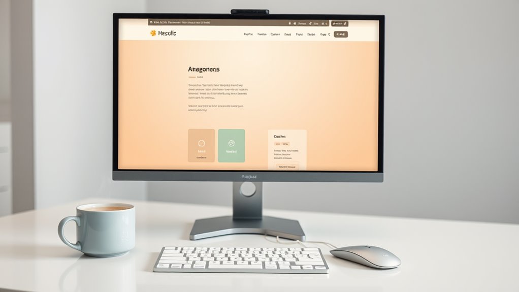

When designing your website, you can utilize the influence of color theory to improve user experience. By applying principles like color harmony, consistency, and psychology, you can create a visually appealing and engaging site. Use the 60-30-10 rule to balance your color scheme, and choose colors that align with your brand's personality and values. Create a visual hierarchy to guide user flow, and balance contrast and legibility to enhance readability. With these fundamentals in place, you're just a step away from crafting a website that truly resonates with your users – and there's still so much more to explore to take your design to the next level.
Understanding Color Harmony Principles
When designing a website, you're likely to spend hours selecting the perfect colors, but did you know that color harmony principles can make or break the user experience? The key to creating a visually appealing website lies in comprehending how colors interact with each other. This is where the color wheel comes in – a circular representation of colors, with primary colors at the center and secondary colors created by mixing them.
To create harmony, you can use complementary colors, which are pairs of colors directly opposite each other on the color wheel. For example, blue and orange are complementary colors that create a striking contrast when used together. You can additionally use analogous colors, which are next to each other on the color wheel, to create a cohesive look.
Another important principle is the 60-30-10 rule, where 60% of the website is a dominant color, 30% is a secondary color, and 10% is an accent color. This balance creates visual harmony and guides the user's attention. By applying these principles, you can create a website that's not just visually appealing but also easy to navigate. Remember, color harmony isn't merely about aesthetics; it's about creating an intuitive user experience that keeps visitors coming back.
Color Psychology in Web Design
Color psychology plays an important role in web design, as it influences how visitors perceive and interact with your website. When you grasp how colors affect human emotions and behavior, you can create a more engaging and user-friendly experience. Color associations are deeply rooted in our culture and personal experiences, so it’s vital to evaluate the emotional responses you want to evoke in your visitors. Additionally, understanding the benefits of color psychology can help you strategically choose color palettes that align with your brand’s message and values. For instance, warm colors like red and orange can create a sense of urgency or excitement, making them ideal for sales promotions, while cooler colors like blue and green tend to instill a sense of calm and trust, perfect for financial or health-related websites. By intentionally selecting colors, you not only enhance visual appeal but also foster a deeper emotional connection with your audience, ultimately driving engagement and conversions.
Red, for instance, is often associated with energy, passion, and excitement, making it perfect for call-to-actions or promotions. Conversely, blue is commonly linked with trust, reliability, and calmness, making it an excellent choice for financial or healthcare websites. You can use green to convey growth, harmony, and nature, whereas purple is often tied to luxury, creativity, and wisdom.
When selecting colors for your website, reflect on the emotions you want to elicit in your visitors. Do you want to stimulate their appetite with warm, lively hues or create a sense of serenity with cool, muted tones? By comprehending color psychology, you can create a visual language that resonates with your target audience and drives them to take action. By leveraging the right color associations, you can improve user experience, increase engagement, and eventually boost conversions.
Choosing a Dominant Color Scheme
You've grasped the emotional impact of colors on your website's visitors; now it's time to build a cohesive visual identity by selecting a dominant color scheme. This essential step will help you create a consistent look and feel across your website, reinforcing your brand's personality and values.
When choosing a dominant color scheme, consider your brand identity alignment. Your website's color palette should reflect your brand's personality, values, and tone. Ask yourself, "What emotions do I want to evoke in my visitors?" and "How do I want my brand to be perceived?" Your color palette selection should be guided by these questions.
Limit your palette to 2-3 core colors and their variations. This will help you maintain consistency and make design decisions easier. Consider the 60-30-10 rule: 60% of your website's color scheme should be a dominant color, 30% a secondary color, and 10% an accent color. This balance will create visual harmony and guide your visitors' attention.
Creating Visual Hierarchy With Color
Through strategic color placement, you can direct visitors' attention and create a clear visual hierarchy on your website. This visual hierarchy is essential in guiding users through your content and enhancing their overall experience. By using color effectively, you can create a clear order of importance, making it easy for visitors to focus on the most vital elements.
To create a visual hierarchy with color, consider the following strategies:
- Use contrasting shades: Apply contrasting shades to draw attention to specific elements, such as calls-to-action (CTAs) or headings. This contrast will create visual interest and guide the user's attention.
- Employ color gradients: Color gradients can add depth and visual interest to your design. Use them to create a sense of hierarchy, with the most important elements featuring the most prominent gradient.
- Apply color blocking: Divide your content into sections using color blocking, making it easy for users to distinguish between different areas of your website.
- Create a focal point: Designate a focal point on your website using a bold, bright, or contrasting color. This will immediately capture the user's attention and guide them through your content.
Using Color to Guide User Flow
You can use color to guide users through your website by creating a visual hierarchy that directs their attention to specific areas. By strategically placing high-contrast colors, you'll draw users' eyes to the most important elements, such as calls-to-action or key information. Furthermore, you can use subtle color cues to suggest the direction of flow, encouraging users to move through your site in a logical and intuitive way.
Visual Hierarchy Creation
A well-designed visual hierarchy is crucial for guiding users through your website, and color plays a significant role in creating this hierarchy. By strategically using color, you can direct users' attention to the most important elements on your page, creating a seamless user experience.
To create an effective visual hierarchy, try these techniques:
- Use color gradients to create a sense of depth and dimension, drawing users' eyes to key areas of your page.
- Employ visual spacing to create a clear distinction between different sections of content, making it easy for users to navigate.
- Apply contrasting colors to call-to-actions (CTAs) and other critical elements to make them stand out.
- Limit your color palette to 3-5 core colors to maintain a cohesive look and prevent visual overwhelm.
Attention Focus Areas
Colors can be strategically placed to serve as attention focus areas, guiding users' eyes to specific parts of your website and influencing their flow. By creating color hotspots, you can draw attention to crucial elements, such as calls-to-action (CTAs), promotions, or vital information. These visual cues help users quickly identify what's important and what to focus on.
When used effectively, attention focus areas can greatly improve user engagement and conversion rates. For instance, using a bold, contrasting color for your CTAs can increase clicks and conversions. Similarly, highlighting promotions or special offers with bright, eye-catching colors can drive sales.
To create effective attention focus areas, identify the most crucial elements on your webpage and use color to make them stand out. Confirm the colors you choose are consistent with your brand identity and resonate with your target audience. By guiding users' attention with strategic color placement, you can create a more intuitive and engaging user experience.
Flow Direction Cues
Visual pathways created by deliberate color choices can greatly influence how users navigate your website, directing their attention and flow through strategic flow direction cues. By using color to guide user flow, you can create a seamless and intuitive experience that keeps users engaged.
To create effective flow direction cues, consider the following strategies:
- Use contrasting colors to create visual pathways that lead users through your website's layout
- Employ warm colors to draw attention to call-to-actions (CTAs) and navigation indicators
- Apply color gradients to create a sense of movement and direction
- Utilize whitespace to create a clear visual hierarchy and guide user flow
Balancing Contrast and Legibility
About 60% of your website's aesthetic appeal hinges on its color scheme, which can make or break user experience. In terms of balancing contrast and legibility, you need to strike the right chord to guarantee your website is visually appealing and easy to navigate.
Contrast ratios play an essential role in determining the legibility of your website's text. A high contrast ratio between the text and background guarantees that your content is easily readable. The Web Content Accessibility Guidelines (WCAG) recommend a contrast ratio of at least 4.5:1 for normal text and 7:1 for large text.
Here's a breakdown of contrast ratios and legibility standards:
| Contrast Ratio | Legibility Standard | Example |
|---|---|---|
| 1:1 | Very Low | White text on white background |
| 3:1 | Low | Light gray text on white background |
| 4.5:1 | Medium | Dark gray text on white background |
| 7:1 | High | Black text on white background |
When choosing a color scheme, keep in mind that legibility is key. Verify that your text is easy to read by maintaining a sufficient contrast ratio. You can use online tools to calculate the contrast ratio of your chosen colors and make adjustments accordingly. By balancing contrast and legibility, you can create a website that's both visually appealing and user-friendly.
Color Consistency Across Platforms
Across various devices and platforms, your website's color scheme must remain consistent to establish a strong brand identity and guarantee a seamless user experience. This means that the colors you choose for your website should be identical across all devices, browsers, and platforms, including desktops, laptops, mobile phones, and tablets.
To achieve color consistency across platforms, you should:
- Define a core color palette and stick to it, making certain that all design elements, from logos to buttons, use the same colors.
- Use a single, unified design language across all platforms, including typography, imagery, and iconography.
- Confirm that your color scheme is adaptable to different screen sizes, resolutions, and devices, without compromising the overall aesthetic.
- Create a style guide that outlines the usage of your color palette, typography, and design elements, and share it with your development team and stakeholders.
Testing and Refining Color Choices
Now that you've established a consistent color scheme across platforms, it's time to put your color choices to the test. You've invested time and effort into selecting a palette that aligns with your brand's personality and resonates with your target audience. But, how do you know if your color scheme is truly effective?
The answer lies in testing and refining. A/B testing is an excellent way to gauge user response to different color variations. Create two versions of your website – one with your current color scheme and another with a modified palette. Then, direct half of your website traffic to each version and analyze user behavior, such as engagement, conversion rates, and bounce rates. This will give you concrete data on which color scheme performs better.
Another vital aspect of testing is user feedback. Conduct surveys or gather feedback through social media to understand how users perceive your brand's color scheme. Do they find it appealing? Do they associate it with your brand values? This qualitative data will help you refine your color choices and make informed decisions.
Frequently Asked Questions
Can I Use My Brand's Logo Color as the Dominant Color Scheme?
You're wondering if you can use your brand's logo color as the dominant color scheme. Although it's tempting, consider the logo color psychology implications. Using it as the primary color might overwhelm users and create visual fatigue. Instead, try incorporating it as an accent color to maintain brand identity consistency. This approach will allow you to create a cohesive look without overwhelming your audience.
How Do I Ensure Color Choices Are Accessible for Colorblind Users?
When choosing colors, you'll want to guarantee they're accessible to colorblind users. Start by selecting a color palette with sufficient color contrast between background and text. You can use online tools to test your palette's accessibility. Furthermore, consider using colors with a higher lightness value for backgrounds and darker values for text. This will help create a clear visual hierarchy. By doing so, you'll create an inclusive design that caters to all users, regardless of their visual abilities.
Can I Use Bright Colors for a Professional Website?
You're wondering if bright colors can work for a professional website. The answer is yes, but it's all about balance. Bright colors can evoke emotions and grab attention, but they can as well overwhelm. Use bright colors strategically, like accents or calls-to-action, to create a visually appealing contrast. Bright color psychology shows that bold hues can stimulate energy and creativity, but professional design demands restraint. By balancing bright colors with neutrals, you'll create a site that's both lively and professional.
Do I Need to Consider Color Theory for Mobile Apps Too?
As you design for mobile, think of your app as a key that opens a user's attention. Just like a master locksmith crafts a key to perfectly fit a lock, you must craft a color scheme that perfectly fits your user's mobile experience. Don't assume what works on desktop will translate; mobile design demands its own unique approach. Consider how colors can boost user engagement on smaller screens, and you'll reveal the secret to a gripping mobile experience that keeps users coming back for more.
How Often Should I Update My Website's Color Scheme?
You're wondering how often to update your website's color scheme. The answer lies in color psychology. Since colors evoke emotions, you should update your scheme seasonally to reflect changing moods and preferences. For instance, warm tones in winter and bright hues in summer. This will keep your site fresh and engaging. Don't be afraid to experiment, but make certain updates align with your brand's overall aesthetic. By doing so, you'll create an immersive experience that resonates with your audience.