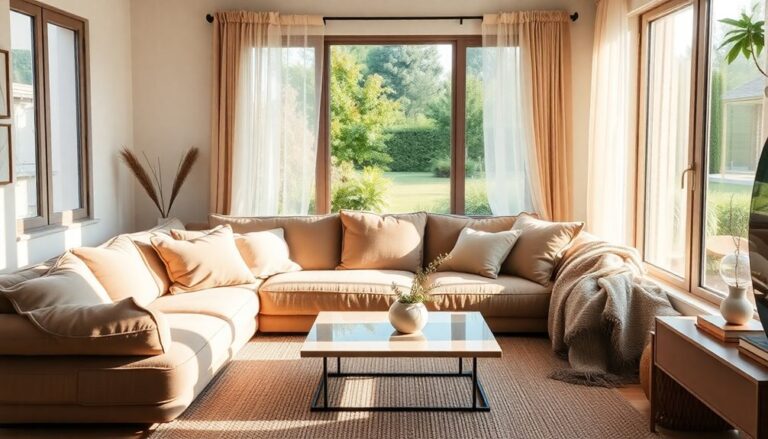
To choose the perfect color palette for your home, start by grasping color theory and the emotions different hues evoke. Assess each room's functionality and determine your décor style. Consider how natural and artificial lighting impacts color perception. Limit your palette to three to five colors for cohesion, and incorporate accent colors sparingly to highlight focal points. Don't forget to sample paint on your walls to see how colors work in your space. Testing your choices guarantees you're happy. With these tips, you'll soon find a palette that truly reflects your style. There's so much more to explore about creating the ideal atmosphere.
Understand Color Theory
To create a harmonious color palette for your home, it's essential to grasp the basics of color theory. Comprehending how colors interact can enhance your design game and infuse your space with creativity. Start by exploring the concept of color harmony, which refers to the pleasing arrangement of colors. When you achieve this balance, you set the stage for a visually appealing environment.
One key element in color theory is complementary colors. These are pairs of colors located opposite each other on the color wheel, such as blue and orange or red and green. When paired together, they create striking contrasts that can energize a room. Using complementary colors in your palette can draw attention to specific areas, creating focal points that inspire conversation.
But don't stop there! Think about the mood you want to convey. Warm colors like reds and yellows can create an inviting atmosphere, whereas cool colors such as blues and greens can evoke calmness. Mixing these shades artfully can help you achieve a unique style that resonates with your personality.
Experiment with various combinations to see what feels right. You might discover that a pop of a complementary color against a neutral backdrop invigorates your space. By comprehending the principles of color theory and embracing innovative combinations, you'll craft a palette that not only looks stunning but also feels like home. Embrace the influence of color harmony, and let your creativity flourish!
Assess Your Space
Before plunging into color selection, take a moment to evaluate your space. Comprehending the unique characteristics of your area is essential for creating a cohesive and innovative color palette. Start by examining the space functionality—what activities take place here? A lively kitchen may benefit from energizing colors, whereas a serene bedroom might call for softer, calming hues.
Next, consider layout optimization. How does the arrangement of furniture and architecture influence your color choices? Open spaces can handle bold, statement colors that invite creativity, whereas smaller rooms might feel more cohesive with lighter, airy tones. Take note of focal points, such as a striking piece of art or a beautiful window view; you'll want your color palette to complement these elements rather than compete with them.
Don't forget to evaluate the proportions of your space. High ceilings can handle darker colors, creating a cozy atmosphere, whereas lower ceilings may benefit from lighter shades to improve the sense of height. Jot down key observations about how the room feels and functions—this will guide your color decisions.
Lastly, think about how you want your space to make you feel. Your chosen colors should align with your vision for the room, reflecting both personal style and the intended purpose. By thoroughly evaluating your space now, you'll set the stage for an innovative color palette that breathes life into your home.
Consider Lighting Effects
When choosing colors for your home, think about how lighting will impact your choices. Natural light can change the way a color looks throughout the day, whereas artificial lighting can create a completely different atmosphere. By considering both types of lighting, you can select a palette that truly improves your space.
Natural Light Influence
Natural light plays a crucial role in how colors appear in your home. The natural light effects can dramatically alter the perception of your chosen palette throughout the day and across different seasons. To utilize this strength, consider these three key factors:
- Direction of Light: South-facing rooms receive abundant sunlight, making colors appear lively. North-facing spaces, conversely, can create a cooler, more subdued atmosphere.
- Time of Day: Morning light tends to be softer and warmer, whereas afternoon sun can be harsher and more intense. Observe how colors shift as the day progresses.
- Seasonal Changes: Colors can look different depending on the season. In winter, the light is often cooler and less intense, whereas summer brings in warmer, more abundant rays. This variation can greatly influence how your colors feel.
Artificial Lighting Considerations
Artificial lighting can transform the way colors in your home are perceived, impacting the overall mood and aesthetic of your spaces. When choosing your color palette, consider the effects of artificial brightness and color temperature. Different light sources emit varying temperatures—some warmer, others cooler—which can dramatically alter how paint colors appear.
For instance, a warm white light can improve earthy tones, making them feel inviting and cozy, whereas cooler, bluish lighting might make lively colors pop but can likewise render softer hues dull. Before committing to a color, test it under the specific lighting you plan to use.
Don't forget about layering your lighting. Combining ambient, task, and accent lights can create a dynamic atmosphere and highlight your chosen colors in innovative ways.
Smart lighting options, including dimmable LEDs, allow you to adjust brightness, allowing you to see how colors shift throughout the day and into the evening. By thoughtfully considering your artificial lighting, you can guarantee your home's color palette reflects your desired vibe and enriches the overall experience of your spaces. Embrace the transformative influence of light, and watch your palette come alive!
Determine Your Style
You often find that identifying your personal style is a crucial step in choosing a color palette for your home. Your style reflects who you are and sets the tone for your living space. Whether you lean in the direction of minimalist aesthetics or prefer eclectic designs, comprehending your preferences will guide your color choices.
To help you define your style, consider these three key aspects:
- Inspiration Sources: Look around for inspiration. Browse design magazines, explore social media platforms like Pinterest and Instagram, or visit local art galleries. Notice what resonates with you—are you drawn to clean lines and neutral tones, or do lively colors and varied textures excite you?
- Lifestyle Needs: Think about your daily life. If you enjoy hosting gatherings, you might opt for warm and inviting colors. Conversely, if you crave tranquility, softer hues might suit you better. Your lifestyle should inform your palette choices.
- Existing Elements: Pay attention to the furniture and decor you already own. Are they modern and sleek, or vintage and colorful? Your color palette should harmonize with these elements, creating a cohesive look throughout your space.
Create a Focal Point
To create a focal point in your home, you'll want to choose bold accents that draw the eye. Incorporating textures and patterns can additionally add depth and interest to your space. With the right elements, you can transform an ordinary room into a enchanting one.
Choose Bold Accents
A striking bold accent can transform an ordinary space into a mesmerizing centerpiece. When you integrate bold color combinations into your home, you create an inviting atmosphere that sparks interest and conversation. Here are three ways to choose bold accents that make a statement:
- Statement Furniture: Look for standout pieces like a dynamic sofa or a uniquely colored chair. These can anchor the room and draw attention immediately.
- Art and Decor: Invest in large-scale artwork or bold decorative items that reflect your personality. A bright painting or an oversized sculpture can become the focal point in any space.
- Accent Walls: Consider painting one wall in a striking hue or using wallpaper with bold patterns. This not only creates depth but also emphasizes your chosen style.
Incorporate Textures & Patterns
Incorporating textures and patterns into your home can improve your design and create an engaging focal point. By experimenting with innovative texture combinations, you can uplift your space from ordinary to extraordinary. Reflect on mixing sleek metals with soft textiles or incorporating natural elements like wood and stone alongside lively fabrics. This interplay adds depth and visual interest, fascinating anyone who enters.
Pattern layering is another influential technique to contemplate. Don't shy away from bold prints—layer them thoughtfully to create a dynamic atmosphere. For instance, you could pair a geometric rug with floral throw pillows, allowing each pattern to complement the other as they still stand out. This approach can evoke a sense of harmony and creativity.
Explore Color Psychology
Grasping color psychology can significantly impact the ambiance of your home. The colors you select not just mirror your personal style but additionally evoke emotional responses that can improve your living experience. By comprehending the cultural significance behind various shades, you can create spaces that resonate profoundly with you and those who visit.
Here are three key emotions associated with popular colors:
- Blue: Often linked to calmness and tranquility, blue can create a serene environment, making it ideal for bedrooms or relaxation areas.
- Yellow: This lively hue promotes happiness and energy, perfect for kitchens or playrooms where you want to nurture creativity and joy.
- Green: Symbolizing nature, green promotes balance and harmony. It can be a rejuvenating choice for living rooms or home offices, encouraging focus and revitalization.
When you select colors based on their psychological effects, you're not merely decorating; you're crafting an experience. Think about how each color makes you feel and its associations within your culture. By aligning your color choices with your emotional responses and their cultural significance, you'll transform your home into a sanctuary that invigorates you or provides comfort, depending on your needs. So, take a moment to reflect on how you want to feel in each space—this approach can lead you to the perfect color palette that truly speaks to you.
Use Color Wheel Techniques
Using color wheel techniques can simplify the process of selecting a harmonious color palette for your home. By comprehending how colors interact, you can create stunning spaces that reflect your unique style. One effective approach is to choose complementary colors, which are located opposite each other on the color wheel. This strategy creates lively contrasts that can energize a room.
Alternatively, you might explore analogous schemes, which involve selecting three colors that sit next to each other on the wheel. This technique promotes a more cohesive and serene environment, perfect for spaces where you want to unwind.
To better visualize these concepts, here's a simple table to guide you:
| Color Scheme | Example Colors | Best Uses |
|---|---|---|
| Complementary | Blue and Orange | Living rooms, accent walls |
| Analogous | Blue, Blue-Green, Green | Bedrooms, cozy reading nooks |
| Triadic | Red, Yellow, Blue | Playrooms, creative spaces |
| Tetradic | Red, Green, Yellow, Blue | Dynamic areas, open concepts |
Experiment With Neutrals
Neutral colors can be a transformative element regarding designing your home. They provide a versatile backdrop that allows you to express your style without overwhelming your space. By experimenting with neutrals, you can create stunning interiors that feel both fresh and timeless. Here are three key ways to innovate with neutral color combinations:
- Layer Textures: Combine different materials like wood, fabric, and metal in neutral tones. This adds depth and interest, making your space feel dynamic yet still being calm.
- Accent with Bold Accessories: Use bold colors or patterns in your accessories, like pillows or artwork. This creates a striking contrast against the timeless neutral palettes, allowing your personality to shine through without competing with the overall tranquility of your surroundings.
- Play with Shades: Don't limit yourself to just one shade of neutral. Experiment with various tones like beige, gray, and taupe. This layering of shades can create a sophisticated, cohesive look that feels inviting and elegant.
Incorporating these strategies will help you embrace the beauty of neutrals as you maintain your home innovative and stylish. Neutral color combinations aren't just safe choices; they offer endless possibilities for creativity and expression. So go ahead, explore the realm of neutrals, and watch how they transform your living space into a chic haven!
Test Paint Samples
To truly find the perfect color for your home, you should frequently test paint samples on your walls. This hands-on approach allows you to visualize how colors interact with your space, lighting, and existing furniture. Begin by selecting a few shades that pique your interest, but don't stop there—explore variations in hue, saturation, and brightness.
Utilize effective paint sample techniques to maximize your testing. Instead of painting large swaths, consider using sample pots for smaller sections of the wall. This method offers a more manageable way to compare colors side by side. Apply samples using different color application methods, like rollers or brushes, to see how texture affects the final appearance.
Pay attention to how the paint looks at various times of the day. Natural light can drastically change a color's perception, so take note of morning, afternoon, and evening views. If you're feeling particularly adventurous, consider using temporary color swatches or peel-and-stick samples, which allow for easy removal without damaging your walls.
Lastly, don't forget to observe how colors make you feel. Each shade can evoke different emotions, so trust your instincts. By carefully testing and comparing samples, you can confidently narrow down your palette to find that perfect color that resonates with your vision for your home.
Incorporate Accent Colors
Accent colors can transform a room, adding depth and personality to your overall design. When you reflect on incorporating these lively hues, you're not just choosing colors; you're crafting an experience. Here are three bold accent choices to ponder:
- Contrast with Neutrals: Pair striking accent colors with a neutral backdrop. This combination allows your bold colors to pop, creating a stunning focal point in any space.
- Color Blocking: Use accent color combinations in distinct sections of a room. For example, a bright yellow armchair against a teal wall can create a enchanting visual without overwhelming the senses.
- Accessorize: Incorporate accent colors through accessories like cushions, artworks, and rugs. These elements offer flexibility, allowing you to change the mood of your room without a complete overhaul.
When you choose your accent colors, reflect on how they interact with your main palette. Bold accent choices can spark conversation and inspire creativity, making your space feel alive. Whether you opt for a fiery red or a calming aqua, the key is to select colors that resonate with your personality and lifestyle.
Don't shy away from experimenting! Mixing and matching different accent color combinations can lead to unexpected and delightful results. So go ahead, let your imagination run wild, and watch as your home transforms into a unique expression of you.
Evaluate Overall Harmony
To create a cohesive look in your home, you need to understand color theory and how colors interact. Consider how natural light affects your choices and think about how your color palette aligns with your décor style. This overall harmony will guarantee your space feels balanced and inviting.
Understand Color Theory
A well-chosen color palette can transform your home, creating a sense of harmony and balance. To attain this, grasping color theory is crucial. Here are three key concepts to reflect on:
- Color Temperature: Colors can be categorized as warm or cool. Warm colors (like reds and yellows) can energize a space, whereas cool colors (like blues and greens) promote calmness. Think about the mood you want to create.
- Complementary Colors: These are colors opposite each other on the color wheel, like blue and orange. When used together, they create striking contrasts that can add drama and interest to your decor.
- Monochromatic Schemes: Using varying shades and tints of a single color can create a cohesive look during still providing depth and dimension.
Consider Natural Light
When choosing a color palette, don't overlook how natural light affects your space. The interplay between your chosen colors and the natural light sources in a room can either improve or diminish the overall aesthetic. Start by observing the light direction—does it flood in from the east, west, or maybe the north? Each direction has a unique effect on how colors appear throughout the day.
For instance, southern light is warm and can make colors feel lively, whereas northern light is cooler and can create a more subdued atmosphere. If you have large windows, consider how the sunlight shifts, altering the mood of your space.
Innovative design involves embracing these nuances. When selecting your colors, test swatches in various lighting conditions to see how they transform. You might find that a shade you love in the store looks entirely different in your living room.
Ultimately, harmonizing your color palette with your home's natural light will create a cohesive and inviting environment. By being mindful of light direction and its impact on color perception, you'll craft spaces that feel both innovative and harmonious.
Match With Décor Style
Considering your home's décor style is vital for achieving a cohesive color palette. Your chosen colors should enhance and complement your existing furnishings. Here are some color coordination tips to help you create harmony:
- Identify Your Style: Whether it's modern, rustic, or eclectic, pinpointing your style will guide your color choices. Each style has its signature hues that can boost the overall look.
- Choose Complementary Color Schemes: Use the color wheel to find opposites that work well together. For example, pairing blue with orange can add vibrancy as you maintain balance.
- Limit the Palette: Stick to three to five main colors. This approach prevents overwhelming the space and guarantees that each hue plays nicely with the others.
Frequently Asked Questions
How Do I Choose Colors for Small Versus Large Rooms?
When you're choosing colors for small versus large rooms, think about how the space feels. For small room colors, lighter shades can create an airy vibe, making the area feel larger. You might want to use bold accents to add character. Alternatively, large room colors can handle deeper hues, giving it warmth and depth. Balance is key—experiment with contrasting tones to define spaces and create an innovative, cohesive look throughout your home.
Can I Mix Warm and Cool Colors Successfully?
Yes, you can mix warm and cool colors successfully! To achieve color harmony, focus on balance. Start with a dominant color, then introduce accents from the opposite temperature. Use neutrals to bridge the gap, creating a cohesive look. Experiment with various shades and intensities to find what resonates with you. Trust your instincts; innovative combinations can bring a fresh vibe to your space, making it feel both inviting and dynamic.
What if I Change My Mind About My Color Choices?
If you change your mind about your color choices, don't worry; it's part of the creative process! Color psychology plays a huge role in how you feel about your space, so trust your instincts. Stay updated on color trends to inspire fresh ideas. Experimenting with new palettes can invigorate your home. Remember, your space should reflect your evolving personality, so embrace the change and let your creativity flow!
How Often Should I Update My Home's Color Palette?
Envision your walls transforming like a chameleon, shifting colors with the seasons! You should consider updating your home's color palette at least every couple of years. This keeps things fresh and exciting, aligning with current color trends. Think about seasonal updates, too; a splash of lively hues for summer can brighten your space, whereas cozy tones in winter create warmth. Don't hesitate to embrace change—your home deserves to reflect your evolving style!
Are There Color Combinations That Are Universally Disliked?
Yes, some color combinations are universally disliked. Color psychology shows that certain unpopular hues, like brown paired with green or bright yellow with grey, can evoke negative feelings. Although you might be drawn to innovative choices, it's crucial to reflect on how these combinations impact mood and perception. Avoiding these clashes can help you create a more harmonious environment, allowing your creative vision to shine without any visual distractions from unpopular pairings.