
By harnessing the emotional impact of color, you can transform your space into a haven that reflects your personality and style. Understanding how colors influence emotions and behavior is key. Blue can evoke calmness, while red energizes. You can create a cohesive look with monochromatic, complementary, or analogous color schemes. Balance warm and cool tones to create atmosphere, and use accent colors to add contrast and interest. With the right colors, you can craft a unique style that's all yours. As you continue on this colorful journey, you'll discover even more ways to enhance your home's style.
Understanding Color Psychology Basics
When it comes to decorating your home, understanding the emotional impact of colors on your mood, energy, and overall well-being is essential. Colors have the power to evoke emotions, stimulate memories, and even influence your behavior. This is why it's important to grasp the basics of color psychology when creating your home's style.
You might be wondering, what exactly is color psychology? It's the study of how colors affect human emotions and behavior. In the context of branding, color psychology is used to create a brand identity that resonates with the target audience. Similarly, when designing your home, you can harness the power of color emotions to create a space that reflects your personality and makes you feel comfortable.
For instance, blue is often associated with feelings of calmness and trust, while red is linked to energy and excitement. By incorporating these colors strategically, you can create a space that boosts your mood and energy levels. Additionally, understanding color psychology can help you create a cohesive look that reflects your personal style. By selecting colors that evoke the right emotions, you can craft a brand identity for your home that resonates with you and your loved ones.
Choosing a Dominant Color Scheme
Now that you've grasped the basics of color psychology, it's time to select a dominant color scheme that sets the tone for your entire space. This scheme will serve as the foundation for your home's style, so it's essential to choose wisely. To begin, consider the mood and atmosphere you want to create in your home. Do you want it to feel calm and soothing, or energetic and vibrant?
| Color Scheme | Characteristics | Mood/Atmosphere |
|---|---|---|
| Monochromatic | Single color with varying shades | Coherent, sophisticated |
| Complementary | Colors opposite each other on the color wheel | Bold, contrasting |
| Analogous | Colors next to each other on the color wheel | Harmonious, soothing |
| Triadic | Equidistant colors on the color wheel | Balanced, vibrant |
| Split-Complementary | A color paired with two adjacent colors | Rich, nuanced |
When selecting your dominant color scheme, remember that Color Blocking can add visual interest to your space by creating bold, geometric patterns. Meanwhile, Palette Evolution allows you to gradually introduce new colors to your scheme, ensuring a cohesive look. By choosing a dominant color scheme that resonates with your personal style, you'll create a sense of belonging in your home.
Balancing Warm and Cool Tones
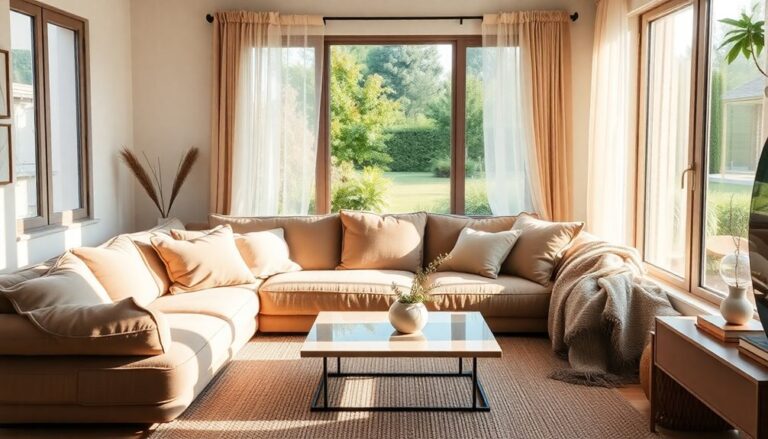
You'll want to strike a balance between warm and cool tones to create a visually appealing space that resonates with your personal style. This balance is important because warm and cool tones evoke different emotions and can greatly impact the ambiance of a room. Warm neutrals, such as beige, taupe, and caramel, create a cozy and inviting atmosphere, perfect for living rooms and bedrooms. On the other hand, cool contrasts, like blues and greens, can bring a sense of calmness and serenity, making them ideal for bathrooms and outdoor spaces.
To achieve harmony, you can combine warm and cool tones in a single room. For instance, you can pair warm beige walls with cool blue accents to create a soothing and calming atmosphere. Alternatively, you can use warm neutrals as the dominant color and add cool contrasts through accessories, such as throw pillows or vases. This balance will create visual interest and depth, making your space feel more dynamic and engaging.
Creating Mood With Monochromatic Hues
By selecting different shades of a single hue, you can craft a cohesive look that evokes a specific mood, from soothing calmness to vibrant energy. This monochromatic approach allows you to create a sense of continuity and harmony in your home, which can have a profound impact on your emotional well-being. Monochromatic neutrals, in particular, can create a sense of calmness and serenity, making them perfect for bedrooms and meditation rooms.
When choosing a monochromatic scheme, consider the emotional resonance you want to create in each room. Do you want to feel energized and motivated in your home office, or relaxed and calm in your living room? By selecting different shades of a single hue, you can tailor the mood of each room to your specific needs and preferences.
To get started, choose a hue that resonates with you, and then experiment with different shades and tints. You can also add texture and depth by incorporating different materials and finishes, such as wood, metal, or fabric. Remember, the key to a successful monochromatic scheme is to create a sense of continuity and harmony. By doing so, you'll create a space that not only looks beautiful but also feels emotionally resonant and supportive of your well-being.
Adding Accent Colors for Contrast
To break free from the monotony of a single-hue space, inject a burst of personality into your design by introducing accent colors that boldly contrast with your monochromatic scheme. By doing so, you'll create visual interest and add depth to your space. Accent walls are a great way to incorporate contrasting colors, drawing attention to a specific area of the room. For instance, if your monochromatic scheme is based on calming blues, you could paint one wall a vibrant coral to create a striking contrast.
Another way to incorporate accent colors is through color blocking. This technique involves dividing your space into sections and painting each section a different color. This creates a visually appealing and modern look, perfect for those who want to make a statement. When using color blocking, it's essential to balance bold colors with neutral shades to avoid overwhelming the senses. For example, if you're using a bold red as an accent color, pair it with a neutral beige or cream to create harmony.
Considering Natural Light Effects
When selecting a color scheme, you'll want to take into account how natural light affects the hues in your space. As you're choosing colors, think about how morning sunlight will impact the shades you've chosen, making them appear brighter and more vibrant. You'll also want to take into consideration how artificial lighting will alter the colors in the evening, ensuring the overall aesthetic remains cohesive.
Morning Sunlight Colors
As morning sunlight pours into your rooms, it brings out the best in certain colors, making them look more vibrant and energized. The soft, warm tones of morning sunlight, often referred to as the Golden Hours, have a profound effect on the colors in your space. During these moments, soft, calming hues like pale blues, mauves, and creamy whites come alive, radiating a sense of serenity and calm.
As the morning progresses, the Soft Dawns bring a gentle warmth that complements earthy tones like terracotta, sienna, and umber. These natural hues blend seamlessly with the sun's gentle rays, creating a cozy and inviting atmosphere. By incorporating these colors into your decor, you can harness the warmth and energy of the morning sun, creating a sense of belonging and comfort in your home. By doing so, you'll create a space that not only looks beautiful but also feels like a warm hug on a chilly morning.
Artificial Lighting Hues
You'll discover that artificial lighting can dramatically alter the ambiance of a room, especially when you consider how it interacts with natural light effects. By choosing the right hues, you can create a sense of warmth and coziness, or brightness and energy.
To achieve the perfect ambiance, consider the following scenarios:
- Imagine a relaxing evening with soft, warm LED ambiance illuminating your living room, creating a sense of tranquility after a long day.
- Picture a bright and airy kitchen, where dimmable options allow you to adjust the lighting to suit your daily routine, from morning coffee to evening dinner prep.
- Envision a cozy reading nook, where a warm, golden glow sets the tone for a relaxing afternoon with a good book.
Selecting Colors for Specific Rooms
Choosing the right color for a specific room can elevate its unique character and functionality. When selecting colors, it's crucial to take into account the room's purpose, natural lighting, and the mood you want to create. For instance, a bedroom should exude calmness and serenity, while a home office should stimulate productivity.
To achieve harmony, contemplate the Room Personality and Color Flow. Room Personality refers to the room's unique character, which can be influenced by its purpose, architecture, and furniture. Color Flow, on the other hand, is the visual connection between rooms, creating a sense of continuity.
Here's a guide to help you pick the perfect colors for specific rooms:
| Room | Recommended Colors |
|---|---|
| Bedroom | Soft blues, pale greens, and creamy whites for a calming atmosphere |
| Home Office | Invigorating yellows, energizing oranges, and focused greens for productivity |
| Living Room | Warm neutrals, rich browns, and cool grays for a cozy and inviting space |
| Kitchen | Vibrant reds, sunny yellows, and crisp whites for a lively and appetizing atmosphere |
Using Neutral Backgrounds Effectively
By building a neutral background with shades of beige, gray, or taupe, you create a blank canvas that lets your furniture and decor take center stage. This approach allows you to add pops of color through accessories and furniture, creating a look that's uniquely yours.
Neutral backgrounds also provide Background Balance, ensuring that no single element overpowers the space. This balance creates a sense of harmony, making your home feel more welcoming and inviting. By incorporating Neutral Nuances, you can add depth and visual interest to your space without overwhelming the senses.
Imagine walking into a room that feels like a warm hug:
- Soft, creamy walls that envelop you in comfort
- A plush area rug in a subtle, muted tone that anchors the space
- A statement piece of furniture, like a bold-colored armchair, that adds a touch of personality to the room
Making a Statement With Bold Colors
Now that you've set the stage with neutral backgrounds, it's time to add some excitement with bold colors! You can make a statement in your home by incorporating vibrant hues through bright accents, colorful wall statements, or vibrant pattern play. By strategically using these elements, you'll create a space that's anything but boring.
Bright Accents Everywhere
With bold colors, you can strategically place pops of personality throughout your space, creating a vibrant atmosphere that's impossible to ignore. This approach allows you to add a dash of flair to your decor without committing to a full-scale color overhaul. By incorporating bright accents, you'll create a space that's uniquely yours and reflects your personal style.
Here are a few ways to incorporate bold colors into your space:
- A bright yellow ottoman adds a burst of energy to a neutral-toned living room
- A bold red vase adds a pop of color to a minimalist shelf
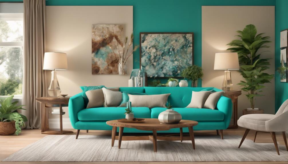
- A turquoise accent wall creates a striking focal point in a calm, monochromatic bedroom
Colorful Wall Statements
You can make a bold statement in your home by painting a single accent wall in a vibrant, eye-catching color that commands attention and adds depth to the room. This one bold move can elevate your space and create a sense of energy. When choosing a color, consider the mood you want to evoke. For example, a rich blue can create a sense of calm, while a bright orange can energize the space.
Another way to make a statement is with a wall mural. This can add a touch of personality and whimsy to your room. You can choose a mural that reflects your personal style, from a nature-inspired scene to a bold geometric pattern. Accent walls can also be used to create a focal point in the room, drawing the eye to a particular area or feature. By incorporating a bold, eye-catching color or a unique mural, you can create a space that truly reflects your personality and style.
Vibrant Pattern Play
Boldly interspersing vibrant patterns throughout your space can instantly elevate your home's style and make a lasting impression on guests. By incorporating global inspiration and whimsy textiles, you can create a unique and enchanting atmosphere that reflects your personality.
Imagine walking into a room that's a vibrant tapestry of colors and patterns, where every piece tells a story. Here are a few ways to bring this vision to life:
- A Moroccan-inspired pouf in bold red and orange hues adds a pop of color to your living room.
- A vintage Indian print scarf turned into a unique throw pillow adds a touch of exotic elegance to your sofa.
- A vibrant African kente cloth-inspired rug anchors the room with its bold geometric patterns.
Frequently Asked Questions
Can I Use My Favorite Color on Every Wall in My House?
You might think, "Why not use my favorite color on every wall?" But imagine walking into a space that's overwhelming, like being surrounded by a never-ending sea of blue. Instead, use your favorite color as an accent wall or in decorative pieces to add personal expression. This way, you'll achieve color consistency without overwhelming the senses. By balancing your favorite color with neutrals, you'll create a harmonious space that feels truly yours.
How Do I Choose a Color That Will Appeal to Buyers if I'm Selling?
When selling your home, you want to appeal to the widest range of buyers possible. To do this, choose a color that’s not too personal or bold. Neutral tones like beige, gray, or off-white are safe bets. Consider buyer psychology: a neutral palette allows buyers to envision themselves living in the space. By selecting a calm, serene color, you’re creating an emotional connection, making it easier for buyers to imagine calling your house their home. Additionally, staging your home with furniture and decor that complements these neutral tones can further enhance the inviting atmosphere. When buyers come to view your property, they should be able to see the potential for their personal touches without being distracted by your individual style. This is where knowing how to identify your home style becomes crucial; it allows you to present your space in a way that appeals broadly, while still highlighting its unique features.
Can I Use Color to Make a Low Ceiling Appear Higher?
You can definitely create the illusion of a higher ceiling! To make a low ceiling appear more spacious, you can use visual tricks with color. Paint the ceiling a lighter shade than the walls to create contrast and draw the eye upwards. You can also use a monochromatic color scheme to minimize visual breaks, making the ceiling height seem more expansive. By cleverly applying color, you'll create a sense of airiness and make the space feel more welcoming.
Are There Any Colors That Can Make a Small Room Appear Larger?
As you gaze into the mirror of your tiny retreat, remember the wise words of Michelangelo: "Beauty is the purging of superfluities." To create an optical illusion, you'll want to strip your small room of visual clutter. Paint the walls a soothing light hue, like sky blue or creamy white, to visually expand the space. This visual expansion trick will make your room appear larger, allowing you to breathe easier and feel more at home.
Can I Use Color to Distract From an Architectural Flaw?
You can definitely use color to divert attention from an architectural flaw in your space. One clever trick is to create visual tricks that draw the eye away from the imperfection. For instance, you can paint a bold, contrasting color on a nearby wall or add a statement piece of furniture to distract from the flaw. By cleverly redirecting the eye, you can create a more balanced and harmonious space that makes you feel right at home.