
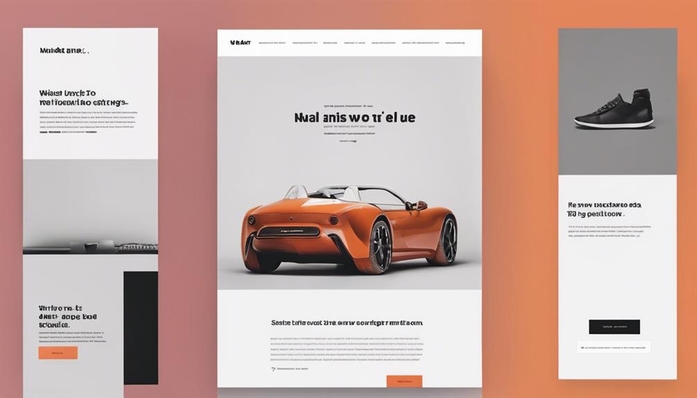

To create a visual hierarchy that guides users, establish clear communication goals and prioritize important information. Utilize size and scale to draw attention and convey emotional tone, balancing visual weight with color, contrast, and texture. Leverage color and contrast to guide the user's flow, and employ grid systems for logical organization. Balance elements with whitespace to create equilibrium and emphasize key information. By applying these principles, you can direct user attention and create an intuitive user experience. Now, explore the nuances of visual hierarchy creation to craft a design that truly resonates with your audience.
Define Clear Visual Goals
Creating a Visual Hierarchy
Define Clear Visual Goals
An essential visual hierarchy begins with a clear understanding of the communication goals, as a designer must prioritize the most important information to effectively engage and guide the viewer. This foundation is pivotal, as it directly impacts the success of the design in achieving business objectives. To establish a strong visual hierarchy, designers must first identify the primary message they want to convey and the actions they want users to take.
By understanding user expectations, designers can craft a visual hierarchy that resonates with their target audience. This involves recognizing the key information that users need to access quickly and easily. For instance, in an e-commerce website, the call-to-action (CTA) buttons should be prominently displayed to encourage users to make a purchase. By prioritizing the CTA, designers can create a clear visual path that guides users towards the desired action.
To guarantee a seamless user experience, designers should also consider the business objectives that the design aims to achieve. By aligning the visual hierarchy with these objectives, designers can create a cohesive and effective design that drives results. By defining clear visual goals, designers can create a visual hierarchy that is both aesthetically pleasing and functionally effective, ultimately driving user engagement and conversion.
Use Size and Scale Effectively
When using size and scale effectively, designers can create a visual hierarchy that guides the viewer's attention through a composition. By applying a thoughtful range of font sizes, balancing visual weight, and maintaining proportion in design, creators can establish a clear order of importance and promote engagement. By strategically employing these principles, designers can craft a visual narrative that resonates with their audience.
Hierarchy of Font Sizes
A well-designed visual hierarchy relies on a thoughtful arrangement of font sizes to guide the viewer's attention and create a clear order of importance. Font sizes play an essential role in conveying the message's emotional tone and emphasis. In font psychology, size emotions are evoked through the careful selection of font sizes. Larger font sizes can evoke feelings of excitement, importance, or urgency, while smaller font sizes can convey a sense of subtlety, detail, or nuance.
To create a harmonious visual hierarchy, it's vital to establish a clear font size structure. Typically, a hierarchy consists of a few font sizes, with the largest size reserved for headings and the smallest size for body text. The key is to create a clear distinction between each font size, allowing the viewer's eye to flow effortlessly through the content. By doing so, you can create a visual flow that guides the user's attention and reinforces the message's intended meaning. By mastering the art of font size hierarchy, you can craft a visual language that resonates with your audience and communicates your message with clarity and precision.
Balance of Visual Weight
Effectively balancing visual weight is crucial in guiding the viewer's attention, as it enables designers to direct focus towards key elements and create a sense of harmony within the composition. Visual balance is achieved when the visual weight of various elements is distributed in a way that creates a sense of stability and equilibrium. Weight distribution can be controlled by manipulating size, color, and texture.
Here are some key considerations for achieving visual balance through weight distribution:
- Size matters: Larger elements carry more visual weight, so use size to draw attention to important elements.
- Color contrast: High-contrast colors can add visual weight, while low-contrast colors can reduce it.
- Texture and pattern: Adding texture or pattern to an element can increase its visual weight.
- Balance warm and cool colors: Warm colors tend to carry more visual weight than cool colors, so balance them to create harmony.
Proportion in Design
Proportion in design plays a vital role in creating a visually appealing composition, as it enables designers to establish a clear hierarchy of elements and guide the viewer's attention through deliberate size and scale variations. By manipulating the size and scale of elements, designers can create a sense of harmony and balance, drawing the viewer's eye to the most important information. Effective use of proportion can also create a sense of unity and cohesion, tying together disparate elements into a cohesive whole.
One key aspect of proportion in design is the aspect ratio, which refers to the relationship between the width and height of an element. By using a consistent aspect ratio throughout a design, designers can create a sense of continuity and flow. Additionally, designers can use proportion to create visual interest and hierarchy by using contrasting sizes and scales. By balancing large and small elements, designers can create a sense of dynamic tension, guiding the viewer's eye through the composition. By mastering the art of proportion, designers can create designs that are both beautiful and effective, communicating their message with clarity and precision.
Leverage Color and Contrast
By strategically pairing colors that pop against those that recede, designers can draw attention to key elements and create a clear visual flow. This is where color psychology and contrast theory come into play. Color psychology studies how colors evoke emotions and influence user behavior, while contrast theory explains how to create visual interest by combining contrasting colors. Incorporating these concepts into web design not only enhances the aesthetic appeal but also improves user experience. By applying color theory principles for web design, designers can effectively guide users’ eyes to crucial information and call-to-action buttons. Additionally, understanding the cultural and psychological implications of color can help tailor a website’s design to its target audience, making it more relevant and engaging.
To effectively leverage color and contrast, consider the following:
- Use high-contrast color combinations: Pair bright, saturated colors with muted, desaturated ones to create visual interest and draw attention to key elements.
- Create a clear hierarchy with color: Use a dominant color for the most important elements, and secondary colors for less important ones, to guide the user's attention.
- Balance warm and cool colors: Combine warm colors (like orange and red) with cool colors (like blue and green) to create visual harmony and balance.
- Check for color blindness and accessibility: Confirm that your color choices are accessible to users with visual impairments by testing for color blindness and following accessibility guidelines.
Organize With Grid Systems
When designing a visual hierarchy, a well-structured grid system is essential for organizing content in a clear and logical manner. By establishing a grid-based layout, designers can align elements in a way that creates a sense of harmony and balance, making it easier for the viewer to navigate and understand the information being presented. By dividing space efficiently, a grid system also enables designers to create a visual flow that guides the viewer's attention through the composition.
Grid-Based Layout Principles
How do grid systems, a fundamental component of visual hierarchy, help designers organize and structure content in a way that is both aesthetically pleasing and easy to navigate? By providing a structured framework, grid systems enable designers to create a clear visual flow, guiding users through the content in a logical and intuitive manner.
Here are some essential principles of grid-based layout principles to keep in mind:
- Establish a clear grid pattern: Define a consistent grid structure to create harmony and balance in your design.
- Use a modular layout system: Divide your content into modular units that can be easily rearranged and reconfigured.
- Create a visual rhythm: Use grid systems to create a visual rhythm that guides the user's eye through the content.
- Balance flexibility and structure: Strike a balance between flexibility and structure to create a design that is both engaging and easy to navigate.
Align Elements Logically
Grid systems provide a foundation for logical alignment, enabling designers to organize elements in a cohesive and harmonious manner that facilitates easy navigation and comprehension. By using a grid, you can create a sense of symmetry, which is essential for establishing a clear visual hierarchy. Symmetry is vital because it creates a sense of balance and order, allowing users to focus on the content rather than being distracted by visual noise. However, asymmetry also has its benefits. It can add visual interest, create a sense of dynamism, and emphasize certain elements. A well-designed grid system allows you to strike a balance between symmetry and asymmetry, creating a visually appealing and harmonious layout. By aligning elements logically, you can guide users' attention through the content, creating a seamless and engaging experience. A grid system helps you to prioritize elements, create a clear flow of information, and establish a clear visual hierarchy. By doing so, you can create a design that is both aesthetically pleasing and functional.
Divide Space Efficiently
Harmony in visual composition is achieved by dividing space into manageable sections, allowing designers to allocate content efficiently and create a clear visual flow. This is where grid systems come into play, helping to organize content in a logical and methodical way. By dividing space efficiently, designers can create a sense of visual balance, making it easier for users to navigate and focus on key elements.
Here are some benefits of using grid systems to divide space efficiently:
- Improved spatial economy: Grid systems help designers make the most of available space, reducing clutter and increasing the overall sense of simplicity.
- Enhanced visual balance: By dividing space into equal or proportional sections, designers can create a sense of harmony and balance, guiding the user's eye through the composition.
- Increased clarity: Grid systems help to organize content in a clear and logical way, making it easier for users to understand and engage with the design.
- Flexibility and adaptability: Grid systems can be adapted to different screen sizes and devices, ensuring that the design remains cohesive and effective across various platforms.
Apply Typography Best Practices
Four fundamental typography principles—legibility, readability, scalability, and consistency—form the foundation of a well-crafted visual hierarchy. These principles work in harmony to guide the user's attention, create a clear message, and establish a lasting impression. In the domain of typography, psychology plays a significant role in shaping the user's emotional response. Font psychology, in particular, is vital in evoking the desired emotions and attitudes. For instance, serif fonts often convey a sense of tradition, elegance, and sophistication, while sans-serif fonts exude modernity, simplicity, and cleanliness.
Typographic emotions are another critical aspect to consider. The careful selection of font styles, sizes, and colors can evoke feelings of excitement, calmness, or even nostalgia. By understanding the emotional impact of typography, designers can create a visual hierarchy that resonates with their target audience. Consistency in typography is essential in establishing a clear visual language. This can be achieved by limiting the number of font families, defining a clear hierarchy of font sizes, and applying a consistent color scheme. By applying these typography best practices, designers can create a visual hierarchy that not only guides the user's attention but also elicits the desired emotional response. A well-crafted visual hierarchy is essential in communicating the message effectively, engaging the user, and ultimately driving conversions.
Create Visual Flow With Alignment
Proper alignment of visual elements serves as the backbone of a cohesive design, as it guides the viewer's eye through the composition in a logical and intentional manner. When visual elements are aligned, they create a sense of harmony and balance, making it easier for users to navigate and understand the content. Alignment also helps to create a clear visual flow, drawing the user's attention to the most important information.
To achieve effective alignment, consider the following techniques:
- Axis alignment: Align elements along a horizontal or vertical axis to create a sense of order and stability.
- Angular harmony: Use angular lines and shapes to create a sense of tension and energy, which can be balanced by softer, curved lines.
- Grid-based alignment: Use a grid system to align elements and create a sense of structure and organization.
- Visual flow alignment: Align elements to create a clear visual flow, guiding the user's eye through the composition.
Balance Elements With White Space
When crafting a visual hierarchy, it's essential to strike a balance between elements and white space. A well-balanced composition guarantees that the viewer's attention is guided effortlessly through the design, with neither clutter nor emptiness dominating the visual field. By thoughtfully allocating white space, designers can create a sense of harmony, drawing the viewer's focus to key elements and facilitating a clear understanding of the message.
Empty Space Is Essential
Effective visual hierarchy relies on the deliberate use of empty space to balance elements and create a clear flow of information. This empty space, also known as negative space, is not just a void, but a powerful tool that guides the user's attention and creates a sense of harmony. It's a form of silent messaging that communicates importance, simplicity, and sophistication.
Here are four ways to effectively use empty space in your visual hierarchy:
- Create breathing room: Leave sufficient space between elements to reduce visual clutter and make content more digestible.
- Use negative space to create focus: Employ empty space to draw attention to key elements, such as calls-to-action or headlines.
- Organize content with grids: Utilize grid systems to balance elements and create a sense of order.
- Employ whitespace to create visual flow: Guide the user's eye through the content by strategically placing empty space to create a natural flow.
Balance Is Key Element
Balance Is Key Element
A harmonious balance of visual elements is achieved by deliberately allocating whitespace to counterbalance the weight of text, images, and other components, thereby creating a sense of stability and equilibrium. This delicate balance is essential in establishing visual harmony, as it allows the user's attention to focus on the most important elements.
| Visual Element | Whitespace Allocation | Design Stability |
|---|---|---|
| Large Headings | Ample whitespace above and below | Emphasizes importance |
| Images | Breathing room around the edges | Creates a sense of calm |
| Body Text | Moderate whitespace between lines | Improves readability |
| Call-to-Actions | Generous whitespace around the button | Draws attention and encourages action |
Visual Flow Matters
By deliberately guiding the user's eye through a composition, a well-balanced visual flow can be achieved, where whitespace is used to connect and separate elements in a harmonious dance. This intentional flow creates a visual priority, drawing attention to the most important elements and guiding the user through the content. A harmonious visual flow is essential in creating a visual hierarchy that guides users, as it helps to organize complex information and create a sense of cohesion.
To achieve a balanced visual flow, consider the following:
- Direct the user's eye: Use visual elements such as lines, shapes, and colors to guide the user's attention through the composition.
- Create flow patterns: Use repetition, alignment, and proximity to create a sense of rhythm and flow.
- Balance elements with whitespace: Use whitespace to create a sense of breathing room and visual balance.
- Prioritize content: Use size, color, and placement to create a clear visual hierarchy, drawing attention to the most important elements.
Use Images to Guide Attention
In visual communication, images have the power to capture attention and direct the viewer's gaze to specific areas of the composition, making them an essential element in creating a visual hierarchy. By strategically placing images, you can control the flow of attention and create a clear path for the viewer's eye to follow. This is achieved through eye direction, where the image encourages the viewer to look at a specific area of the composition. For instance, if you're showcasing a product, an image of a person looking at the product can guide the viewer's attention to the product itself.
Images also have the ability to create an emotional connection with the viewer, evoking feelings and emotions that can influence their behavior. By using high-quality, relevant, and contextually appropriate images, you can create a deeper connection with your audience and encourage them to engage with your content. This emotional connection can be especially powerful when combined with a clear visual hierarchy, as it can guide the viewer's attention to specific areas of the composition and create a sense of flow.
Make Interactive Elements Standout
As visual communicators leverage the emotional connection established through images, they must also guarantee that interactive elements, such as buttons and forms, are prominently displayed to facilitate user engagement. These elements are vital in guiding users through a website or application, and their prominence can greatly impact the overall user experience.
To make interactive elements stand out, designers can employ various techniques. Here are four strategies to ponder:
- Use Interactive Icons: Incorporate icons with interactive elements, such as buttons and checkboxes, to draw attention to their functionality. This can help users quickly understand the purpose of each element and encourage engagement.
- Apply Hover Effects: Implement hover effects, such as color changes or animations, to provide visual feedback when users interact with elements. This can create a sense of responsiveness and make the experience more engaging.
- Contrast with Background: Ensure that interactive elements have sufficient contrast with the background to make them easily noticeable. This can be achieved through color, size, or typography.
- Create Visual Hierarchy: Organize interactive elements in a logical and consistent manner to create a clear visual hierarchy. This can help guide users' attention and simplify the interaction process.
Test and Refine Your Hierarchy
A well-crafted visual hierarchy requires rigorous testing and refinement to guarantee that it effectively communicates the desired message and guides users through the interface efficiently. This is where usability testing comes into play, providing valuable insights into how users interact with your design. By observing users moving through your interface, you can identify areas where your visual hierarchy falls short, and make targeted improvements.
Conducting usability testing will help you answer critical questions, such as: Are users focusing on the most important elements? Are they easily finding what they need? Are there any areas of confusion or frustration? The answers to these questions will inform your design iterations, allowing you to refine your visual hierarchy and create a more intuitive user experience.
Through design iterations, you can make subtle adjustments to typography, color, size, and placement, and then re-test to see how these changes impact user behavior. This process of testing and refinement helps to make sure that your visual hierarchy is not only aesthetically pleasing but also highly functional. By continually refining your design, you can create an interface that effortlessly guides users through the desired flow, ultimately leading to increased engagement and conversion rates. By investing time in testing and refinement, you can confidently say that your visual hierarchy is optimized for maximum impact.
Frequently Asked Questions
How Do I Ensure My Visual Hierarchy Works on Different Screen Sizes?
'When designing for diverse screen sizes, a responsive approach is essential. Guarantee your visual hierarchy remains intact by implementing a mobile-first strategy, where key elements are prioritized and adjusted according to screen real estate. Use relative units, flexible grids, and media queries to adapt your design seamlessly. This mobile optimization technique will secure a harmonious user experience across various devices, from smartphones to desktops.'
Can I Use Too Many Fonts in My Visual Hierarchy Design?
When it comes to selecting fonts for your design, the age-old adage "less is more" rings true. Font Overload, a common pitfall, can lead to visual chaos and distract from your message. While it's tempting to follow Typography Trends, using too many fonts can dilute your visual hierarchy. Stick to a maximum of 2-3 fonts that complement each other, ensuring a harmonious and cohesive design that effectively communicates your intended message.
What if My Branding Guidelines Contradict Visual Hierarchy Best Practices?
When branding guidelines clash with visual hierarchy best practices, it's essential to strike a balance between brand consistency and design effectiveness. Brand flexibility is key in such situations. A design compromise can be reached by identifying areas where branding guidelines can be adapted to accommodate visual hierarchy principles, ensuring a harmonious coexistence between the two. This thoughtful approach will ultimately enhance the user experience while maintaining brand integrity.
How Do I Prioritize Elements When Everything Seems Important?
When faced with multiple important elements, prioritization can be challenging. To tackle this, establish an Importance Ranking system, where each element is assigned a level of significance. Next, group related elements together, creating a clear visual flow. This Element Grouping technique helps allocate attention and guides the user's focus. By categorizing and ordering elements, you can effectively communicate the most essential information, ensuring a cohesive and intuitive user experience.
Can I Use Animation to Enhance My Visual Hierarchy?
When considering the role of animation in visual design, it's essential to strike a balance. Animation can be a powerful tool, leveraging motion cues to draw attention and create attention triggers that guide the user's focus. However, overuse can be distracting and diminish the effectiveness of your visual hierarchy. Use animation judiciously to accentuate key elements, and prioritize subtle, purpose-driven motion that enhances the user experience without overwhelming it.


