
Color plays an essential role in shaping emotional responses within spaces. Different hues evoke specific feelings—warm colors like red and orange ignite energy and passion, whereas cool tones such as blue and green promote calmness and trust. Neutral shades offer balance, serving as versatile backgrounds that improve the overall aesthetic. Trends in color combinations reflect cultural moods, further influencing the atmosphere. By strategically applying color in commercial and personal settings, individuals can greatly improve experiences and interactions. Exploring this fascinating interplay further reveals how thoughtful color choices can transform environments into emotionally resonant spaces.
The Science of Color Psychology
Color psychology explores how different hues influence emotions and behaviors, providing valuable insights for designers and architects. By comprehending color associations, professionals can utilize the strength of color to evoke specific emotional responses, create desired atmospheres, and ultimately improve user experiences.
For instance, blue often symbolizes trust and dependability, making it a prime choice for corporate environments where authority and professionalism reign. This strategic use of color can reinforce a brand's identity, nurturing a sense of loyalty among clients. At the same time, green, associated with growth and harmony, finds its place in wellness spaces, promoting tranquility and rejuvenation.
Moreover, red commands attention and stirs passion, perfect for dynamic environments like restaurants or creative studios. By skillfully employing these associations, designers can manipulate the emotional environment of a space, driving engagement and productivity.
The science of color psychology also investigates how cultural contexts shape perceptions. For instance, although white signifies purity in Western cultures, it may be associated with mourning in others. This insight empowers architects and designers to tailor their color choices to resonate with diverse audiences, ensuring their spaces communicate effectively.
In a world where first impressions matter, leveraging color effectively can tip the scales in one's favor. By prioritizing emotional responses through strategic color use, designers and architects hold the ability to command attention, influence behaviors, and create environments that not just look strong but feel strong.
Warm Colors and Their Effects
Warm colors, with their lively and inviting nature, play a significant role in shaping the emotional atmosphere of a space. These hues, including reds, oranges, and yellows, are known for their capacity to evoke feelings of energy, passion, and enthusiasm. According to warm color psychology, these colors stimulate the senses, encouraging an environment where creativity and motivation can thrive.
In corporate settings, for instance, the strategic use of warm colors can enhance teams, igniting a sense of urgency and action. A conference room painted in a bold red can inspire dynamic discussions and prompt innovative ideas. Similarly, an orange accent wall in a common area can invite collaboration, motivating employees to engage and share insights.
Beyond stimulating productivity, warm colors additionally imbue a space with emotional warmth. They create an inviting atmosphere that makes individuals feel welcome and valued. This emotional resonance is vital for leaders aiming to build strong relationships within their teams. When people feel connected, they're more likely to contribute meaningfully, driving the collective success of an organization.
Moreover, the psychological impact of warm colors extends to personal spaces as well. In homes, warm shades can encourage intimacy and comfort, making gatherings more enjoyable and memorable.
Ultimately, utilizing the influence of warm colors can transform not just the aesthetic appeal of a space but also its emotional dynamics, leading to a more engaged and motivated environment. By comprehending and applying warm color psychology, leaders can reveal the full potential of their spaces.
Cool Colors and Calmness
In comparison to the energizing effect of warm hues, cool colors like blues, greens, and purples create a serene and calming atmosphere. These tranquil hues effectively transform spaces into soothing environments, promoting relaxation and focus. Professionals seeking to cultivate a sense of calm in their surroundings can utilize the strength of color therapy, using these shades to improve their productivity and well-being.
The strategic application of cool colors can lead to the creation of serene spaces that inspire clarity and confidence. For instance, a softly painted sky-blue wall can evoke feelings of tranquility, whereas deeper greens can encourage a connection to nature, grounding individuals in their environment.
Here's a closer look at how different cool colors can impact emotional states:
| Color | Emotional Response |
|---|---|
| Blue | Promotes calm and focus |
| Green | Encourages balance and harmony |
| Purple | Inspires creativity and introspection |
In today's fast-paced world, the pursuit of calmness becomes crucial. By incorporating cool colors into their spaces, individuals not just improve their environments but also enable themselves to navigate challenges with a clearer mind. Embracing such soothing environments nurtures resilience, allowing one to thrive amidst the chaos. In the end, the thoughtful use of cool colors can transform any space into a sanctuary of peace and strength, making it an indispensable tool for those who seek control over their emotional environment.
The Role of Neutral Tones
Neutral tones play a vital role in creating calmness and balance within a space. They offer versatile design choices that allow for seamless integration with various color palettes. By serving as a foundation for accent colors, neutral tones improve the overall aesthetic and emotional impact of a room.
Calmness and Balance
Embracing a palette of neutral tones can greatly boost the sense of calmness and balance within a space. These calming hues promote mindful spaces that encourage clarity and focus, allowing individuals to thrive in tranquil environments. Neutral tones, such as soft grays, beiges, and whites, create soothing palettes that improve harmonious designs and balanced interiors.
| Element | Impact on Space |
|---|---|
| Light Beige | Instills warmth and comfort |
| Soft Gray | Encourages reflection and peace |
| Crisp White | Amplifies brightness and clarity |
Incorporating these elements nurtures peaceful atmospheres that inspire productivity and creativity. Serene aesthetics, achieved through neutral tones, enable individuals to find tranquility amid chaos. This intentional design choice cultivates a sense of balance, reinforcing the notion that impactful environments begin with simplicity. By strategically utilizing neutral hues, one can transform any space into an oasis of calm, where clarity reigns and distractions fade away. In the quest for empowerment, the role of neutral tones in achieving calmness and balance cannot be overstated. They serve as a foundation for enduring design strategies that resonate deeply with the desire for control and harmony.
Versatile Design Choices
A wide array of design choices emerges when incorporating neutral tones into a space. These tones serve as a significant foundation for color versatility, permitting seamless design adaptability. By selecting a neutral palette, designers can achieve remarkable space transformation, improving spatial perception and creating an environment that resonates emotionally with its inhabitants.
Neutral colors enable effective color layering, inviting bolder hues to assert their presence without overwhelming the senses. This layering encourages aesthetic harmony, where each element contributes to a cohesive look as well as promoting functional beauty. In a world where trends come and go, neutral tones effortlessly integrate various styles, ensuring longevity and relevance.
Additionally, these hues provide a canvas for personal expression. By strategically placing accents and textures, individuals can infuse their unique identity into a neutral backdrop, showcasing their tastes with confidence. This combination of trend integration and personal flair improves the emotional resonance of the space, making it not just visually appealing but also deeply meaningful.
In essence, the versatility of neutral tones equips designers and homeowners alike to create dynamic environments, proving that true elegance lies in the balance of simplicity and complexity.
Foundation for Accents
Creating a harmonious environment often hinges on how well accents are integrated into a space. Neutral tones serve as the crucial foundation for color accents, allowing them to command attention without overwhelming the senses. By establishing a strong base, these tones create accent balance, ensuring that lively colors stand out effectively.
A well-crafted use of neutral tones can:
- Improve the impact of bold color accents
- Provide a calming backdrop, encouraging focus and productivity
- Offer versatility, adapting to changing design trends
- Create a sense of cohesion across different spaces
- Allow for easy updates by simply changing color accents
When a designer understands the role of neutral tones, they wield significant influence in shaping an environment's emotional backdrop. Neutral shades act as a canvas, enabling dynamic color accents to shine. This strategic approach not only raises the aesthetic but contributes to the overall mood of the space. In impactful spaces, the right balance between neutral tones and color accents can transform a mere room into an experience, influencing emotions and perceptions profoundly.
Color Trends in Interior Design
In the domain of interior design, color trends continually evolve, reflecting both societal moods and seasonal shifts. Popular color palettes often create distinct emotional impacts, influencing how spaces feel and function. As designers adapt to these trends, they carefully consider the interplay of colors to craft inviting environments that resonate with occupants.
Popular Color Palettes
Color palettes play a pivotal role in shaping the atmosphere of interior spaces, influencing mood and aesthetics. By utilizing color symbolism and achieving color harmony, designers create environments that empower inhabitants. In today's trends, several palettes stand out for their effectiveness and appeal.
- Monochromatic schemes: Utilize varying shades of a single color for sophistication and unity.
- Earth tones: Inspire grounding and stability, reminiscent of nature, promoting a serene atmosphere.
- Bold contrasts: Juxtapose lively colors for dynamic energy, grabbing attention and igniting creativity.
- Pastels: Offer softness and calmness, encouraging relaxation and tranquility in busy lifestyles.
- Jewel tones: Infuse spaces with richness and opulence, making a strong statement of luxury.
These palettes not only improve visual appeal but likewise resonate on an emotional level. By selecting a color scheme that aligns with desired feelings and intentions, one can transform any interior into a strong reflection of personal identity. The right combination ignites passion, instills confidence, and commands respect, eventually shaping an environment that empowers and inspires.
Emotional Impact of Colors
Utilizing the emotional strength of colors, designers can greatly affect how people feel within a space. The strategic use of color symbolism can be a potent tool, transforming environments into significant emotional experiences. For instance, red exudes passion and energy, igniting motivation and intensity, whereas blue cultivates calmness and reliability, instilling a sense of trust.
Understanding emotional resonance is vital for creating spaces that inspire and uplift. Designers know that the right palette can evoke feelings of serenity or excitement, shaping the very essence of a room. Earthy tones like terracotta and olive green establish a grounding atmosphere, connecting individuals to nature and stability. Conversely, lively hues energize the environment, encouraging creativity and spontaneity.
In impactful design, the interplay of colors transcends mere aesthetics; it encapsulates the emotional experience and narrative of a space. When executed with precision, color becomes a catalyst for empowerment, guiding feelings and behaviors within the environment. Therefore, utilizing the emotional impact of colors is not just a choice—it's a strategic advantage in the field of interior design.
Seasonal Color Trends
Embracing the shifting hues of each season, designers continually refresh interior spaces to reflect current color trends. Seasonal palettes evolve with nature, enhancing environments and influencing moods. Through careful color forecasting, professionals anticipate which shades will dominate, ensuring their designs remain relevant and impactful.
This year, several colors are making waves in interior design:
- Earthy Tones: Rich browns and muted greens ground spaces, invoking a connection with nature.
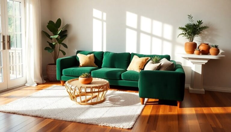
- Bold Jewel Tones: Deep blues and emeralds add drama, commanding attention and exuding luxury.
- Soft Pastels: Gentle pinks and light blues create serene atmospheres, perfect for relaxation.
- Vibrant Accents: Bright yellows and oranges energize spaces, injecting liveliness and optimism.
- Neutrals with Texture: Creams and grays, layered with various textures, offer sophistication and depth.
Cultural Meanings of Colors
Even though cultures around the world differ greatly, the meanings attributed to colors often reveal deep-rooted beliefs and values. Color symbolism plays a pivotal role in how societies perceive and interact with their environment. For instance, in Western cultures, white symbolizes purity and new beginnings, whereas in many Eastern cultures, it's associated with mourning. Such cultural contrasts highlight the importance of comprehending regional preferences and historical significance when utilizing color in influential spaces.
Color associations can evoke strong emotional resonance, influencing everything from branding strategies to architectural choices. Red, for example, is universally recognized as a color of passion and strength, yet its implications can shift dramatically across cultures. In China, it signifies good fortune and celebration, whereas in South Africa, it's linked to mourning. These traditional meanings shape how colors are employed in rituals and ceremonies, showcasing their societal impact.
As contemporary interpretations evolve, colors maintain their rich fabric of significance, weaving together cultural symbolism and modern aesthetics. Professionals seeking to leverage the strength of color must consider these diverse meanings. Ignoring the historical context can lead to misinterpretations and ineffective designs. By embracing the intricacies of color rituals and emotional associations, one can create spaces that resonate deeply and empower individuals, nurturing a connection that transcends mere aesthetics. Comprehending the cultural meanings of colors is crucial for anyone looking to wield influence and create impactful environments.
Color Combinations That Inspire
Crafting inspiring color combinations can transform a space and evoke specific emotions that resonate with its occupants. By comprehending color harmony and color symbolism, designers can create environments that empower and invigorate. A well-chosen palette not just improves aesthetics but also influences mood, productivity, and well-being.
Consider these influential combinations that inspire:
- Navy Blue and Gold: This pairing exudes confidence and sophistication, perfect for spaces meant for decision-making or leadership.
- Emerald Green and Charcoal: A blend that symbolizes growth and stability, ideal for offices or creative studios where innovation thrives.
- Crimson Red and Cream: This dynamic duo ignites passion and warmth, making it suitable for social spaces aimed at encouraging connections.
- Soft Lavender and White: A calming mix that promotes tranquility and clarity, perfect for personal retreats or meditation areas.
- Burnt Orange and Deep Brown: Invokes feelings of strength and resilience, ideal for spaces meant for brainstorming or strategic planning.
Each combination creates color harmony, ensuring that the selected shades resonate with the intended emotions. By utilizing the strength of these color pairings, individuals can mold their environments to reflect their aspirations and values. In the end, the right color combinations don't just beautify; they inspire and empower those who inhabit the space, leading to a more dynamic and purposeful existence.
Impact of Lighting on Color
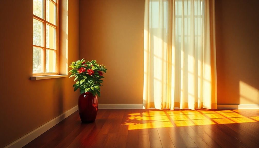
Lighting plays an essential role in how colors are perceived within a space. The temperature of light can greatly alter the mood, whereas the contrast between natural and artificial light can improve or diminish color vibrancy. Furthermore, shadows and highlights can create depth, transforming the overall emotional impact of a room.
Color Temperature Influence
The interplay of color temperature significantly impacts how people perceive and experience a space. By manipulating the warmth or coolness of light, designers can evoke strong emotional resonance, transforming an ordinary environment into an extraordinary one. Color temperature isn't just a technical detail; it's a tool for influencing mood and behavior.
Consider the following effects of varying color temperatures:
- Warm Light (2700K-3000K): Instills a sense of comfort and intimacy, ideal for residential settings.
- Neutral Light (3500K-4100K): Promotes clarity and focus, perfect for workspaces that demand concentration.
- Cool Light (5000K-6500K): Energizes and stimulates, often used in commercial environments to improve productivity.
- Color Shift Effects: As light changes throughout the day, so does the perception of color temperature, impacting emotional responses.
- Psychological Impact: Different temperatures can trigger specific emotional reactions, making strategic choices vital in design.
Harnessing color temperature effectively enables designers to shape experiences that resonate deeply, ensuring that every space communicates its intended message. In this high-stakes arena, comprehending the nuances of light becomes fundamental for those who wish to dominate their surroundings.
Natural vs. Artificial Light
Natural and artificial light each play a distinctive role in shaping color perception within a space. Natural light benefits include its ability to improve color rendering and create a lively atmosphere. Daylighting strategies that maximize sunlight can transform a dull room into a dynamic environment, enriching space perception and elevating mood. The warm, shifting light temperature of daylight influences how colors are viewed, allowing for a deeper emotional connection to the space.
Conversely, artificial light drawbacks can undermine this effect. Many artificial sources fail to replicate the natural spectrum, leading to distorted color representation that can dampen the energy of a room. Mood lighting, often a product of artificial sources, can create specific atmospheres, but its impact is contingent on light source effects, which may not align with natural lighting's advantages.
To achieve ideal results, savvy designers must integrate both light types, leveraging natural light's strengths as they strategically employ artificial solutions. Through comprehension of environmental influences on lighting, they can masterfully manipulate space perception, ensuring that every hue resonates with strength and intention.
Shadows and Highlights Effect
Shadows and highlights greatly influence how colors are perceived in a space. The interplay of light creates a dynamic environment where colors can evoke strong emotions and reactions. By mastering the art of shadow play and highlight contrast, individuals can transform ordinary spaces into impactful experiences.
Consider these impactful aspects of shadows and highlights:
- Depth Creation: Shadows add dimension, improving the visual complexity of colors.
- Mood Setting: Strategic highlights can uplift a space, whereas shadows can evoke a sense of mystery or intimacy.
- Color Improvement: Bright highlights can intensify colors, making them appear more radiant and alive.
- Focus Direction: Highlight contrast can guide attention, drawing the eye to key features or artwork.
- Spatial Perception: Variations in light can alter how one perceives the size and shape of a room.
Harnessing the strength of light and its effects on color allows for a profound emotional impact. By comprehending the nuances of shadows and highlights, one can assert control over the atmosphere, crafting spaces that resonate with strength and sophistication.
Color in Commercial Spaces
Color plays a significant role in shaping the atmosphere of commercial spaces, influencing customer behavior and employee productivity. Effective use of branding colors can enhance a business's identity, creating a lasting impression that resonates with clients. In an environment where first impressions are critical, the strategic application of color psychology can improve the customer experience, guiding their emotions and decisions.
Designers must consider color harmony to guarantee that every shade complements one another, cultivating an inviting atmosphere that encourages patrons to engage with products and services. This harmony not only improves space functionality but also promotes design cohesion, ensuring that every element within a commercial space serves a purpose.
Moreover, color accessibility is essential in creating inclusive environments. When spaces are designed with all potential customers in mind, businesses demonstrate a commitment to sensory engagement, increasing their appeal. The impact of color on employee productivity cannot be overstated; the right palette can invigorate staff, promoting creativity and focus.
In this competitive environment, comprehending the color impact on both clients and employees can distinguish a brand. It's not merely about aesthetics; it's about crafting an experience that drives results. By utilizing the influence of color, commercial spaces can transform into dynamic environments that not only attract but also retain, guaranteeing long-term success.
Personalizing Spaces With Color
Creating a personal connection to space improves the overall experience for individuals. By employing effective color selection strategies, one can evoke significant emotional responses that resonate with personal identity and aspirations. Tailoring environments through thoughtful color choices not just amplifies aesthetic appeal but additionally nurtures a sense of ownership and belonging.
To achieve this, individuals can consider the following strategies:
- Identify Personal Preferences: Choose colors that reflect personal tastes and styles.
- Understand Psychological Effects: Leverage the emotional influence of colors—blues for tranquility, reds for energy, or yellows for optimism.
- Integrate Cultural Significance: Incorporate colors with cultural relevance to strengthen connections.
- Use Color to Define Zones: Differentiate spaces within a larger area to create distinct atmospheres—calming for relaxation, lively for creativity.
- Experiment with Accents: Utilize accent colors to infuse energy and interest without overwhelming the primary palette.
These strategies enable individuals to transform their spaces into reflections of their personalities and desires. When color selection aligns with one's emotional needs, the environment becomes not just a backdrop, but a dynamic participant in daily life. In this way, personalizing spaces with color transcends mere decoration, creating an immersive experience that echoes individual stories and ambitions. Embracing this approach can lead to environments that invigorate, inspire, and affirm the essence of those who inhabit them.
Case Studies: Color Transformations
Transformations in environments often reveal the profound impact that color can have on mood and functionality. Numerous case studies demonstrate how strategic color transformations can enhance spaces, ultimately improving productivity and well-being. For instance, a corporate office in a thriving city underwent a dramatic shift from sterile white to bold, invigorating hues of blue and green. This deliberate choice didn't just invigorate the aesthetics; it improved employee morale and collaboration, resulting in a measurable increase in productivity.
In another case, a healthcare facility recognized the influence of color in patient recovery. By replacing cold, clinical tones with warm, earthy colors, the environment cultivated a sense of calm and security. Patients reported lower anxiety levels, showcasing how thoughtful color transformations can lead to tangible benefits in health outcomes.
A retail space also illustrates the significance of color strategy. A boutique transformed its interior from muted shades to lively pops of color. This shift not only attracted more foot traffic but also influenced purchasing behavior, as consumers felt more engaged and drawn to the products.
These case studies underscore that color is not merely an aesthetic choice; it's an essential tool that shapes experiences and drives results. By grasping the psychological effects of color transformations, decision-makers can utilize this influence to create environments that inspire, heal, and energize. In the field of design and functionality, the right colors can redefine how spaces are perceived and utilized, making them invaluable assets in any strategic plan.
Tips for Choosing Colors Wisely
Selecting the right palette for a space involves grasping the interplay between color psychology and the intended atmosphere. Individuals aiming to create impactful environments must consider how colors influence emotional associations and convey strong messages through color symbolism. The right choice can transform a room, enhancing productivity, comfort, or serenity.
To choose colors wisely, one should keep the following tips in mind:
- Understand the Purpose: Define the space's function. Is it a sanctuary for relaxation or a dynamic area for collaboration?
- Consider Natural Light: Observe how light interacts with colors throughout the day. It can greatly alter perceptions and moods.
- Test Samples: Before committing, apply samples to the walls and observe how they resonate with the existing elements in the room.
- Balance Warm and Cool Tones: Striking a balance can create harmony, ensuring the emotional associations align with the desired atmosphere.
- Think Beyond Trends: Although current trends can be alluring, timeless choices often carry a more profound impact and resonate longer.
Frequently Asked Questions
How Do Colors Affect Productivity in Workspaces?
Colors profoundly influence productivity in workspaces. Research shows that focus colors like blue and green improve concentration and creativity, driving results. When workspace design incorporates these hues, employees experience increased motivation and reduced stress. A well-planned color scheme can transform an environment, leading to higher performance levels. By strategically selecting colors, companies can create an atmosphere that empowers their teams, encouraging both innovation and efficiency in their daily tasks.
What Colors Are Best for a Child's Bedroom?
When choosing colors for a child's bedroom, one must consider both comfort and inspiration. Pastel palettes create a serene environment, promoting relaxation and restful sleep. Meanwhile, lively accents can energize the space, sparking creativity and playfulness. By balancing these elements, a strong atmosphere emerges, nurturing a child's development and imagination. Eventually, the right colors not just improve aesthetics but additionally greatly impact a child's mood and overall well-being.
Can Colors Influence Social Interactions in Public Spaces?
Colors shape social dynamics, colors evoke emotion, and colors influence behavior. In public spaces, lively hues can energize interactions, whereas muted tones may promote calmness. Research in public psychology shows that specific colors can improve communication and nurture connections among individuals. For example, warm colors often invite engagement, whereas cool colors encourage reflection. By strategically using color, designers can create environments that empower social interactions, amplifying the overall experience for everyone involved.
How Do Personal Color Preferences Shape Emotional Responses?
Personal color preferences greatly shape emotional responses, reflecting individuals' unique experiences and cultural backgrounds. People often associate colors with specific symbolism; for instance, red might evoke passion, whereas blue can instill calmness. This psychological impact influences moods and behaviors, affecting interactions and decisions. By comprehending these preferences, influential individuals can utilize color strategically to create environments that resonate emotionally, enhancing persuasion and connection in various social contexts, ultimately propelling their objectives forward.
What Role Does Texture Play in Color Perception?
Texture plays an essential role in color perception, greatly influencing how individuals experience color harmony. When textures vary, they can improve or diminish the vibrancy of colors, impacting emotional responses. For instance, a rough texture might absorb light, making colors appear muted, whereas a smooth surface reflects light, intensifying hues. By comprehending texture's influence, one can create impactful, emotionally resonant environments that captivate and inspire, ensuring that every choice evokes the desired response.