Timeless aesthetics rely on a thoughtful application of fundamental design principles, such as balanced composition, harmonious color palettes, and deliberate typography choices, which together create a sophisticated and enduring visual language. Simple shapes, proportion, and scale rules guide the creation of balanced compositions.Neutral colors and classic color combinations establish brand identity and evoke emotions. Typography choices influence emotional connections, and texture, pattern, and balance add depth to designs. By understanding these principles, designers can craft timeless aesthetics that exude sophistication and elegance. As they explore these principles further, they'll uncover the secrets to creating truly enduring designs.
Balanced Composition Matters
In any visual composition, balanced elements deliberately work together to create a sense of harmony, drawing the viewer's eye through the piece in a logical and aesthetically pleasing way. A well-balanced composition isn't just aesthetically pleasing; it's also a powerful tool for communicating a message or evoking an emotional response. By carefully controlling visual flow, designers can guide the viewer's attention to key elements, creating a sense of direction and purpose.
Effective balance requires a deep understanding of creative constraints. It's not about having complete freedom, but about working within boundaries to create something truly remarkable. By embracing these constraints, designers can tap into their creative potential, producing work that's both beautiful and functional. A balanced composition can elevate even the simplest of designs, imbuing them with a sense of sophistication and elegance.
The Power of Simple Shapes
They explore the essence of geometric forms, recognizing that simple shapes like circles, squares, and triangles are the building blocks of timeless design. By understanding these fundamental elements, designers can create harmonious and balanced compositions that resonate with audiences. By simplifying visual noise, they can distill complex ideas into elegant and intuitive designs.
Geometric Form Essentials
Simple shapes, such as circles, squares, and triangles, serve as the fundamental building blocks of geometric form, providing designers with a versatile toolkit for creating visually appealing compositions. These shapes are essential in geometric abstraction, where designers use them to create simplified representations of complex forms. By combining and manipulating these shapes, designers can create powerful architectural elements that evoke emotion and convey meaning.
Here are three ways geometric shapes can be used to create timeless designs:
- Symmetry and Balance: Geometric shapes can be used to create symmetrical compositions that exude power and sophistication.
- Visual Hierarchy: By using geometric shapes of varying sizes and colors, designers can create visual hierarchies that guide the viewer's attention.
- Emotional Connection: Geometric shapes can be used to create abstract representations of emotions and ideas, allowing designers to tap into the viewer's subconscious mind.
Simplifying Visual Noise
By paring down complex compositions to their simplest geometric forms, designers can quiet visual noise and create a sense of clarity that engages the viewer. This process of simplification allows designers to strip away design distractions, revealing the essence of their message. Simple shapes empower designers to convey complex ideas with precision and power.
| Shape | Effect | Emotional Response |
|---|---|---|
| Circle | Unity, wholeness | Calm, serenity |
| Triangle | Balance, stability | Confidence, authority |
| Square | Structure, solidity | Trust, reliability |
| Rectangle | Order, functionality | Efficiency, practicality |
| Hexagon | Harmony, unity | Creativity, innovation |
Harmony Through Color Palette
She explores how classic design achieves harmony through a thoughtful color palette, which typically involves striking a balance between neutral colors and rich accent hues. By combining these elements, designers can create a visually appealing atmosphere that engages the viewer. This harmonious blend of colors is essential to evoking a sense of timelessness and sophistication in a design.
Neutral Color Balance
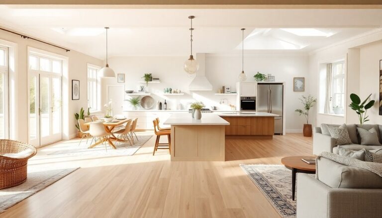
Most interior designers agree that a neutral color balance is the foundation of a harmonious space, as it allows the eye to move effortlessly throughout the room. This timeless approach creates a sense of calm and serenity, making it perfect for those who desire a powerful and sophisticated atmosphere. Neutral colors also provide a clean canvas for showcasing statement pieces and artwork, allowing them to take center stage.
Neutral color balance is essential for establishing a strong brand identity, as it conveys a sense of stability and professionalism. Earth tones, such as beige, taupe, and sage, are particularly effective in creating a natural and calming atmosphere. By incorporating these hues, designers can create a sense of continuity and cohesion throughout a space.
Here are three benefits of incorporating neutral colors into your design:
- Flexibility: Neutral colors can be paired with a wide range of styles and materials, making them incredibly versatile.
- Timelessness: Neutral colors never go out of style, ensuring your space remains fresh and modern for years to come.
- Sophistication: Neutral colors exude a sense of luxury and refinement, perfect for those who desire a high-end aesthetic.
Rich Accent Hues
While neutral colors provide a serene backdrop, rich accent hues inject personality and depth into a space, creating harmony through a thoughtful color palette. In luxury interiors, these bold hues are used to make a statement, conveying a sense of sophistication and opulence. A carefully curated selection of rich accent hues can elevate a room, imbuing it with cultural significance and character. For instance, a deep, velvety red can evoke the grandeur of a bygone era, while a rich, earthy tone can bring a sense of warmth and coziness to a space. When used thoughtfully, these hues can create a sense of balance and harmony, drawing the eye to specific areas of the room and creating visual interest. By incorporating rich accent hues into a design, individuals can create a space that exudes power, sophistication, and refinement, making a lasting impression on all who enter.
Proportion and Scale Rules
One fundamental principle of classic design is that proportion and scale rules govern the arrangement of visual elements to create a sense of harmony and balance. By applying these principles, designers can create a visual language that resonates with their audience on a deep level. Proportion and scale rules are rooted in human perception, where our brains are wired to respond to certain ratios and proportions that evoke feelings of beauty and harmony.
Architectural influences have also played a significant role in shaping these principles. From the ancient Greeks to modern-day skyscrapers, the use of proportion and scale has been a key element in creating iconic and timeless designs. This focus on balance and harmony not only enhances aesthetic appeal but also fosters a sense of connection to the past. Ultimately, these design principles contribute to the timeless elegance in architecture that continues to inspire both architects and enthusiasts alike. As each era builds upon the lessons of those before it, the enduring qualities of proportion and scale ensure that architectural masterpieces remain relevant across generations.
Here are three essential proportion and scale rules to keep in mind:
- The Golden Ratio: Also known as the divine proportion, this ratio of 1.618 to 1 has been used in design for centuries to create a sense of balance and harmony.
- The Rule of Thirds: Divide your design into thirds both horizontally and vertically, and place key elements along these lines to create a sense of balance and visual interest.
- Hierarchy and Emphasis: Use size, color, and placement to create a clear hierarchy of elements, drawing the viewer's attention to the most important parts of the design.
Emotional Connection Through Typography
As designers aim to create an emotional connection with their audience, they understand that typography plays an essential role in evoking feelings and conveying messages. A thoughtful font choice can instantly evoke a specific mood or atmosphere, while a well-balanced hierarchy guides the viewer's attention and guarantees a clear understanding of the content. By mastering these aspects, designers can craft a visual language that resonates with their audience on a deeper level.
Font Choice Matters
Carefully selecting a font can evoke emotions and convey a message's tone, making typography an essential aspect of effective communication. A well-chosen font can elevate a brand's personality, creating an emotional connection with the audience. In the domain of classic design, font choice matters, as it's a pivotal element in shaping the typographic voice.
The evolution of fonts has led to a vast array of options, but not all fonts are created equal. To evoke emotion in the audience, consider the following:
- Serif fonts, such as Garamond or Georgia, convey sophistication and elegance, perfect for luxury brands or academic institutions.
- Sans-serif fonts, like Arial or Helvetica, exude modernity and simplicity, ideal for tech startups or clean designs.
- Script fonts, such as Lobster or Pacifico, add a touch of whimsy and romance, suitable for creative or artistic projects.
Balance in Hierarchy
Typography's emotional connection relies on a delicate balance in hierarchy, where font sizes, styles, and arrangements work in harmony to guide the reader's attention and evoke the desired emotional response. A well-crafted hierarchy creates a clear visual flow, directing the reader's eye through the content with ease. This balance is achieved by manipulating visual weight, where larger font sizes and bold styles draw attention, while smaller sizes and lighter styles recede into the background. By cleverly using visual weight, designers can create a sense of importance, emphasis, and rhythm, ultimately influencing the reader's emotional response. A harmonious design flow is essential, as it allows the reader to effortlessly navigate the content, absorbing the message without distraction. When executed correctly, balance in hierarchy becomes a powerful tool, elevating the design from mere aesthetics to a compelling, emotionally resonant experience. By mastering this principle, designers can craft timeless designs that command attention and inspire action.
Texture and Pattern Balance
Designers intentionally balance texture and pattern to create visual harmony, preventing overwhelming or underwhelming the viewer. This balance is essential in classic design, as it adds depth and dimension to a space without creating visual noise. By combining tactile elements, such as velvet and wood, with visual weight, designers can craft a sense of luxury and sophistication.
A well-balanced blend of texture and pattern can evoke powerful emotions, including:
- Serenity: A harmonious mix of smooth surfaces and subtle patterns can create a sense of calm and tranquility.
- Energy: Contrasting textures and bold patterns can inject excitement and dynamism into a space.
- Elegance: A refined balance of luxurious materials and refined patterns can exude opulence and refinement.
To achieve this balance, designers consider the visual weight of each element, ensuring that no single texture or pattern dominates the space. By doing so, they create a visual harmony that engages the viewer without overwhelming them. This delicate balance is key to crafting timeless, classic designs that exude power and sophistication. By mastering the art of texture and pattern balance, designers can create spaces that inspire, uplift, and leave a lasting impression.
Classic Color Combinations
Three timeless color combinations – monochromatic, complementary, and analogous – form the foundation of classic design, providing a palette that exudes sophistication and elegance. These combinations have been utilized by designers for centuries, and their enduring appeal lies in their ability to evoke emotions and convey messages. A monochromatic color scheme, for instance, creates a sense of cohesion and harmony, while a complementary combination can energize and stimulate. Analogous colors, on the other hand, produce a calming effect, perfect for creating a soothing atmosphere.
When crafting a classic design, it's crucial to take into account the historical context in which the color combinations were first used. Understanding the cultural and social nuances of the past can help designers create a design that resonates with their audience. For instance, the Art Deco era's penchant for bold, geometric patterns and metallic accents can inspire a modern design that exudes luxury and glamour.
To visualize and refine their color palette, designers often turn to mood boards. These visual tools allow designers to experiment with different color combinations, textures, and patterns, ensuring that the final design aligns with their vision. By combining timeless color combinations with a deep understanding of historical context, designers can create classic designs that transcend time and trends, speaking to their audience on a profound level.
Negative Space Effectiveness
By deliberately leaving areas of a design uncluttered, negative space becomes a revitalizing respite that guides the viewer's attention, creates a sense of sophistication, and ultimately enhances the overall aesthetic appeal. This breathing room allows the viewer's eye to move effortlessly through the design, creating a sense of calm and focus.
In a world where clutter and noise dominate our visual landscape, negative space is a rejuvenating respite that commands attention. It's a bold statement that says, 'I'm confident in my message, and I don't need to shout to be heard.' By strategically using negative space, designers can create a visual hierarchy that draws the viewer's eye to the most important elements of the design. This is particularly effective in communicating complex information, such as in infographics or data visualization.
Here are three reasons why negative space is essential for timeless design:
- Elegance: Negative space adds a level of sophistication and refinement to a design, making it feel more luxurious and high-end.
- Focus: By eliminating distractions, negative space helps the viewer focus on the most important elements of the design.
- Emotional Connection: Negative space creates a sense of calm and serenity, allowing the viewer to form a deeper emotional connection with the design.
Symmetry and Asymmetry
Harmony and tension coexist in the delicate balance of symmetry and asymmetry, as these opposing forces shape the visual narrative of a design. Symmetry creates a sense of order and stability, while asymmetry introduces visual tension, challenging the viewer's expectations and sparking curiosity. This delicate balance is essential in classic design, as it allows designers to convey complex emotions and ideas through visual storytelling.
| Design Element | Symmetry | Asymmetry |
|---|---|---|
| Visual Hierarchy | Clear, organized structure | Dynamic, attention-grabbing composition |
| Emotional Response | Calm, serene, and predictable | Energized, engaging, and thought-provoking |
| Creative Freedom | Restrictive, formulaic approach | Liberating, flexible, and innovative |
While symmetry provides a sense of comfort and familiarity, asymmetry offers creative freedom, allowing designers to break free from traditional norms and explore new possibilities. By skillfully combining symmetry and asymmetry, designers can craft a visual narrative that is both aesthetically pleasing and thought-provoking. By understanding the interplay between these opposing forces, designers can harness the power of visual tension to create timeless, classic designs that resonate with their audience.
Authenticity Through Imperfection
In embracing imperfection, classic designers find authenticity in the subtle flaws and nuances that make their work relatable and human. This acceptance of imperfection is rooted in the Japanese philosophy of Wabi Sabi, which celebrates the beauty of impermanence and imperfection. By embracing the unique characteristics of materials and the human touch, designers can create pieces that exude a sense of character and soul.
Classic designers understand that perfection can be sterile and uninviting. Instead, they seek to create pieces that tell a story, that have a history, and that evoke emotion. This is achieved through the subtle imperfections that make their work human.
Here are three ways imperfection can elevate design:
- Uniqueness: Imperfections make each piece unique, giving it a distinct character that sets it apart from mass-produced items.
- Emotional Connection: Imperfections create an emotional connection between the user and the object, making it more relatable and human.
- Timelessness: Imperfections can make a piece timeless, as it becomes more beautiful with age, telling a story of its own.
Frequently Asked Questions
Can Classic Design Principles Be Applied to Modern Digital Products?
She asks whether classic design principles can be applied to modern digital products. In today's digital evolution, it's important to understand human psychology. Classic design principles, rooted in timeless aesthetics, can indeed be applied to modern digital products. By doing so, designers can create visually appealing and user-friendly products that resonate with humans on a deeper level, ultimately driving engagement and success in the digital landscape.
How Do I Avoid Making My Design Look Too Nostalgic or Outdated?
She'd be a million miles away from creating a modern masterpiece if she didn't balance nostalgia with innovation. To avoid making her design look too nostalgic or outdated, she employs avoidance strategies like subtle nods to the past, rather than blatant replicas. By embracing design evolution, she stays ahead of the curve, infusing classic principles with fresh, modern twists that exude power and sophistication.
Are There Any Timeless Design Principles That Work for All Cultures?
She recognizes that effective design transcends cultural boundaries, and that's what makes it truly powerful. To achieve universal appeal, designers must strike a balance between embracing cultural nuances and avoiding clichés. By doing so, they can create designs that resonate with diverse audiences, conveying a sense of timelessness that's both inclusive and enduring.
Can I Use Trendy Colors and Still Achieve a Timeless Aesthetic?
She wonders if trendy colors can coexist with a timeless aesthetic. The answer lies in Color Psychology. While bold hues can evoke emotions, they can also quickly become outdated. To achieve timelessness, she should strike a Neutral Balance. By pairing trendy colors with classic neutrals, she can create a look that's both modern and enduring. This balanced approach allows her to stay current while avoiding the pitfalls of fleeting fashion trends.
Do Timeless Design Principles Work for Fast-Paced and Trendy Industries?
Some might argue that timeless design principles are too static for fast-paced industries, but they'd be wrong. In reality, these principles allow brands to evolve with their industry, ensuring trendy relevance without sacrificing longevity. By focusing on fundamental aspects like simplicity, balance, and harmony, brands can create a solid foundation that adapts to changing trends, staying ahead of the curve without getting lost in it.