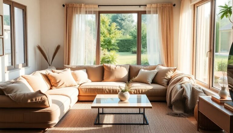
Exploring color psychology is crucial in interior design, as colors can shape your emotions and behaviors. Warm colors like red and orange can energize and inspire, whereas cool tones such as blue and green promote calmness and serenity. Choosing the right hues for specific rooms maximizes their potential; for instance, soft blue works well in bedrooms for relaxation, whereas yellow brightens kitchens with energy. Cultural influences equally play an important role in how colors are perceived. Grasping these principles can help you craft harmonious environments that reflect your lifestyle and preferences, revealing even more insights to contemplate.
Understanding Color Psychology
How does color influence your emotions and behaviors? Regarding interior design, comprehending color psychology can be a significant shift. Each hue carries its own symbolism and emotional associations, shaping how you feel and act within a space. For instance, warm colors like red and orange can ignite passion and energy, whereas cool colors like blue and green often promote calmness and tranquility.
You might not realize it, but the colors you choose for your home can subtly steer your mood. A bright yellow kitchen can inspire creativity during meal prep, whereas a soft lavender bedroom can help you unwind after a long day. This isn't just about aesthetics; it's about crafting an environment that resonates with your lifestyle and aspirations.
The Impact of Warm Colors
Warm colors play a significant role in shaping the atmosphere of a space. When you incorporate shades like red, orange, and yellow into your interior design, you're not just making aesthetic choices; you're tapping into warm color psychology that can transform how people feel in a room. These colors evoke emotional responses, creating an inviting and stimulating environment that can energize your space.
Imagine walking into a cozy living room painted in a warm terracotta hue. You immediately feel a sense of comfort and warmth, making it an ideal setting for gatherings or family time. Warm colors stimulate conversation and connection, inspiring creativity and enthusiasm. If you're looking to innovate your home or workspace, consider how these colors can influence interactions and productivity.
On the flip side, you might want to be mindful of how much warmth you introduce. Overdoing it can lead to feelings of agitation or restlessness. Instead, balance warm colors with neutral tones to maintain an inviting yet calming atmosphere.
Experimenting with accent walls, furniture, or artwork in warm hues is a fantastic way to utilize their energy without overwhelming the senses. By thoughtfully integrating warm colors into your design, you create a dynamic space that resonates emotionally with everyone who enters. So, get creative and let warm colors redefine your environment, making it a hub of comfort and inspiration.
The Effects of Cool Colors
Cool colors, with their calming shades of blue, green, and purple, can dramatically influence the mood of a space. They create a serene environment that promotes relaxation and tranquility, making them ideal for areas where you want to unwind. When you choose these colors, you not only improve the aesthetic but additionally evoke strong emotional responses that can transform your experience within the room.
To achieve best color harmony, it is crucial to understand how different cool colors interact with each other and the overall space. Here's a concise table that highlights the effects of various cool colors:
| Color | Emotional Response | Ideal Use |
|---|---|---|
| Blue | Calming, serene | Bedrooms, offices |
| Green | Invigorating, revitalizing | Living rooms, kitchens |
| Purple | Luxurious, creative | Reading nooks, studios |
| Teal | Tranquil, balanced | Bathrooms, meditation spaces |
Incorporating cool colors into your interior design not only improves visual appeal but also cultivates a soothing atmosphere. By thoughtfully combining these hues, you can create a cohesive palette that promotes emotional well-being. Picture stepping into a room painted in soft teal or deep blue, where stress melts away, and creativity flourishes. When you embrace cool colors, you're inviting a sense of calm and clarity into your space, making it a haven of peace amidst the chaos of everyday life.
Choosing Colors for Different Rooms
When choosing colors for different rooms, it's crucial to contemplate the mood you want to create. For instance, calming shades in the bedroom promote serenity, whereas lively hues in the kitchen can boost your energy. In the living room, warm colors can encourage a welcoming atmosphere for gatherings.
Bedroom Serenity Colors
Serenity is essential in creating a restful bedroom environment, and choosing the right colors can greatly elevate this tranquility. When you think about bedroom hues, consider how calming tones can transform your space into a haven of relaxation. Here are three innovative color choices to improve your bedroom's serenity:
- Soft Blue: This color evokes the calmness of the sky and water, promoting a peaceful atmosphere that encourages restful sleep.
- Gentle Green: Inspired by nature, gentle greens bring a sense of balance and renewal, making your bedroom feel soothing and invigorating.
- Warm Neutrals: Shades like beige or soft taupe create a cozy, inviting space that allows you to unwind after a long day.
Kitchen Energy Boosters
Your kitchen can be a dynamic hub of energy and creativity, and the right colors play a significant role in achieving that lively atmosphere. When you're designing this space, consider kitchen colors that invigorate and inspire. Bright shades like sunny yellows and spirited oranges can stimulate appetite and encourage social interaction, making your kitchen the perfect gathering spot.
Energy-boosting hues like revitalizing greens and lively blues can additionally improve your cooking experience. These colors evoke feelings of freshness and tranquility, helping you feel more focused and inspired during meal preparation. If you want to add a modern twist, consider using bold accent colors, such as electric red or deep teal, to create a striking contrast against neutral cabinetry.
Don't shy away from creative combinations that blend these energy-boosting hues. For instance, pairing a soft, cream backdrop with a bright backsplash can create a dynamic visual effect that energizes the entire room. Remember, your kitchen isn't just for cooking; it's a canvas for your culinary creativity. Embrace innovative color choices to transform it into your personal source of energy and inspiration!
Living Room Warmth
After energizing your kitchen with lively colors, it's time to create a warm and inviting atmosphere in your living room. Choosing the right colors can transform your space into a cozy haven, perfect for relaxation and socializing. Here are three innovative tips to help you select the ideal palette:
- Warm Tones: Embrace colors like soft reds, oranges, and yellows. These hues evoke feelings of warmth and energy during making the room feel more intimate.
- Cozy Textures: Incorporate plush fabrics and materials that complement your color choices. Think velvet cushions or textured throws that invite you to snuggle up and enjoy the space.
- Inviting Lighting: Layer your lighting to improve the warmth. Use a mix of floor lamps, table lamps, and wall sconces with soft, warm bulbs to create an inviting glow that highlights your color palette.
Cultural Influences on Color Perception
Color perception varies markedly across different cultures, impacting how individuals respond to and utilize color in interior design. When you reflect on designing a space, it's essential to contemplate the cultural symbolism attached to colors. For instance, in Western cultures, white often signifies purity and new beginnings, making it a popular choice for weddings. Conversely, in many Asian cultures, white is linked to mourning and loss, highlighting the importance of grasping color significance in different contexts.
As you investigate innovative design ideas, pay attention to the emotional responses colors evoke based on cultural backgrounds. Red, for example, is frequently associated with luck and prosperity in Chinese culture, whereas in some Western settings, it can convey danger or urgency. Knowing these associations allows you to create spaces that resonate positively with your audience.
Moreover, reflect on how color can serve not merely as a decorative element but as a bridge between cultures. You can blend various color influences to craft a unique, harmonious environment that reflects a global perspective. This approach not only improves aesthetic appeal but also nurtures inclusivity.
Incorporating culturally significant colors into your interior design can uplift a space, making it more meaningful and engaging. So, next time you're selecting a palette, take a moment to explore the deeper cultural implications of your choices. Embrace the richness of color psychology, and transform your designs into innovative reflections of diverse perspectives.
Color Trends in Interior Design
Frequently, interior design trends shift as designers and homeowners seek fresh inspiration to rejuvenate their spaces. Staying ahead of the curve involves comprehending color forecasting and how it impacts your choices. This year, you can expect a lively array of colors that inspire creativity and comfort. Here are three trending color combinations to reflect upon:
- Terracotta and Sage Green: This warm and earthy combination evokes a sense of connection to nature. It's perfect for creating a cozy, inviting atmosphere in any room.
- Deep Blue and Mustard Yellow: This striking contrast brings energy and sophistication to your space. Use deep blue as a base and accent with mustard yellow for a bold statement.
- Soft Blush and Charcoal: This pairing balances softness with strength, making it ideal for modern, chic interiors. The softness of blush adds warmth, while charcoal provides grounding.
As you explore these color combinations, contemplate how they align with your personal style and the overall vibe you want to create. By embracing these trends, you'll not only refresh your surroundings but also utilize the psychological effects of color to improve your mood and wellbeing. Remember, the right colors can breathe new life into your space, allowing for innovation and individuality. So, immerse yourself in these trends and experiment—your ideal sanctuary awaits!
Practical Tips for Color Selection
When choosing colors for your space, it's crucial to understand what different colors represent and how they can influence your mood. Consider the purpose of each room to guarantee your color choices improve functionality and comfort. Finally, always test color samples in your space to see how they interact with the lighting and other design elements.
Understand Color Meanings
Selecting the right hues for your space can greatly impact your mood and perception of the environment. Comprehending color meanings and their symbolism is essential for creating an innovative atmosphere that resonates with you. Each color evokes specific emotional responses, so consider these three tips when choosing your palette:
- Red: This lively hue symbolizes passion and energy. Use it sparingly to create a dynamic focal point or accent wall.
- Blue: Known for its calming effects, blue represents tranquility and reliability. Incorporate it in bedrooms or offices to promote relaxation and focus.
- Yellow: This cheerful color symbolizes happiness and optimism. Use it in well-lit areas like kitchens or living rooms to improve positivity and warmth.
Consider Room Purpose
Comprehending color meanings sets the groundwork for effective interior design, but considering the purpose of each room is equally important. Your room’s functionality directly influences your choice of color, as it shapes the space dynamics and the atmosphere you want to create. For example, in a home office, opt for colors that inspire productivity and focus, like cool blues or energetic greens. These hues can improve concentration and nurture creativity. In contrast, a bedroom should embrace warmer, more soothing tones, such as soft pastels or neutral shades, to promote relaxation and tranquility. It’s essential to acknowledge the impact of color choices not just on aesthetics, but also on the emotional well-being of the inhabitants. By thoughtfully selecting hues that align with the room’s purpose, you can cultivate an environment that enhances both functionality and comfort, resulting in a harmonious living space.
In contrast, when designing a bedroom, think about tranquility and relaxation. Soft, muted colors such as gentle pastels or warm neutrals can help cultivate a serene environment, ideal for unwinding after a long day.
For high-traffic areas, like a living room or hallway, consider colors that can withstand wear and tear while still emanating warmth and welcome. Earthy tones or lively accents can balance both durability and aesthetic appeal.
Ultimately, aligning your color choices with the room's purpose not only improves its functionality but likewise enriches the overall experience. By thoughtfully selecting colors that resonate with the intended use, you'll create spaces that truly reflect your lifestyle and vision.
Test Color Samples
Before plunging into a full paint job, it's wise to test color samples on your walls. This step is essential for ensuring that your chosen hues align with your vision and the room's purpose. You don't want to be stuck with a color that feels off once it's on all four walls!
Here are three practical tips to help you test color combinations effectively:
- Create Swatches: Paint large swatches on different walls or sections to see how the colors interact with light throughout the day. This will give you a thorough view of your color palettes in varying conditions.
- Consider Surroundings: Pay attention to your furniture, flooring, and decor. Colors can change based on their surroundings, so make sure to test them in context for a harmonious look.
- Live with It: Don't rush the decision. Leave the samples up for a few days. Notice how they make you feel at different times of day, ensuring they evoke the desired emotional response.
Frequently Asked Questions
How Do Colors Affect Mood and Behavior in Daily Life?
Colors profoundly affect your mood and behavior daily. You might notice how lively reds spark energy, whereas calming blues promote tranquility. These emotional responses stem from color associations; for instance, yellow can evoke happiness and creativity. By consciously choosing colors around you, you can innovate your environment to improve productivity or relaxation. Experimenting with different hues can lead to transformative experiences, empowering you to curate your emotional scenery effectively.
Can Color Choices Influence Productivity in Home Offices?
Envision a workspace where ideas flow as freely as a painter's brush on canvas. Your color selection strategies can greatly affect productivity in your home office. By comprehending workspace color psychology, you can choose hues that inspire creativity or promote focus. For instance, calming blues might improve concentration, whereas energetic yellows can spark innovation. So, as you design your office, consider how these lively choices can raise your work experience to new heights.
What Colors Are Best for Small Spaces?
When you're choosing colors for small spaces, light colors are your best bet. They improve space perception, making the area feel larger and more open. Soft whites, pale blues, and light grays can create an airy vibe that invites creativity. You might likewise consider incorporating accents in bolder shades to add personality without overwhelming the space. By blending light colors with innovative decor, you'll transform your small area into an inspiring retreat.
How Do Lighting Conditions Alter Perceived Color?
Envision a canvas transforming under the sun's warm embrace or the cool glow of moonlight. You'll notice how color temperature shifts with different lighting types, altering your perception of hues. Warm light can make colors appear inviting and lively, whereas cool light might lend an air of calmness. Embrace these changes, and you'll discover how lighting can redefine your space, breathing life into your surroundings and inspiring innovative design choices.
Are There Universal Color Meanings Across Different Cultures?
Yes, there are some universal color meanings, but cultural symbolism plays a huge role in how you perceive colors. For instance, whereas white often represents purity in Western cultures, it signifies mourning in some Eastern traditions. Similarly, red can signify love or danger, depending on the context. By comprehending these color associations, you can innovate and create spaces that resonate with diverse audiences, making your design both meaningful and impactful.