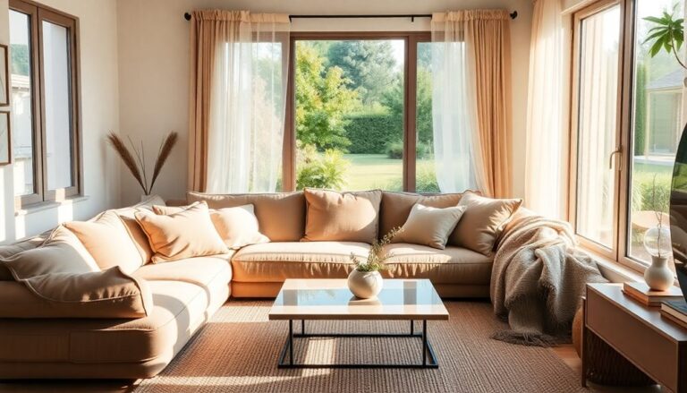
To balance bold and neutral tones in your space, start with a cohesive color palette that incorporates both. Use bold shades to create focal points, drawing attention without overwhelming the room. Layer different textures and patterns to add depth and interest, ensuring that they complement your color scheme. Accents like colorful throw pillows or artwork paired with soft, neutral textiles will improve this balance. Finally, consider how natural light influences your colors throughout the day, adjusting as needed. With these tips, you'll create a lively yet inviting atmosphere that reflects your personal style. There's more helpful advice ahead!
Understanding Color Psychology
Color psychology plays a vital role in how we perceive and react to our surroundings, influencing everything from our mood to our decision-making. When you explore color meanings, you'll discover that each hue carries unique emotional impacts. For instance, blue often evokes calmness and trust, whereas red can ignite feelings of excitement or urgency. Comprehending these associations is fundamental for creating spaces that resonate with your personal or brand identity.
Think about the space you want to design. By strategically selecting colors, you can steer the emotional atmosphere. If you're aiming for a lively, energetic environment, bold shades like orange or fuchsia can energize the room. Conversely, integrating neutral tones like beige or gray can balance the intensity, providing a grounding effect that helps avoid overwhelming sensations.
It's not just about aesthetics; it's about the experience. When you enter a room painted in warm colors, you'll likely feel more sociable, whereas cooler tones can create a serene backdrop for reflection. This interplay between bold and neutral tones can transform a space from merely functional to truly innovative.
Consider how you want people to feel in your space. Do you want them to collaborate, relax, or feel inspired? By grasping color psychology, you can consciously shape those feelings. Remember, the colors you choose can greatly impact not just the look of your space but the emotional connections formed within it.
Choosing a Color Palette
With regard to selecting a color palette, you'll want to narrow down your options to create a cohesive and appealing look. Start by consulting a color wheel; it's an invaluable tool for grasping how colors interact. Aim for a balance between bold and neutral tones, ensuring that neither overpowers the other. This balance is key to maintaining a harmonious space.
To help you visualize your options, consider the following table:
| Color Type | Example Colors |
|---|---|
| Bold Tones | Electric Blue, Crimson Red |
| Neutral Tones | Soft Beige, Cool Gray |
| Accent Colors | Bright Yellow, Deep Green |
| Complementary | Orange with Blue, Purple with Yellow |
| Monochromatic | Various Shades of Blue |
When choosing your palette, think about how these tones will work together. Bold colors can energize a space, but too many can overwhelm. Instead, use neutral tones as a grounding element that provides balance. This approach creates a dynamic yet soothing environment.
Experiment with different combinations on your walls, furniture, and accessories until you find that sweet spot. Remember, tone balance is not merely about aesthetics; it's about how colors make you feel. By carefully selecting your palette, you'll not just enhance your design but create a space that resonates with your personal style.
Focal Points in Design
Creating a balanced color palette sets the stage for effective design, but the real magic happens when you establish focal points. These focal points act as visual anchors in your space, drawing the eye and creating a dynamic interaction with the surrounding elements. By strategically placing a bold piece of art, a striking piece of furniture, or an eye-catching architectural feature, you can create a solid focal point that commands attention and improves the overall design.
Think of your focal point as the star of your room—it's where you want your guests to look first. To achieve this, consider the principles of visual hierarchy. Use contrasting colors and textures to differentiate your focal point from the rest of the space. For instance, if your walls are painted in neutral tones, a lively artwork or a colorful accent chair can stand out beautifully, creating an engaging visual narrative.
Don't shy away from experimenting with scale, either. A large, bold piece can dominate a room, whereas a series of smaller focal points can guide the eye around the space. The key is to maintain balance—too many competing focal points can lead to visual chaos.
Ultimately, establishing a focal point not merely improves the aesthetic appeal of your design but equally helps to create a cohesive atmosphere. It unifies the bold and neutral tones, allowing each element to shine during contributing to a harmonious overall experience. So go ahead, embrace innovation, and let your focal points tell your unique design story.
Layering Textures and Patterns
When you layer textures and patterns, mixing fabrics effectively can enhance your design game. Think about how different materials interact and complement each other, creating visual interest without overwhelming the space. Choosing complementary patterns likewise plays an essential role in maintaining balance and harmony in your overall look.
Mixing Fabrics Effectively
How can you improve your space by mixing fabrics effectively? Embracing innovative fabric combinations can transform your environment and raise its aesthetic. Start by considering texture contrast; pairing a sleek velvet with a chunky knit creates visual intrigue and depth. This layering not only adds dimension but additionally invites touch, making your space feel more inviting.
When you select fabrics, think beyond just color. Experiment with different weaves and finishes—smooth silks can beautifully complement coarse linens. This interplay between soft and rigid will help you achieve a balanced look that's both bold and neutral.
Don't shy away from patterns either. A striped throw can harmonize with a floral cushion, provided you maintain a cohesive color palette. This approach will keep your space dynamic without overwhelming it.
Lastly, remember to vary the scale of your patterns; mixing large prints with smaller ones can create a cohesive yet lively atmosphere. By thoughtfully mixing fabrics, you can craft a space that feels layered, sophisticated, and uniquely yours. So go ahead, play with your fabric choices—your innovative spirit will shine through!
Complementary Pattern Choices
Mixing fabrics isn't just about texture; it's also an opportunity to explore complementary patterns that enhance your space. When layering textiles, think about bold pattern pairings that can invigorate your room. For instance, a lively geometric print on a pillow can create a striking focal point when paired with a more subdued floral on a throw. This contrast not only adds depth but also keeps the visual interest alive.
On the flip side, don't underestimate the influence of neutral pattern contrasts. Subtle stripes or polka dots in earthy tones can bring balance, allowing your bold patterns to shine without overwhelming the senses. You'll achieve a harmonious blend when you strategically position these patterns throughout your decor.
Consider using patterned rugs or curtains that echo the shapes or colors of your bold elements, establishing a cohesive look. The key is to guarantee that your patterns share at least one color or motif, creating a visual thread that ties your design together. By thoughtfully mixing bold and neutral patterns, you'll craft a space that feels dynamic yet sophisticated, inviting innovation and creativity into your home.
Accents and Accessories
Regarding accents and accessories, you want to choose pieces that complement your bold and neutral tones. Think about how layering different textures and patterns can improve your overall aesthetic. By carefully selecting these elements, you'll create a cohesive and visually striking look.
Choosing Complementary Accents
A careful selection of accents can improve your space by harmonizing bold and neutral tones. When you're considering accent color selection, think about how these hues can complement your existing palette. Bold tone placement can energize the room, but to maintain balance, choose accessories that bridge the gap between your bold and neutral shades.
Here's a quick reference table to inspire your choices:
| Bold Accents | Neutral Accents |
|---|---|
| Lively throw pillows | Soft, textured blankets |
| Colorful artwork | Earthy vases |
| Bright rugs | Minimalist lamps |
| Statement chairs | Subtle wall art |
Layering Textures and Patterns
Layering textures and patterns adds depth and interest to your space, making it feel more dynamic. By thoughtfully combining various textile combinations, you can create an atmosphere that engages the senses and invites exploration. Start by selecting a bold patterned rug as your foundation; this will set the tone for the entire room.
Next, enhance the visual interest by incorporating contrasting textiles—think a smooth, neutral throw against a textured, lively couch. Don't shy away from mixing prints; stripes and florals can coexist harmoniously if balanced correctly.
Consider accent pillows as an easy way to introduce diverse patterns without overwhelming the space. Play with sizes, shapes, and fabrics, ensuring each piece complements the others. For instance, pair a silky cushion with a chunky-knit one to increase tactile contrast.
Finally, remember to incorporate natural elements like woven baskets or wooden decor to ground your design. This balance of textures will not just raise your aesthetic but also create a warm, inviting space that feels both innovative and comforting. Embrace the art of layering, and watch your room transform into an enchanting haven.
Evaluating Natural Light
Natural light plays a vital role in how colors appear in your space. It creates a dynamic canvas that shifts throughout the day, influencing the perceived brilliance of both bold and neutral tones. To utilize this natural light effectively, you should first evaluate its direction and intensity. South-facing windows typically invite warm, bright light, whereas north-facing ones yield cooler, diffused light. Comprehending this can help you choose colors that either complement or contrast with the natural light in your room.
Next, consider the color temperature of your chosen hues. Bold colors can appear more saturated in bright, warm light, whereas neutrals may take on different undertones depending on the light's quality. For example, a neutral gray can seem cool in the morning light and warmer in the afternoon. This interplay is vital when you're trying to create a balanced atmosphere.
To make your space truly innovative, experiment with how different shades respond to the changing light. Test paint samples on your walls at various times of day, and observe how they interact with your furnishings and decor. This hands-on approach will guarantee you achieve a harmonious balance that feels both fresh and inviting.
Finally, keep in mind that layering in textiles and art can further improve the effect of natural light, allowing you to fine-tune your color palette in a way that feels uniquely yours. Trust your instincts, and let the natural light guide your choices for a lively, balanced space.
Frequently Asked Questions
How Can I Effectively Mix Warm and Cool Tones?
Mixing warm and cool tones can create a lively, dynamic space. Start by choosing warm color combinations like oranges and yellows, then introduce cool color contrasts like blues and greens. Balance is key; use warm tones in larger areas for energy, whereas cool tones can soften the look. Experiment with accessories and artwork to tie the two together. Don't hesitate to play around—innovation often comes from unexpected pairings that spark joy and creativity!
What Are Some Examples of Bold Colors to Use?
Did you know that 80% of people feel more energized in environments with bold colors? You can transform your space by incorporating lively reds, deep blues, and bold greens. Bright yellows can inject cheerfulness, whereas striking purples add a touch of sophistication. Don't forget fiery oranges to bring warmth and excitement. Mixing these colors innovatively can create a dynamic atmosphere that captivates and inspires, making your surroundings truly stand out.
How Do I Know if a Tone Is Too Bold?
You can tell a tone's too bold by considering its emotional impact. Color psychology shows that some bold hues, like bright reds or electric blues, can overwhelm a space. If you find the color distracts rather than improves your mood or focus, it's probably too intense. Experiment with bold tone examples in smaller areas first, and see how they make you feel. Remember, balance is key to creating an innovative and inviting environment.
Can I Use More Than One Bold Color?
Envision a lively garden, where each flower dances in its own hue. You can absolutely use more than one bold color in your space! Think of color combinations like a symphony; when harmonized, bold accents can create a stunning visual melody. Experiment with complementary shades, ensuring they play well together. Just remember, too many bold tones can overwhelm, so balance them with subtler elements for an innovative and inviting atmosphere.
What Should I Avoid When Balancing Colors?
When balancing colors, you should avoid overwhelming your space with high color saturation. Too many bold hues can clash and disrupt color harmony, making your room feel chaotic instead of cohesive. Stick to a few striking colors and let them shine against neutral backgrounds. Remember, innovation in design often comes from simplicity, so focus on creating a balanced palette that feels fresh without being overpowering. Less can truly be more!