
You're desperate to find the perfect paint color, but where do you start? Begin by identifying your personal style, thinking about the atmosphere you want to create, and reflecting on your fashion preferences. Next, understand how colors interact on the color wheel and how lighting affects their appearance. Consider the room's purpose – is it for relaxation or productivity? Test samples on your walls, observing how they change throughout the day. Finally, seek inspiration from others, whether online or in-person. Take the first step towards finding your perfect hue, and you'll soon be surrounded by a space that truly reflects you – and there's more to discover as you continue on this journey.
Identify Your Personal Style
To uncover the perfect paint color, start by taking a closer look at your own personal style, including the colors you're naturally drawn to and the atmosphere you want to create in your space. Think about the clothes you wear, the accessories you choose, and the decor you're attracted to. Are you more into bold and bright, or soft and subtle? This self-reflection will help you identify the colors that resonate with you on a deep level.
Consider the fashion trends that influence your daily life. Do you follow the latest styles, or do you have a more classic, timeless approach to fashion? These preferences can give you a hint about the colors you'll love in your home. For instance, if you're a fan of minimalist chic, you might lean towards a monochromatic palette with clean lines and simple shapes.
Childhood memories can also play a significant role in shaping your color preferences. Perhaps you have fond memories of your grandmother's cozy kitchen, which was painted a warm, sunny yellow. This nostalgia can inspire your color choices and create a sense of comfort and belonging in your space.
Lastly, reflect on your personal symbolism and cultural heritage. Do certain colors hold spiritual or emotional significance for you? Are there colors that remind you of your family's cultural traditions or your personal values? By considering these factors, you'll be able to create a color scheme that not only looks beautiful but also feels authentic and meaningful to you.
Understand the Color Wheel
As you've reflected on your personal style, now consider how colors interact with each other by exploring the color wheel, a circular representation of colors that helps you visualize how hues relate and harmonize. The color wheel is a powerful tool for understanding color psychology and achieving color harmony in your space. By studying the color wheel, you'll discover how colors are grouped into primary, secondary, and tertiary categories, and how they interact with each other.
You'll notice that colors directly across from each other on the wheel, called "complementary colors," create a visually appealing contrast. Colors next to each other, "analogous colors," produce a soothing harmony. You can use this knowledge to select paint colors that work together in perfect harmony, creating a sense of belonging and comfort in your space.
As you explore the color wheel, consider how different colors evoke emotions and moods. Cool colors like blues and greens can create a calming atmosphere, while warm colors like oranges and yellows can energize a room. By understanding how colors interact and the emotions they evoke, you'll be able to choose a paint color that not only reflects your personal style but also creates the desired mood in your space.
Consider the Lighting
When choosing a paint color, remember to take into account the lighting in your space. You'll want to think about how natural daylight influences the color, as well as how artificial lighting sources like lamps and overhead lights will affect the final result. By taking these factors into consideration, you'll be able to choose a color that looks great in your specific environment.
Natural Daylight Effects
You'll want to take into account how natural daylight affects the color you've chosen, since it can drastically alter the way your paint job looks. As the sun rises and sets, it casts different shades and tones on your walls, changing the appearance of your paint color.
To get it just right, consider the following natural daylight effects:
- Morning Shadows: Soft, warm tones are cast on your walls during early morning hours, making cool-toned colors appear more vibrant.
- Sunlit Walls: Direct sunlight can make warm-toned colors appear more saturated, while cool-toned colors may appear washed out.
- Afternoon Highlights: As the sun reaches its peak, highlights on your walls can accentuate the color's undertones, making them more noticeable.
Artificial Lighting Impact
Consider the lighting in your space, since artificial light sources can dramatically alter the appearance of your chosen paint color. You might be surprised at how different a shade can look under various lighting conditions. For instance, a warm white lamp shade can bring out the yellow undertones in a paint color, while a cool blue-toned LED light can make the same color appear more neutral.
When selecting a paint color, think about the types of lighting you'll be using in the space. Will you be using table lamps, floor lamps, or overhead lighting? Consider installing dimmer switches to adjust the lighting levels and see how the color appears at different intensities. This will give you a better sense of how the color will look in the space.
Think About the Room's Purpose
As you're selecting a paint color, think about how you'll be using the room – are you looking to boost energy and focus or unwind and relax? Different purposes call for different hues, so it's essential to identify the room's function before making a color choice. Consider whether your space will be a task-oriented zone or a relaxation haven, and let that guide your color selection.
Task-Oriented Spaces
When deciding on a paint color for task-oriented spaces like home offices or kitchens, think about the specific tasks that will be performed in that room. You want to create a space that fosters productivity and efficiency.
For a functional layout, consider a paint color that promotes a sense of calm focus. A productive ambiance is essential in task-oriented spaces, as it helps you stay motivated and engaged. Here are some tips to keep in mind:
- Cool Neutrals: Shades like light blue, pale green, or creamy white can create a calming atmosphere, perfect for focused work.
- Soft Pastels: Soft pastel hues like pale pink, baby blue, or mint green can add a touch of warmth and coziness to your task-oriented space.
- Monochromatic: Using different shades of the same color can create a sense of continuity, making your space feel more organized and structured.
Relaxation Zones
In relaxation zones like bedrooms or reading nooks, you're creating a space where you'll unwind and recharge, so choose a paint color that sets the tone for serenity and calmness. You want to create a calming atmosphere that envelops you in tranquility, allowing you to let go of the day's stresses. To achieve this, consider soft, soothing hues like pale blues, muted greens, or creamy whites. These gentle colors will help you relax and unwind, creating a serene ambiance that's perfect for a good night's sleep or a quiet moment of contemplation.
When selecting a paint color for your relaxation zone, think about the emotions you want to evoke. Do you want to feel cozy and snug, or light and airy? Do you prefer a bold, statement color or a soft, subtle tone? By considering your personal preferences and the room's purpose, you can create a space that truly feels like your own personal sanctuary. Remember, the right paint color can make all the difference in creating a calming atmosphere that welcomes you home.
Test the Paint Samples
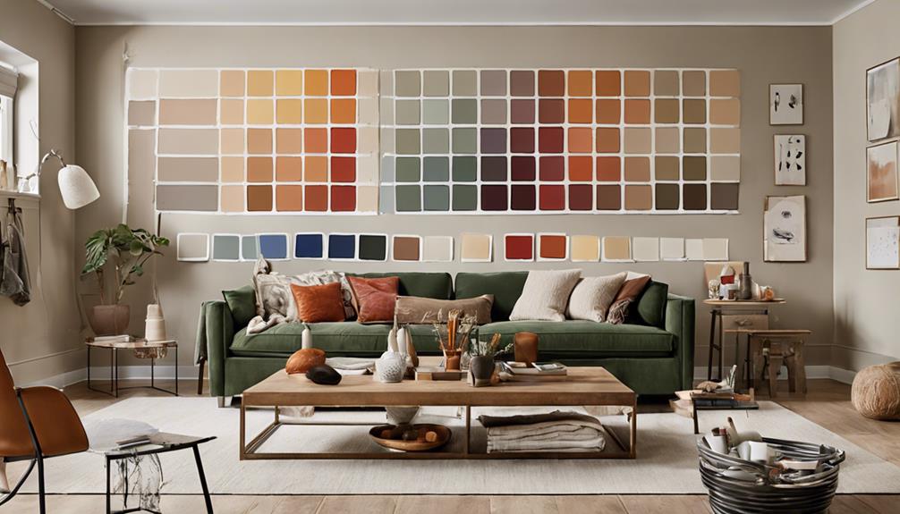
You'll want to apply the paint samples to your walls, observing how the color appears in different lighting conditions throughout the day. This is important in ensuring the chosen color complements your space. Paint swatches can be deceiving, and what looks great on a small piece of cardboard may not translate to your walls.
To get an accurate representation, apply the paint samples to multiple areas of your wall, including corners, baseboards, and areas with varying levels of natural light. Observe how the color changes throughout the day, taking note of how it looks in the morning, afternoon, and evening.
Here are some key considerations to keep in mind when testing paint samples:
- Color Variations: Pay attention to how the color appears in different lighting conditions. Does it look blue in the morning and green in the evening?
- Color Intensity: Observe how the color intensity changes throughout the day. Does it appear more vibrant in the afternoon?
- Color Undertones: Take note of any undertones that may appear, such as pink or yellow undertones that can affect the overall appearance of the color.
Get Inspiration From Others
After testing paint samples, turn to friends, family, and online communities for inspiration, as their experiences and opinions can help you narrow down your color options. You don't have to go through this process alone! Reach out to friends who have recently painted their homes and ask for their advice. They can share their own experiences, both positive and negative, which can be incredibly valuable. You can also join online forums or social media groups dedicated to home decor and ask for feedback on your color choices.
You can also find inspiration online by browsing Pinterest boards and social media feeds dedicated to home decor. Create your own boards and start pinning colors and styles that resonate with you. This will help you visualize your options and identify patterns and themes that appeal to you. You can also follow design influencers and bloggers who share your style, and take note of the colors they use in their own homes. By surrounding yourself with like-minded individuals and gathering inspiration from various sources, you’ll feel more confident in your color choice and excited to see the final result. Remember, choosing the perfect paint color is a process, and it’s okay to take your time and seek guidance from others. Additionally, it’s important to consider how different colors can influence mood and atmosphere, which brings us to the concept of color psychology in home design. Warm tones can create a cozy and inviting space, while cooler shades may promote tranquility and focus. Don’t hesitate to experiment with color swatches in your home to see how the light affects them throughout the day, allowing you to make a more informed decision that aligns with your intended ambiance.
Frequently Asked Questions
Can I Use Online Paint Color Visualizers to Make a Decision?
You're like a chef trying to create a new recipe, but instead of ingredients, you're mixing colors. Online paint color visualizers can be a great starting point, but be cautious – they're not always a perfect reflection of reality. Color accuracy can be off, and digital reality can be misleading. To make sure you don't end up with a color that's not quite right, use these tools as a guide, but don't be afraid to test samples on your walls before making a final decision.
How Do I Ensure the Paint Color Won't Clash With Furniture?
When decorating your space, you want to create a sense of harmony. You're right to worry that your paint color might clash with your furniture. To avoid this, think about the style of your furniture – is it modern, traditional, or eclectic? Then, choose a paint color that complements it. Consider the 60-30-10 rule: 60% of the room should be a dominant color, 30% a secondary color, and 10% an accent color. This will guarantee color harmony and a sense of belonging in your space.
Are There Any Eco-Friendly and Sustainable Paint Options Available?
You're making a conscious effort to live more sustainably, and that's amazing! You'll be happy to know that many eco-friendly paint options are available. Look for brands that offer vegan formulas, made with natural ingredients and recycled materials. Some companies even aim for zero waste in their production process. By choosing these sustainable paints, you'll not only be doing the planet a favor, but you'll also be creating a healthier, more harmonious space that aligns with your values.
Can I Paint Over a Dark Color With a Lighter Color Easily?
When you're trying to cover a dark color with a lighter shade, it can be a challenge. Dark undertones can still peek through, ruining the look you're going for. To avoid this, consider color layering – applying a primer or a tinted base coat to neutralize the dark tone. This helps the new color adhere smoothly and evenly, ensuring a beautiful finish that makes you feel proud of your space.
How Often Should I Repaint My Walls to Keep Them Looking Fresh?
You want to keep your walls looking fresh and fabulous, don't you? To maintain that "just-painted" look, plan to give your walls a fresh coat every 5-7 years, depending on wear and tear. Regular wall maintenance is key! You'll notice a big difference in how your space feels when you stay on top of it. By repainting regularly, you'll keep your walls looking vibrant and you'll feel like you're walking into a brand new space every day.