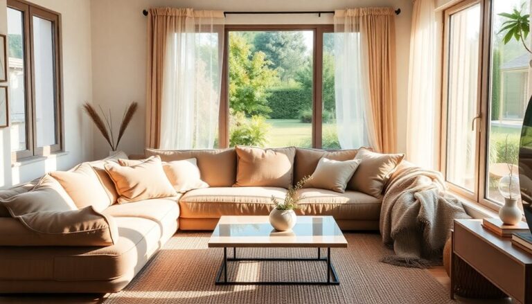
Layering patterns can enhance your space without feeling chaotic. Start by mixing different scales; pair bold patterns with smaller ones. Limit yourself to three or four patterns to keep unity. Stick to a cohesive color palette of 3-5 shades, ensuring at least one common color among your patterns. Balance is key, so incorporate solid colors to ground your design. Textures in addition add depth, so mix them thoughtfully. Finally, don't hesitate to experiment with placement until it feels right. You'll discover more tips to master layering and create a stunning room that feels harmonious.
Understand Pattern Basics
In regard to layering patterns in a room, do you know the foundational elements that make or break your design? Comprehending pattern basics is vital for creating an innovative space that feels cohesive rather than chaotic. Start by exploring different pattern types—geometric, floral, striped, or abstract. Each offers a unique vibe and can evoke various emotions. Mixing these can lead to stunning results, but it's important to choose wisely.
Next, reflect on pattern origins. Historical context can inspire your choices, whether you're drawn to traditional motifs or modern interpretations. For instance, a contemporary geometric may beautifully complement a vintage floral, creating a dynamic dialogue between eras. This blend not just adds depth but also tells a story within your space.
To achieve balance, think about scale. Large patterns can dominate, whereas smaller ones can recede, creating a layered effect. When combining different types, aim for a mix of scales to maintain visual interest without overwhelming the room. Remember, your chosen patterns should harmonize, even though they originate from different styles or periods.
Finally, don't shy away from experimenting. Layering patterns is about pushing boundaries and defining your aesthetic. Trust your instincts, and don't forget to reflect on texture, as it can enhance your patterns further. By grasping these basics, you'll be well on your way to crafting a space that's not just stylish but uniquely yours.
Choose a Color Palette
Choosing a color palette is essential for successfully layering patterns in your room. Start by selecting a dominant color that sets the tone, then incorporate complementary shades to improve the overall look. Remember to limit the color count to keep the space feeling cohesive and balanced.
Select a Dominant Color
Your room's overall vibe hinges on selecting a dominant color that sets the tone for the entire space. This choice not only affects your mood but additionally allows other patterns and textures to shine. By focusing on dominant hues, you create a cohesive foundation that improves the visual impact of your design.
Consider the color significance of each hue as you decide. For example, blues evoke calmness, whereas reds ignite energy. To help you visualize your options, here's a simple table to guide your selection:
| Color | Dominant Hue Example | Color Significance |
|---|---|---|
| Blue | Navy | Calm, Trust |
| Green | Olive | Growth, Harmony |
| Yellow | Mustard | Cheerfulness, Optimism |
| Red | Burgundy | Passion, Action |
| Neutral | Beige | Balance, Warmth |
Once you've selected your dominant color, you'll find it easier to layer patterns without overwhelming the space. This foundational element will help that your innovative design feels both intentional and harmonious.
Incorporate Complementary Shades
To create a visually appealing space, incorporating complementary shades is essential for enhancing your chosen dominant color. By grasping color psychology, you can select shades that not only harmonize but likewise evoke specific emotions and atmospheres. Think about how colors interact; a bold blue might pair beautifully with a warm orange, creating a dynamic yet balanced look.
When it comes to shade harmony, consider the undertones of your dominant color. If you've chosen a cool hue, such as teal, you might want to incorporate complementary shades like coral or soft peach to create a sense of balance. These combinations can breathe life into your patterns, making them more engaging without overwhelming the space.
You can likewise experiment with varying shades of the same color to add depth while maintaining cohesion. For instance, layering different greens—sage, olive, and emerald—can create a serene yet lively environment. The key is to maintain a sense of unity while embracing innovation. By thoughtfully selecting your complementary shades, you'll craft a room that feels fresh, inviting, and perfectly curated.
Limit the Color Count
Limiting the color count in your room can considerably streamline the design process and create a cohesive look. By choosing a focused color palette, you can encourage a sense of pattern harmony that improves your space without overwhelming it. Start by selecting three to five key colors that resonate with you and align with your vision. Consider color psychology: certain hues evoke specific emotions, so think about how you want your room to feel.
For instance, warm tones like reds and oranges can create energy, whereas cool blues and greens promote tranquility. Once you've chosen your colors, apply them thoughtfully across different patterns. A bold geometric print in a primary color can pair beautifully with a softer floral pattern in a complementary shade.
Mix Different Pattern Sizes
Even though it might seem intimidating at first, mixing different pattern sizes can create a dynamic and visually appealing space. To achieve a harmonious yet innovative look, consider combining large-scale patterns with smaller ones. This interplay not only draws the eye but additionally adds depth to your design.
Start by choosing a bold, oversized pattern as your focal point. Think of a lively floral pattern on an accent chair or a statement wall. This large design sets the tone and serves as a canvas for introducing smaller patterns. Next, incorporate stripes or geometric prints in a more subdued size. These smaller patterns can work wonders when layered against your larger floral designs, creating visual contrast without overwhelming the space.
When mixing stripes and floral patterns, keep in mind that balance is key. If your floral pattern is lush and intricate, opt for simpler stripes in a muted color to keep the overall aesthetic cohesive. You can as well play with orientations; vertical stripes can elongate a space, whereas horizontal ones can add width.
Don't shy away from experimenting with textures, either. A soft, textured fabric can enhance the visual interest, providing an engaging tactile experience. By thoughtfully combining different pattern sizes, you'll create a room that feels curated and lively, showcasing your unique style. So go ahead, mix it up! Embrace the challenge and watch your space transform into a lively mosaic of patterns.
Limit the Number of Patterns
When layering patterns, it's essential to limit the number of designs to maintain a cohesive look. Stick to a few complementary color schemes and balance the scale and size of the patterns you choose. Don't forget to focus on texture variety, as it can add depth without overwhelming the space.
Choose Complementary Color Schemes
Choosing complementary color schemes is vital for creating a harmonious look in a room filled with patterns. By selecting complementary hues, you can guarantee that each pattern improves rather than competes with the others. Start by picking a dominant color that resonates with your vision, then choose patterns that incorporate this color alongside its complementary counterparts. This approach promotes color harmony and creates a cohesive atmosphere.
For instance, if you lean in the direction of a bold navy, consider pairing it with warm tones like coral or mustard. When you layer patterns, make certain they share at least one common hue to unify the space. This shared color acts as a visual anchor, preventing your design from feeling chaotic.
Limit the number of distinct patterns to three or four to maintain clarity. By focusing on complementary hues, you allow each pattern to shine without overwhelming the senses. Don't shy away from experimenting; patterns can introduce depth and interest as you still celebrate color harmony. Remember, the goal is to inspire and innovate, resulting in a dynamic yet balanced design that feels effortlessly curated.
Balance Scale and Size
To create a visually appealing room, balancing the scale and size of your patterns is key. You want to guarantee that your patterns complement rather than compete with each other. Start by considering scale proportions; large patterns can dominate a space, whereas smaller ones can get lost. A good rule of thumb is to limit yourself to three different patterns. This keeps your design cohesive and avoids overwhelming the room.
Mixing a large-scale pattern with medium and small-scale patterns can create a dynamic yet harmonious look. For instance, pair a bold, oversized floral print on a sofa with smaller geometric pillows and a subtle striped rug. This combination cultivates a sense of size harmony.
Focus on Texture Variety
Layering different textures can improve the visual interest in your room without overwhelming it with too many patterns. When you focus on texture variety, you create a rich environment that invites touch and engagement. Start by selecting a few standout materials—think soft velvet, rustic wood, and cool metal. This approach not only introduces texture layering but likewise establishes a tactile contrast that makes each element pop.
Limit the number of patterns you use, opting instead for solid colors or subtle designs that complement your textures. For example, a bold geometric pillow can shine against a woven throw, whereas a sleek leather chair can juxtapose a knitted blanket. This balance allows your space to feel cohesive yet dynamic.
Experiment with layering different textures on surfaces too—mix a smooth glass lamp with a rough ceramic vase, or combine a plush rug with a sleek hardwood floor. By curating your choices, you'll achieve a sophisticated look that's both innovative and inviting. Remember, the key is in the details; each texture tells a story, contributing to the overall ambiance of your room without the chaos of competing patterns.
Use a Unifying Element
In any room where you want to layer patterns, a unifying element can tie everything together seamlessly. Think of this element as a common thread that weaves through your design, creating harmony amidst the visual excitement. This could be a specific color, a particular pattern, or even unifying textures that resonate throughout your space. When you choose a unifying element, you're not just making a design choice; you're crafting a narrative that invites innovation and creativity.
For instance, if you're working with bold geometric patterns and floral designs, consider incorporating a color that appears in both. This color acts as a bridge, allowing the distinct patterns to coexist without clashing. Alternatively, you might choose unifying textures, such as soft fabrics that echo across cushions, curtains, and throws. This tactile consistency can improve your room's overall feel, making it inviting and cohesive.
Another approach is to focus on cohesive themes. If your room has an eclectic mix of patterns, ascertain that they align with a central idea—like a bohemian vibe or a modern chic aesthetic. This theme reinforces your unifying element, guiding your choices and confirming that every piece contributes to the larger picture.
Balance With Solids
Balancing lively patterns with solid colors is essential to creating a visually appealing room. When you layer patterns, it's easy for a space to feel chaotic or overwhelming. That's where the magic of solid colors comes in. By incorporating solid textures, you can introduce a sense of calm and cohesion that anchors your design.
Start by choosing a primary solid color that complements your patterns. This could be a neutral shade like white, beige, or gray, or even a bold hue that ties into one of your patterned elements. The key is to guarantee your solid colors serve as a backdrop that improves the patterns rather than competes with them.
Next, consider the textures of your solids. A plush velvet or a smooth linen can add dimension to your room during the time of maintaining a grounded feel. Use these solid textures in larger pieces, like sofas or curtains, to create a balanced foundation. This way, your bold patterns can shine on smaller accents like throw pillows or artwork without overwhelming the eye.
Don't shy away from mixing different solid colors, either. A palette of complementary hues can add depth and interest without straying into visual chaos. Just remember to keep the overall ratio in mind—more solid colors than patterns will help maintain equilibrium.
Incorporate these strategies, and you'll find that balance between playful and serene, allowing your innovative spirit to thrive in a beautifully layered space.
Experiment and Adjust
Finding the right combination of patterns can be an exciting process, so don't hesitate to experiment and adjust your selections. This phase is essential for creating a dynamic and visually appealing space. Begin by mixing different patterns, but additionally experiment with textures to add depth. For example, pairing a bold geometric print with a soft floral can create an intriguing contrast.
While experimenting, keep in mind that adjusting pattern placement can dramatically change the room's feel. Sometimes, simply moving a patterned cushion or repositioning a rug can improve your design considerably. Don't be afraid to play around until it feels just right.
To help you visualize your choices, here's a simple table to guide your experimentation:
| Pattern Type | Ideas for Texture | Placement Tips |
|---|---|---|
| Geometric | Use canvas or linen | Center on a neutral sofa |
| Floral | Incorporate velvet | Layer on a solid-color chair |
| Stripes | Experiment with silk | Position on a patterned rug |
As you explore these combinations, trust your instincts. Look for balance and cohesion, and keep in mind that it's okay to make adjustments as needed. The goal is to create a space that feels innovative yet harmonious. Keep experimenting until you find that perfect mix that speaks to your style and comfort!
Frequently Asked Questions
How Can I Incorporate Patterns in Small Spaces Effectively?
Incorporating patterns in small spaces can be a game-changer for your decor. Start by choosing a few key pieces that feature effective layering—like a patterned rug paired with solid furniture. Use small space tips such as mixing different scales of patterns, ensuring they complement each other. You can as well add pops of pattern through accessories like cushions or artwork, keeping the overall look fresh and innovative without overwhelming your cozy area.
What Are Some Common Pattern Combinations to Avoid?
Did you know that over 60% of people feel stressed in overly busy environments? To keep your space serene, steer clear of clashing colors and busy textures. Mixing two bold patterns can create visual chaos, making a room feel cramped and overwhelming. Instead, opt for complementary designs that balance each other. Think subtle accents paired with more striking elements. This way, you'll maintain innovation during ensuring your space remains inviting and harmonious.
Can I Use Patterned Furniture With Patterned Decor?
Absolutely, you can use patterned furniture with patterned decor! To make it work, focus on mixing textures to create depth. Choose a bold patterned upholstery for your sofa, then complement it with smaller, subtler patterns in your throw pillows or rugs. This way, the patterns interact without overwhelming the space. Experiment with color palettes to guarantee cohesion, and don't shy away from unique combinations that reflect your personal style!
How Do I Choose Patterns for a Child's Room?
Choosing patterns for a child's room can be exciting! Start by picking a cohesive color scheme that reflects your child's personality. Mix bold patterns with softer ones to maintain a texture balance. For instance, pair playful prints on bedding with subtle designs on curtains. Don't shy away from experimenting; kids' rooms are perfect for innovating! Remember, create a space that sparks creativity during still feeling comfortable and inviting.
What Seasonal Patterns Work Best for Home Decor?
When you're choosing seasonal patterns for home decor, think about how seasonal color and textiles can transform your space. For spring, light floral prints and pastel tones breathe freshness, whereas summer calls for lively stripes and playful motifs. In autumn, warm hues and cozy plaid can create a welcoming atmosphere, and winter often brings rich textures and festive patterns. Mixing these elements innovatively adds depth and character to your decor throughout the year.