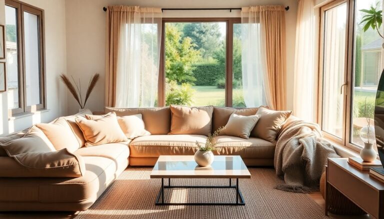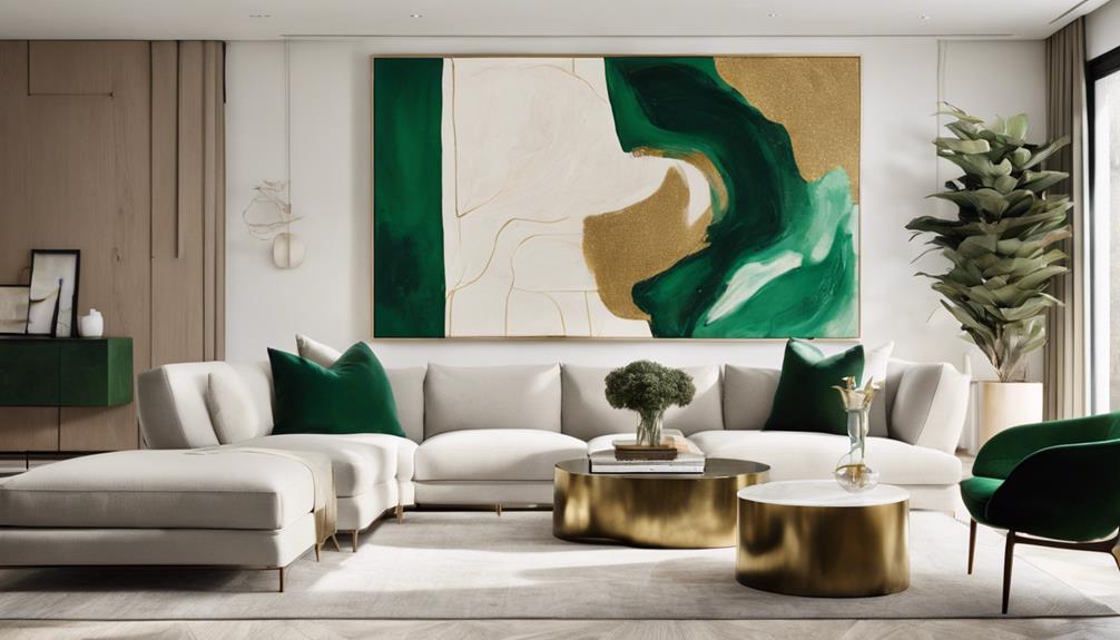

You're ready to make a statement with your wall art! Start by choosing a piece that reflects your personal style and complements your room's aesthetic. Consider the 60-30-10 Rule for color allocation and balance to create visual harmony. Mixing mediums, textures, and styles can add depth to your space. Don't be afraid to use bold, contrasting hues to command attention. By curating a focal point, you can elevate your space and reflect your unique personality. Now, take the next step in creating a space that truly represents you…
Choosing the Perfect Piece
When it comes to choosing the perfect piece of wall art, your personal style and the room's aesthetic are the ultimate decision-makers. It's essential to think about what resonates with you and what will enhance the atmosphere of the space. Your personal taste plays a significant role in selecting a piece that reflects your unique character. Think about the artistic vision you want to convey – do you prefer bold and eclectic or soft and serene?
The room's atmosphere is also pivotal in determining the perfect piece. Take into account the decor theme, lighting, and furniture to make sure the art complements the space. For instance, a modern art piece might clash with a traditional decor theme, while a vintage print might blend seamlessly. Your personal style is crucial in making this decision, as it will reflect your taste and personality.
As you build your art collection, remember that each piece should contribute to the overall ambiance you want to create. Don't be afraid to experiment and try out different styles until you find the one that speaks to you. Ultimately, the perfect piece of wall art will not only elevate the room's atmosphere but also become a reflection of your personality and artistic vision. By trusting your instincts and taking into account the room's aesthetic, you'll find the perfect piece that makes a statement and creates a sense of belonging.
Understanding the 60-30-10 Rule
When choosing wall art, you'll want to keep in mind the 60-30-10 rule to create a visually appealing space. This principle suggests allocating 60% of your wall art to a dominant color or style, 30% to a secondary element, and 10% to an accent piece that adds a pop of contrast. By balancing these visual elements, you'll create a harmonious look that draws the eye to your statement piece.
Balancing Visual Elements
You can create visual harmony in your wall art arrangement by applying the 60-30-10 rule, a fundamental principle for balancing visual elements. This rule helps you allocate visual weight to create a sense of balance and harmony in your arrangement. The 60% dominant element sets the tone, the 30% secondary element adds depth, and the 10% accent element adds a pop of contrast. This visual hierarchy guarantees that your arrangement doesn't feel cluttered or overwhelming.
Dominant Color Choice
Your dominant color choice sets the tone for your entire wall art arrangement, so selecting a hue that resonates with your personal style is vital. This dominant color will dictate the mood expression of your space, making it important to choose wisely. According to the 60-30-10 rule, your dominant color should occupy 60% of your wall art, with the remaining 30% and 10% allocated to secondary and accent colors, respectively.
When selecting your dominant color, consider the emotions you want to evoke in your space. Color psychology plays a significant role in shaping the ambiance of your room. For instance, calming shades like blue or green can create a soothing atmosphere, while bold colors like red or orange can energize the space. Think about the mood you want to create and choose a color that aligns with your vision. By doing so, you'll create a cohesive look that reflects your personality and style. Remember, your dominant color choice sets the tone for your entire space, so take your time and choose a hue that truly represents you.
Accentuating Focal Points
With the dominant color in place, it's time to accentuate focal points by allocating the remaining 30% and 10% to secondary and accent colors, respectively, to create visual harmony and balance. This is where the 60-30-10 rule comes into play. By allocating these percentages wisely, you'll create a visual hierarchy that draws the eye to specific areas of your wall art.
| Color Allocation | Visual Effect |
|---|---|
| 60% Dominant Color | Sets the tone and mood |
| 30% Secondary Color | Adds depth and contrast |
| 10% Accent Color | Creates focal anchors |
| Balance and Harmony | Visual hierarchy and flow |
Mixing Mediums and Textures
By combining paintings, prints, and sculptures, eclectic mixes of mediums and textures can elevate your space and create a visually striking atmosphere. When you mix mediums, you're not limited to a single style or aesthetic, allowing you to express your unique personality and create a space that truly reflects who you are.
By incorporating different textures, you can create a tactile experience that invites exploration and sensory play. For instance, pairing smooth glass or metal sculptures with rough-hewn wooden prints or canvases adds depth and visual interest to your space. The material contrast between these elements will draw the eye and create a sense of dynamic energy.
To take your wall art to the next level, consider using emphasis techniques like grouping similar pieces together or creating a focal point with a statement piece. This will create visual depth and dimensional interest, making your space feel more dynamic and engaging. By mixing mediums and textures, you’ll create a space that’s not only visually stunning but also tactilely engaging, inviting you and your guests to explore and connect with the art on a deeper level. Experimenting with different frame styles and sizes can further enhance the overall aesthetic, adding variety while maintaining cohesion. Incorporating personal touches like travel photos or handmade artwork can make your display more meaningful and reflective of your personality. Exploring home gallery wall ideas can also provide inspiration for unique layouts and arrangements that bring your vision to life.
Combining Styles and Eras
As you explore combining styles and eras, you'll discover the excitement of merging modern and vintage pieces to create a unique visual story. You might pair a sleek, contemporary photograph with an antique etching, or juxtapose a bold, abstract painting with a delicate, Victorian-era watercolor. By combining contrasting art movements, you'll create a visually striking display that showcases your personal taste and flair.
Mixing Modern and Vintage
You can create a visually striking space by combining modern and vintage pieces, juxtaposing sleek, contemporary designs with antique or distressed elements that add depth and character to your walls. This eclectic curation of styles and eras can result in a unique visual narrative that reflects your personality and aesthetic. By mixing modern and vintage pieces, you'll create a timeless fusion that's both nostalgic and forward-thinking.
To achieve this look, start by selecting a few statement pieces that catch your eye, whether it's a mid-century modern print or a vintage map. Then, balance these pieces with more contemporary designs, such as minimalist prints or abstract art. Don't be afraid to experiment with different textures, colors, and frames to add visual interest. Remember, the key to pulling off this look is to trust your instincts and have fun with the process. By embracing your personal style and curating a mix of modern and vintage pieces, you'll create a space that's truly one-of-a-kind.
Contrasting Art Movements
Combining contrasting art movements, like Cubism and Art Nouveau, can create a visually striking juxtaposition that challenges your perceptions and adds depth to your space. By blending different styles and eras, you can curate a unique and thought-provoking collection that sparks conversation and reflects your personality.
Here are three ways to combine contrasting art movements:
- Cubist Revival: Pair Cubist-inspired pieces with Art Nouveau's flowing curves to create a fascinating contrast of geometric shapes and organic forms.
- Abstract Expressionism: Combine the bold brushstrokes of Abstract Expressionism with the delicate patterns of Art Deco to create a dynamic and visually striking combination.
- Eclectic Mix: Blend vintage posters with modern abstract art to create a visually arresting display that showcases your eclectic taste.
Making a Statement With Color
Your walls become a vibrant reflection of your personality when you deliberately choose wall art with bold, contrasting hues that command attention. Making a statement with color is all about being intentional with your art selection. You can create a cohesive look by choosing pieces that share a similar color palette or bold, contrasting hues that create visual interest. Vibrant neutrals like sunny yellows, sky blues, and mint greens can add a touch of warmth and personality to your space.
If you want to make a bolder statement, consider bold monochromes that feature a single, striking color. A large-scale piece with a bold, bright hue can instantly elevate your space and create a focal point. You can also experiment with mixing and matching different colors to create a unique look that reflects your personality. Remember, the key is to have fun and be fearless in your art selection. Don't be afraid to try out new color combinations or take risks with bold, contrasting hues. By embracing your personal style and being intentional with your color choices, you can create a space that truly reflects who you are.
Balancing Scale and Proportion
A visually appealing space depends on striking a balance between scale and proportion, where each piece of wall art is in harmony with the others and the room's architecture. You want to create a sense of cohesion, not competition, among the artwork and the room's features. When selecting wall art, consider the size of the pieces in relation to the furniture, the room's dimensions, and each other.
To achieve balance and proportion, follow these guidelines:
- Assess the room's spatial awareness: Take note of the room's dimensions, door and window placement, and the location of furniture. This will help you determine the most suitable size and placement of your wall art.
- Create a visual hierarchy: Organize your wall art in a way that guides the viewer's eye through the space. Use size, color, and placement to create a sense of priority among the pieces.
- Scale artwork to the furniture: Make sure that the size of your wall art is proportional to the furniture it's placed near. A large piece above a small sofa can create visual tension, while a small piece above a large sectional can get lost.
Creating a Focal Point
By thoughtfully placing a statement piece, you can create a focal point that draws the viewer's eye and sets the tone for the entire room. A well-curated focal point can elevate your space, creating a sense of visual harmony and balance. To create a compelling focal point, consider the visual hierarchy of your room. Ask yourself: What architectural elements do I want to highlight or distract from?
| Visual Hierarchy | Creating a Focal Point |
|---|---|
| Size: Large pieces draw attention | Use a large statement piece above a sofa or fireplace |
| Color: Bold colors pop against neutral backgrounds | Hang a vibrant piece above a neutral-colored sofa |
| Texture: Mix textures to add depth | Combine a smooth-framed piece with a textured rug |
| Shape: Unconventional shapes intrigue | Hang an asymmetrical piece above a traditional doorframe |
| Placement: Strategically place pieces to guide the eye | Place a piece at the end of a hallway to draw visitors in |
Frequently Asked Questions
Can I Hang Wall Art Above My Furniture?
'Imagine you're a Renaissance patron, commissioning a masterpiece for your castle walls. Fast-forward to your modern abode, where the question remains: can you hang wall art above your furniture? Absolutely! In fact, it's a great way to create wall balance. Just make sure the piece isn't overwhelming your furniture style. A general rule of thumb is to leave about 6-12 inches between the art and furniture. Trust your eye, and don't be afraid to experiment – your space will thank you!'
How High Should I Hang My Wall Art?
When it comes to hanging your wall art, you'll want to contemplate the perfect viewing height. A good rule of thumb is to place the center of the piece at eye level, around 57-60 inches from the floor. This creates a natural focal point, drawing the eye to the art. By doing so, you'll create a sense of harmony in the room, making you feel cozy and connected to the space.
Can I Use Wall Art to Cover Wall Imperfections?
Imagine a masterful painter covering a canvas of imperfections with a beautiful landscape. You can do the same with your wall art, using it as a clever disguise for wall flaws. Don't let imperfections get in the way of your perfect space. Imperfection hiding is an art form, and you're the curator. Strategically place a statement piece to draw attention away from those pesky wall flaws, and you'll be left with a gallery-worthy space that's uniquely yours.
Are There Rules for Hanging Wall Art in Stairwells?
When hanging art in a stairwell, you're creating a unique visual experience. To make the most of this space, you'll want to establish a stairwell focal point, drawing the eye upward or downward. Consider the visual flow continuity, ensuring the art pieces complement each other and the surrounding architecture. By doing so, you'll craft a cohesive, Instagram-worthy space that welcomes and guides visitors as they move through your home.
Can I Use Wall Art to Make a Small Room Feel Larger?
Did you know that 65% of people feel more relaxed in rooms with visually appealing decor? You can use wall art to create a sense of room expansion in small spaces! To achieve this, focus on visual balance by hanging larger pieces on smaller walls and smaller pieces on larger walls. This trick creates an optical illusion, making the room feel more spacious. By doing so, you'll create a sense of calm and belonging in your cozy space.