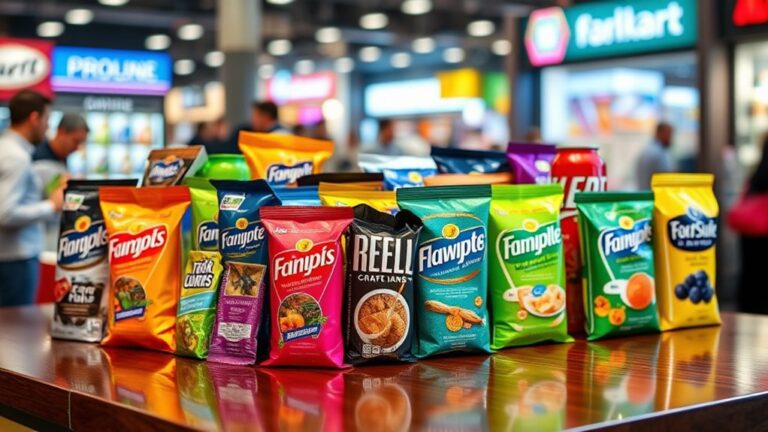
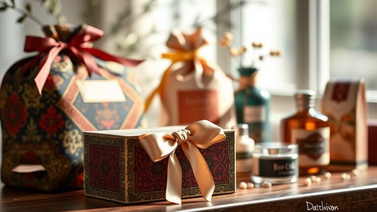
You're about to uncover the secret to making your seasonal packaging design pop – it's all about the role of color trends. You see, colors evoke emotional responses tied to seasons, from winter's warmth to spring's freshness. By comprehending color symbolism, you can create resonant packaging that drives consumer engagement and brand loyalty. Seasonal color palettes, cultural influences, and nature's evolving hues all play a part in shaping your design. As you explore the realm of color trends, you'll discover how to craft a cohesive brand aesthetic that builds anticipation for your seasonal products – and by continuing on this expedition, you'll uncover even more ways to make your packaging stand out.
The Psychology of Seasonal Colors
You've probably noticed how certain colors evoke feelings of coziness and warmth during winter, or freshness and liveliness in the spring. This phenomenon is rooted in color symbolism, where specific hues elicit emotional responses that align with the season. As a designer, it is crucial to understand these psychological connections to create packaging that resonates with your target audience.
During winter, colors like rich reds, deep blues, and earthy tones evoke feelings of comfort and warmth. These colors are often associated with festive holidays, fireplaces, and cozy nights in. Conversely, spring is characterized by pastel hues, lively greens, and sunny yellows, which evoke feelings of renewal, growth, and energy. These colors are reminiscent of blooming flowers, sunshine, and outdoor activities.
Cultural Influences on Color Trends
As you explore cultural influences on color trends, you'll notice a fascinating blend of global flavors, historical nods, and urban inspirations. You'll see how Global Color Fusion brings together lively hues from around the world, whereas Heritage Revival Hues pay homage to traditional colors from the past. Simultaneously, Urban Jungle Tones evoke the gritty, modern feel of city living.
Global Color Fusion
Global Color Fusion blends lively hues from diverse cultural backgrounds, reflecting the modern consumer's eclectic tastes and exposure to international influences. As you explore global color integration, you'll notice how it brings together contrasting colors to create a unique visual identity. This trend celebrates the beauty of cultural color blending, where vibrant shades from Africa, Asia, and Latin America converge to form bold, eye-catching combinations.
In seasonal packaging design, Global Color Fusion offers a rejuvenating departure from traditional color schemes. You can pair bright corals with deep indigos, or merge sunny yellows with rich emerald greens. The result is a visually stunning packaging design that resonates with consumers who crave novelty and excitement. By embracing Global Color Fusion, you can create packaging that not only stands out on store shelves but also narrates a story of cultural diversity and exchange. As you incorporate this trend into your design strategy, remember to balance bold colors with neutral accents to avoid visual overload.
Heritage Revival Hues
Plunging into the domain of nostalgic colors, Heritage Revival Hues resurrects the rich cultural heritage of bygone eras, evoking a sense of timelessness and tradition. You'll find yourself drawn to vintage-inspired packaging that echoes a bygone era, with colors that whisper stories of the past. As you explore Heritage Revival Hues, you'll notice a strong emphasis on heritage color symbolism. Earthy tones like terracotta, sienna, and umber evoke a sense of history and tradition, whereas rich jewel tones like emerald and sapphire nod to the opulence of bygone eras.
Nostalgia-driven palettes are at the heart of Heritage Revival Hues, with designers drawing inspiration from vintage artifacts, antique furniture, and even family heirlooms. You might find yourself incorporating distressed textures, classic typography, and ornate patterns to create a sense of authenticity and heritage. As you work with Heritage Revival Hues, remember to balance nostalgia with modernity, ensuring your designs feel both timeless and contemporary. By doing so, you'll craft packaging that not just resonates with consumers but likewise tells a story that transcends time.
Urban Jungle Tones
In the midst of lively cities, Urban Jungle Tones emerge as a colorful response to the concrete jungle, infusing packaging design with the dynamic energy of urban environments. You'll notice that these tones are heavily influenced by urban jungle aesthetics, which blend the grittiness of city life with the vibrancy of tropical terrains. Think lush greens, bold yellows, and deep blues – a tropical color palette that's both invigorating and rebellious.
As you incorporate Urban Jungle Tones into your packaging design, you'll create a sense of excitement and adventure. These colors are perfect for products that evoke a sense of freedom and spontaneity, like outdoor gear or street food brands. By embracing the urban jungle vibe, you'll appeal to consumers who crave novelty and excitement. So, don't be afraid to get creative and push the boundaries of traditional packaging design. With Urban Jungle Tones, you'll be able to tap into the pulse of the city and create a truly unforgettable brand experience.
Nature's Impact on Seasonal Hues
As you step outside, you're surrounded by nature's kaleidoscope of colors, which inevitably influence the seasonal hues that dominate packaging design. The changing seasons bring about a shift in nature's palette, and designers often turn to these natural hues for inspiration. From the warm, earthy tones of autumn to the cool, icy blues of winter, nature's colors are a constant source of inspiration.
As you observe the seasonal shifts, you'll notice how nature's palette evolves. Spring brings new life and lively colors, as summer's warmth is reflected in bright, bold hues. Autumn's harvest season is characterized by rich, earthy tones, and winter's chill is often accompanied by icy blues and whites. These natural color shifts have a profound impact on packaging design, as brands seek to evoke the emotions and feelings associated with each season.
Current Color Trends in Packaging
Your favorite products are getting a fresh new look, and it's all about the colors. Seasonal packaging design is evolving, and color trends are playing a significant role in this transformation. Currently, you're witnessing a shift in the direction of eco-friendly colors that appeal to the environmentally conscious consumer but likewise contribute to a brand's sustainability efforts. Shades of green, blue, and earthy tones are dominating the packaging scene, conveying a sense of responsibility and harmony with nature.
Minimalistic designs are likewise gaining traction, as brands opt for clean, simple, and sophisticated visuals that let the product speak for itself. This trend is a departure from the bold and bright colors of the past, instead embracing a more subtle and understated approach. The use of whitespace, gentle gradients, and soft textures is creating a calming and premium feel that resonates with consumers.
In addition to eco-friendly and minimalistic designs, you're seeing a rise in metallic and iridescent colors that add a touch of luxury and sophistication to packaging. These colors are often used in combination with earthy tones to create a sense of balance and harmony. As you explore the current color trends in packaging, it's clear that brands are prioritizing aesthetics, sustainability, and emotional connections with their target audience.
How to Choose Seasonal Colors
When selecting seasonal colors for your packaging design, you'll want to contemplate creating a seasonal color palette that resonates with your target audience. You'll likewise need to think about the emotional connections you want to evoke during each season and how to balance those feelings with your brand's consistent color scheme. By doing so, you'll be able to craft a cohesive and engaging visual identity that adapts to the changing seasons.
Seasonal Color Palettes
Many seasonal color palettes are inspired by the natural world, with hues that evoke feelings of warmth, coziness, or freshness. When choosing a seasonal color palette, you'll want to take into account the mood and atmosphere you want to create for your packaging design. For example, pastel spring colors like soft peach and mint green can evoke feelings of freshness and renewal, whereas festive fall colors like rich orange and deep red can create a cozy and inviting atmosphere.
Here's a breakdown of some popular seasonal color palettes:
| Season | Color Palette | Mood/Atmosphere |
|---|---|---|
| Spring | Pastel hues (soft peach, mint green) | Fresh, renewal |
| Summer | Lively hues (bright coral, sunny yellow) | Fun, energetic |
| Fall | Festive hues (rich orange, deep red) | Cozy, inviting |
| Winter | Cool tones (icy blue, snowy white) | Calm, serene |
| Holiday | Bold hues (emerald green, crimson red) | Joyful, celebratory |
Emotional Color Connections
Harmony in packaging design arises from the emotional connections we make with colors. When you choose seasonal colors, you're not just picking hues, you're evoking emotions and associations that can make or break your brand's connection with consumers. Color symbolism plays a significant role in this process, as different colors can evoke distinct emotional responses. For instance, warm colors like orange and red can stimulate feelings of excitement and energy, whereas cool colors like blue and green can promote calmness and serenity.
To create an emotional resonance with your target audience, consider the psychological effects of colors on consumer behavior. Certain colors can improve a person's mood, influencing their purchasing decisions and brand perception. Cultural significance as well comes into play, as colors can hold different meanings in various cultures. By comprehending these nuances, you can craft a visual storytelling that resonates with your audience. In the end, the colors you choose will create sensory experiences that drive consumer behavior and shape your brand's identity. By making informed color choices, you can establish a deeper connection with your customers and set your brand apart from the competition.
Brand Color Consistency
How do you guarantee that your seasonal colors align with your brand's overall visual identity? Establishing brand color consistency is vital to maintain visual recognition and reinforce consumer perception. It's important to confirm your seasonal colors don't stray from your brand's core identity, which can dilute your marketing strategy and packaging impact.
To achieve design coherence, consider the following:
- Audit your brand's color palette: Review your brand guidelines to understand the approved colors, shades, and tones that define your brand identity.
- Create a seasonal color framework: Develop a framework that outlines how to adapt your core colors for each season, confirming consistency and flexibility.
- Test and refine: Pilot test your seasonal colors and gather feedback to refine your approach, confirming it resonates with your target audience and supports your brand loyalty goals.
Balancing Brand Identity With Trends
As you immerse yourself in the domain of packaging design, you'll often find yourself torn between staying true to your brand's identity and keeping up with the latest trends. It's a delicate balance, one that requires careful consideration of your brand's values, messaging, and aesthetic. After all, deviating too far from your brand's core identity can lead to confusion and dilution, whereas neglecting trends can make your brand seem stale and out of touch.
To achieve brand alignment, start by identifying the fundamental elements that define your brand's visual identity. These might include specific colors, typography, and imagery. Once you have a clear comprehension of these core elements, you can begin to adapt them to accommodate trend adaptation. This might involve incorporating trendy colors or patterns into your design, all the while maintaining the essence of your brand's identity.
The key is to strike a balance between staying true to your brand and embracing the latest trends. By doing so, you can create packaging designs that are both timeless and timely. Remember, your brand's identity is not static – it's a living, breathing entity that evolves over time. By embracing trend adaptation and staying true to your brand's core, you can create designs that are both innovative and authentic.
Color Harmony in Seasonal Design
As you approach seasonal design, you'll want to contemplate the color harmony that resonates with each time of year. In the winter, monochromatic whites evoke a sense of serenity and calm, whereas lively hues in the summer convey energy and playfulness. Simultaneously, autumnal earth tones bring warmth and coziness to packaging designs.
Monochromatic Winter Whites
What's the first thing that comes to mind when you think of winter? Is it the snowflakes gently falling on your face, the twinkling lights on frozen lakes, or the cozy warmth of a crackling fire? Whatever your winter wonderland looks like, it's likely filled with a sense of serenity and simplicity.
- Frosty mornings with a warm cup of coffee
- Snowy scenery that stretches as far as the eye can see
- Icy blues and whites that evoke a sense of crisp elegance
In packaging design, capturing this essence of winter minimalism is key. By incorporating monochromatic winter whites, you can evoke a sense of serene sophistication. Ethereal whites and snowy textures can create a sense of frosty contrasts, adding depth and visual interest to your design. The beauty of a monochrome balance lies in its ability to convey seasonal simplicity without being too on-the-nose. By embracing winter's chill, you can create packaging that feels both modern and timeless.
Vibrant Summer Hues
Summer sunbeams warm your skin, and lively colors explode around you. Radiant summer hues are all about capturing the carefree essence of the season. You're drawn to packaging that radiates summer energy, with colors that evoke feelings of freedom and adventure. Bright corals, electric blues, and sunshine yellows create striking contrasts that pop against the mundane backdrop of everyday life.
To utilize the strength of summer hues, you'll want to balance bold colors with neutral backgrounds. This contrast will make your packaging stand out on crowded shelves. Consider pairing juicy oranges with creamy whites or deep turquoise with soft peaches. The key is to create visual tension that grabs attention without overwhelming the senses.
Autumnal Earth Tones
Leaves crumble beneath your feet, releasing the earthy scent of fallen forests, and the warmth of summer gives way to the coziness of autumn. As the seasons shift, so do the color trends in packaging design. Autumnal earth tones evoke a sense of rustic warmth and muted elegance, perfect for capturing the essence of the season.
- Rich terracottas and burnt oranges evoke the lively hues of changing leaves
- Earthy browns and tans recall the rustic charm of wooden cabins and fallen branches
- Deep, mossy greens bring to mind the mystery and tranquility of the forest floor
These autumnal earth tones can add a sense of coziness and sophistication to your packaging design. Envision a warm, golden-brown box adorned with a simple, yet elegant, leaf pattern. Or, picture a sleek, earthy-brown bottle with a subtle, debossed leaf design. By incorporating these autumnal earth tones into your packaging design, you can create a sense of seasonality and sophistication that will resonate with customers.
The Role of Emotions in Color Choice
As you navigate the domain of packaging design, you're likely aware that colors can evoke strong emotional responses in consumers – but did you know that this emotional connection is often rooted in personal experiences and cultural associations? This emotional connection is a significant aspect of color perception psychology, and it's vital to grasp how it influences consumer behavior.
By tapping into the emotional responses associated with specific colors, you can create emotion-driven designs that resonate with your target audience. For instance, warm colors like orange and red can evoke feelings of excitement and energy, whereas cool colors like blue and green can convey calmness and serenity. By leveraging these emotional connections, you can craft packaging designs that both stand out on store shelves and create a lasting impression on consumers.
When selecting colors for your packaging design, consider the emotional responses you want to elicit in your target audience. Ask yourself, what emotions do I want to evoke in my customers? Do I want to create a sense of urgency, excitement, or tranquility? By answering these questions, you can make informed color choices that drive emotional connections and ultimately, sales. By grasping the role of emotions in color choice, you can reveal the full potential of your packaging design and create a lasting impact on your target audience.
Seasonal Color Palettes in Action
In tandem with the emotional connections you're trying to make, seasonal color palettes can be a potent tool to tap into the cultural and social associations tied to specific times of the year. By leveraging seasonal symbolism, you can create packaging designs that resonate with your target audience on a deeper level.
For instance, consider the following examples:
- Winter wonderland: Rich blues and whites evoke a sense of frosty mornings, snowflakes, and cozy nights by the fire. These color contrasts can be used to create a sense of luxury and sophistication in winter-themed packaging.
- Summer vibes: Bright corals, sunny yellows, and sky blues transport consumers to a beachside paradise, perfect for summer-themed packaging that screams fun and relaxation.
- Autumn harvest: Earthy tones like olive green, terracotta, and golden yellow bring to mind the warmth and coziness of the harvest season, ideal for packaging that conveys a sense of comfort and abundance.
Navigating Color Trends Across Seasons
You've explored how seasonal color palettes can evoke emotions and cultural associations, but now it's time to reflect on the bigger picture. As you maneuver color trends across seasons, you'll need to contemplate how to shift between palettes seamlessly. This is vital for maintaining brand consistency during the embrace of the unique spirit of each season.
| Season | Dominant Color | Transitional Color |
|---|---|---|
| Spring | Pastel hues | Soft peach |
| Summer | Lively brights | Warm beige |
| Autumn | Earthy tones | Rich gold |
The table above illustrates how transitional colors can bridge the gap between seasonal palettes. By incorporating these colors into your design, you can create a cohesive visual narrative that flows smoothly from one season to the next. This is especially important for brands that release seasonal products or promotions, as it helps to build anticipation and excitement.
When maneuvering color trends across seasons, it's vital to strike a balance between consistency and innovation. By grasping the emotional resonance of each seasonal palette, you can create a visual language that resonates with your target audience. Remember, the key to success lies in perfecting the art of color shifts, allowing your brand to evolve with the seasons while remaining true to its core identity.
Creating a Cohesive Brand Aesthetic
Establishing a cohesive brand aesthetic is vital for building recognition and trust with your target audience. It's imperative to create a visual identity that resonates with your brand's personality, values, and messaging. This aesthetic should be consistent across all touchpoints, including packaging, to guarantee a seamless brand experience.
When crafting your brand's visual identity, consider the following elements:
- Color palette: Select a palette that evokes emotions and aligns with your brand's personality. This will help create an instant connection with your audience.
- Typography: Choose typography that reflects your brand's tone and voice. This will help communicate your brand's message effectively.
- Imagery: Use imagery that tells your brand's story and resonates with your target audience. This will help create an emotional connection and build trust.
Staying Ahead of the Color Curve
Your brand's color palette is its visual fingerprint, setting the tone for how consumers perceive and interact with your products. To stay ahead of the competition, you need to stay ahead of the color curve. This means anticipating and adapting to emerging color trends before they become mainstream.
Color forecasting and trend analysis are crucial tools in this process. By analyzing consumer behavior, cultural shifts, and design movements, you can identify upcoming color trends and integrate them into your packaging design. This not only keeps your brand looking fresh and modern but likewise helps you connect with your target audience on a deeper level.
Here's a breakdown of how to stay ahead of the color curve:
| Color Forecasting Technique | Description | Benefits |
|---|---|---|
| Analyzing Social Media | Identify trending colors on social media platforms | Stay ahead of emerging trends |
| Conducting Consumer Research | Gather insights on consumer preferences and behaviors | Develop targeted color palettes |
| Attending Design Conferences | Stay updated on the latest design trends and color directions | Network with industry experts |
| Collaborating with Designers | Leverage designers' expertise in color forecasting and trend analysis | Access innovative and unique color solutions |
Frequently Asked Questions
Can Seasonal Color Trends Be Used for Non-Holiday Packaging?
You wonder if seasonal color trends can be used for non-holiday packaging. The answer is yes! By leveraging seasonal color psychology, you can create non-holiday branding that resonates with your audience. For instance, incorporating earthy tones in your packaging can evoke feelings of coziness and comfort, perfect for a winter product launch. Don't be limited by traditional holiday colors – use seasonal hues to create a unique brand identity that stands out all year round.
How Do Color Trends Impact Packaging Sustainability Efforts?
When you incorporate trendy colors into your packaging, you're not just making it look appealing – you're additionally influencing consumer perception of your brand's eco-friendliness. Research shows that certain hues, like earthy tones, can convey a sense of sustainability. By choosing eco-friendly materials and on-trend colors, you're sending a strong message to customers. It's time to get creative and make a positive impact on the environment as you boost your brand's reputation!
Do Seasonal Color Trends Apply to Digital Packaging Designs?
You're wondering if seasonal color trends apply to digital packaging designs. The answer is yes! Digital aesthetics play a vital role in online shopping experiences, and color psychology can greatly influence consumer behavior. By incorporating seasonal color trends into digital packaging, you can create an immersive brand experience that resonates with customers. For instance, using winter-inspired blues and whites can evoke feelings of coziness and serenity, whereas summer-inspired brights can energize and uplift.
Can Brand Colors Be Adapted for Seasonal Packaging?
When you think of your favorite brands, don't their iconic colors instantly come to mind? You can adapt your brand colors for seasonal packaging by applying color psychology principles. For instance, warm tones can evoke coziness in winter, whereas pastels can convey springtime freshness. By making strategic tweaks, you'll maintain brand recognition as you create seasonal relevance. This balance will keep your packaging fresh and exciting, without alienating your loyal customer base.
How Often Should a Brand Update Its Seasonal Color Palette?
When deciding how often to update your seasonal color palette, you'll want to strike a balance between keeping things fresh and maintaining brand consistency. Aim for a seasonal refresh every 2-3 years to stay on-trend without confusing customers. This allows you to adapt to changing tastes during still building recognition. By doing so, you'll create a cohesive visual identity that resonates with your audience and keeps your brand top of mind.