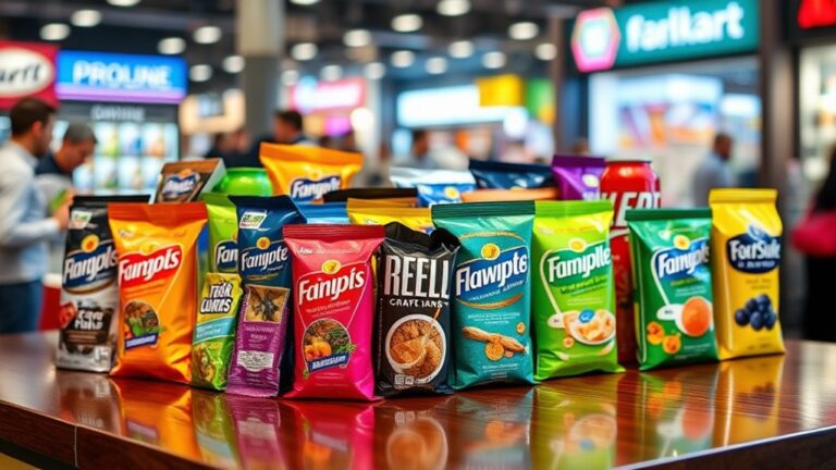
You use typography in packaging design to establish a visual language that resonates with your target audience. It's all about selecting the right fonts, colors, and textures to improve brand storytelling and emotional connections. You convey innovation with bold fonts and elegance with classic scripts. By choosing the right typography, you strengthen your brand messaging and connection with your audience. As you explore typography's role, you'll discover how to effectively balance design elements to create impactful packaging that drives sales and business results.
Brand Identity Through Type
As you explore the domain of packaging design, you'll find that typography plays a crucial role in establishing brand identity through type. It's not just about making your product look good – it's about creating a visual language that resonates with your target audience. You're looking to make a statement, and typography trends can assist you in achieving that. By incorporating bold, modern fonts or classic, elegant scripts, you're able to convey your brand's personality and values.
You're also narrating a story through your packaging, and typography is a key element of brand storytelling. The fonts you choose, the colors you use, and the way you arrange your text all contribute to a narrative that sets your brand apart. When you get it right, you'll create an emotional connection with your customers that goes beyond just the product itself. You'll be building a relationship with them, and that's what drives loyalty and advocacy.
As you consider your typography options, you'll want to stay on top of the latest typography trends to guarantee your packaging stays fresh and relevant. You don't have to follow every trend, but being aware of what's current can help you make informed decisions about your brand's visual identity. By combining innovative typography with compelling brand storytelling, you'll be able to create packaging that truly stands out and leaves a lasting impression on your customers.
Packaging Design Principles
You're now considering the principles that guide packaging design, including design basics that provide a foundation for your work. As you develop your packaging, you'll need to establish a visual hierarchy that directs the viewer's attention to key elements, such as the product name and brand messaging. By applying these principles, you'll create a design that effectively communicates your brand identity and resonates with your target audience.
Design Basics
Effective packaging design starts with a solid comprehension of design basics, which serve as the foundation for creating visually appealing and functional packages. You'll want to contemplate typography trends and design aesthetics that align with your brand's identity. As you explore design basics, you'll find that it's crucial to strike a balance between form and function.
| Design Element | Description |
|---|---|
| Color | Influences consumer emotion and perception |
| Typography | Conveys brand message and tone |
| Imagery | Improves visual appeal and storytelling |
| Texture | Adds tactile experience and depth |
| Space | Creates harmony and guides focus |
Visual Hierarchy
Within the context of packaging design, establishing a clear visual hierarchy is vital for guiding consumers' attention and conveying key information. You're creating a visual flow that directs the viewer's eye to the most important elements. By using typographic emphasis, you can draw attention to specific details, such as the product name or key features. This helps you communicate your message effectively and quickly.
You're additionally balancing the layout to achieve a harmonious composition. Layout balance is significant in creating a visual hierarchy, as it guarantees that the design doesn't look cluttered or overwhelming. By arranging elements in a logical and aesthetically pleasing way, you can create a clear structure that guides the viewer's eye. This balance, combined with typographic emphasis, enables you to create a visual hierarchy that's both effective and visually appealing. As you design your packaging, consider how you can use these principles to capture consumers' attention and convey your message with clarity and precision.
Brand Identity
As you develop your packaging design, it's vital to assess how typography contributes to your brand's identity. You're creating a visual language that'll help consumers recognize and remember your brand. Brand recognition is significant, and typography plays a noteworthy role in achieving it. By using a consistent typography style, you're reinforcing your brand's message and values.
To establish a strong brand identity, you need to focus on type consistency. This means using the same font, size, and color scheme across all your packaging materials. Consistency will help you build a cohesive visual brand language that resonates with your target audience. It's also important to reflect on the emotional connection you want to create with your typography. By selecting a typeface that reflects your brand's personality, you'll be able to evoke the right emotions and create a lasting impression. Effective typography will enhance your brand's identity and make it more memorable.
Typography Style Selection
You're selecting typography styles for your packaging design, and you need to contemplate font choice, as it'll greatly impact the overall look and feel of your product. When choosing a font, you'll additionally think about text size, which should be clear and easy to read from a distance. You'll balance font choice and text size with color use, making sure the colors you pick for your text are legible and stand out against the packaging's background.
Font Choice
Choosing the right font is vital in packaging design, and it's a decision that can make or break the overall look and feel of a product. You're aiming to create a unique brand identity, and typography plays a significant role in achieving this. When selecting a font, consider font pairing as a way to add visual interest and depth to your design. By combining two or more fonts, you can create a harmonious balance that improves the overall aesthetic of your packaging.
To guarantee type consistency, choose fonts that share similar characteristics, such as serif or sans-serif styles. This will help you create a cohesive look that reinforces your brand's message. You're looking to innovate and stand out from the competition, so don't be afraid to experiment with different font combinations. Effective font pairing can boost your packaging design and make your product more noticeable on store shelves. By getting it right, you'll be able to communicate your brand's values and personality more effectively.
Text Size
Most packaging designs feature multiple text elements, and selecting the right text size is vital to create a clear visual hierarchy. You'll want to balance text size with other design elements to guarantee your message gets across. When you're choosing a text size, consider the text prominence – you want the most important information to stand out.
You're aiming to create a design that's easy to read and understand, so the readability impact of your text size choice is significant. If the text is too small, it'll be hard to read, especially for consumers who are browsing quickly. Conversely, if the text is too large, it can overwhelm the design and distract from other important elements. You need to find a balance that works for your brand and your product. By selecting the right text size, you can create a clear and effective visual hierarchy that communicates your message and drives sales.
Color Use
Selecting the right text size is just the starting point, as it sets the stage for other typography elements like color use. You're now tasked with choosing colors that'll make your packaging stand out. It's essential to take into account color psychology, as different hues can evoke distinct emotions and reactions. For instance, bold colors can convey energy, whereas muted tones can suggest sophistication.
When selecting colors, you must additionally think about color contrast. You want to ascertain that your text is legible and visible, even from a distance. High contrast between the text and background is key to achieving this. By applying color psychology and contrast principles, you can create a visually appealing packaging design that captures attention and communicates your brand's message effectively. You'll be able to create a unique and innovative design that sets your product apart from others on the market. Effective color use can make or break your packaging design, so it's worth investing time and effort into getting it right.
Font Size And Legibility
When you're designing packaging, you'll want to nail down the font size to confirm your message gets across – it's crucial that you can pick out the key information at a glance. You'll need to take into account font readability standards to verify your text is clear and easy to read. This involves selecting a font size that's large enough to be readable from a distance, but not so large that it overwhelms the rest of the design. You should furthermore think about text scaling strategies, such as using a hierarchy of font sizes to draw attention to key information and create visual interest.
As you experiment with different font sizes, you'll need to balance readability with the overall aesthetic of the design. You don't want your packaging to look cluttered or overwhelming, but you furthermore don't want to sacrifice readability for the sake of a clean design. By finding the right balance, you can create packaging that's both visually appealing and effective at communicating your message. You should test your design with different font sizes and scaling strategies to see what works best for your product and target audience. By doing so, you'll be able to create innovative packaging that stands out on store shelves and grabs the attention of potential customers.
Color And Contrast Matters
You'll use color and contrast to guide the viewer's eye and create visual interest in your packaging design, making it stand out on store shelves. As you investigate the role of color, you'll consider typography psychology, which reveals how different hues can evoke emotions and influence consumer behavior. By selecting colors that align with your brand's message, you'll create a cohesive visual identity that resonates with your target audience. For instance, you might use bold, bright colors to convey energy and playfulness, or muted, earthy tones to convey sustainability and eco-friendliness.
When it comes to contrast, you'll balance light and dark elements to create visual tension and draw attention to key information. This is particularly important in typography, where contrast can help guide the viewer's eye through the packaging design. By combining color and contrast effectively, you'll create a harmonious visual experience that engages and informs the viewer. Color symbolism also plays a significant role, as different colors can have distinct meanings in various cultures and contexts. By comprehending these nuances, you'll avoid unintended connotations and guarantee your packaging design resonates with a diverse audience. By leveraging color and contrast strategically, you'll enhance your packaging design and make a lasting impression on consumers. Effective use of color and contrast will set your brand apart and drive sales.
Label Design Considerations
Color and contrast play a significant role in packaging design, and it's the typography that brings these elements together to convey your brand's message. As you design your packaging, you're creating an experience that influences consumer perception. You want your label to stand out, and typography is key to achieving this. It's not just about looking good – it's about creating a functional and effective label that communicates your brand's values and message.
When considering label design, you need to think about label functionality and how it impacts consumer perception. You can use the following table to guide your design decisions:
| Design Element | Impact on Consumer Perception |
|---|---|
| Font size and style | Legibility and brand recognition |
| Color scheme | Emotional connection and brand differentiation |
| Label layout | Ease of use and navigation |
| Typography hierarchy | Information prioritization and visual flow |
Product Label Typography
Your product's label typography is an essential element that sets the tone for your brand's message, and it's important to get it right. You're creating a visual identity that'll impact consumer perception, so it's imperative to take into account label readability and branding consistency. When selecting a typeface, you should be aware of current typeface trends and how they'll influence your packaging aesthetics. A well-designed label will convey your brand's values and resonate with your target audience, considering cultural symbolism and its potential impact on your brand.
You're aiming for design coherence, which means balancing text alignment, font pairing, and information hierarchy to create a clear and concise message. A harmonious font pairing will enhance your brand's image and contribute to a professional look. It's also fundamental to take into account the information hierarchy, guiding the viewer's attention through your label's content. By doing so, you'll guarantee that the most significant information stands out, improving label readability. As you explore different typographic options, keep in mind that your goal is to create a cohesive visual identity that reflects your brand's personality and values, ultimately influencing consumer perception and shaping your brand's image. Effective product label typography will make your product stand out on the shelves, reinforcing your brand's identity and leaving a lasting impression on your customers.
Text Arrangement Strategies
You're now considering how to arrange text on your packaging, and you need to think about font size to guarantee it's readable. As you design your packaging, you're balancing font size with text flow, making certain the words and phrases guide the viewer's eye through the information. You'll want to adjust font size and text flow to create a clear hierarchy of information, so it's easy for customers to quickly understand your product's key features and benefits.
Font Size
Most packaging designs feature multiple font sizes to create visual hierarchy and draw attention to key information. You're likely to use font scaling to guide the consumer's eye through the packaging, making it easier to scan and understand. Readability factors, such as font size and style, play a vital role in communicating your brand's message effectively. When selecting font sizes, consider the overall design and how it will be displayed on different packaging materials.
You'll want to balance font sizes to create a clear visual flow, making it easy for consumers to quickly identify key information, such as the product name and description. By adjusting font sizes, you can create a clear hierarchy of information, drawing attention to the most important details. Effective font scaling can make or break the overall design, so it's critical to get it right. You should test different font sizes to guarantee readability factors are optimized, resulting in a design that's both visually appealing and easy to read.
Text Flow
Several key factors influence text flow, and comprehending these elements is vital to creating an effective packaging design. You'll want to take into account how text alignment affects the overall look and feel of your design. Proper text alignment can greatly improve readability factors, making it easier for consumers to quickly scan and understand the information on your packaging.
As you arrange your text, you're not just thinking about aesthetics; you're likewise reflecting on how to guide the viewer's eye through the design. You'll want to balance text with negative space to create a clear visual hierarchy, ensuring that the most important information stands out. By carefully reflecting on text flow and readability factors, you can create packaging that's both visually appealing and highly functional. You'll be able to communicate your brand's message more effectively, making a stronger connection with your target audience and driving sales. Effective text flow is vital to achieving this goal.
Cultural Typography Influences
Cultural influences play a significant role in shaping typography in packaging design, as they can evoke emotions and convey messages that resonate with a specific audience. You'll find that cultural significance is a key factor in determining the typeface, font size, and overall design of a product's packaging. Regional styles, historical influences, and typographic traditions all contribute to the unique cultural symbolism that sets a brand apart. By incorporating design heritage and local typography, you can create a sense of authenticity and connection with your target audience.
As you explore cultural typography influences, you'll discover that different regions have their own distinct artistic expressions. You can draw inspiration from these styles to create innovative and attention-grabbing packaging designs. Historical influences, such as traditional calligraphy or hand-lettering, can add a touch of elegance and sophistication to your design. Meanwhile, modern typographic traditions can provide a bold and contemporary feel. By comprehending and embracing cultural typography influences, you can create packaging designs that not just stand out on store shelves but also resonate with customers on a deeper level. You'll be able to convey your brand's message and values through a unique blend of cultural significance, regional styles, and artistic expressions.
Packaging Material Effects
You'll find that the typeface and design you've carefully chosen can be greatly impacted by the material used for packaging. As you consider the various options, it is vital to think about how the material's durability will affect the overall design. Material durability is critical, as it can make or break the packaging's ability to withstand shipping, handling, and storage. You'll want to choose a material that can protect the product and maintain its visual appeal, even in harsh conditions.
When selecting a packaging material, you should additionally consider the texture impact on your design. Different materials have unique textures that can improve or detract from your typography. For example, a rough texture can add a tactile element to your design, making it more engaging and interactive. Conversely, a smooth texture can create a sleek and modern look. You'll need to balance the texture with your typeface and design to create a cohesive and effective packaging solution.
Digital Printing Techniques
Embracing digital printing techniques, designers can now produce high-quality, customized packaging with ease. You're able to create unique and intricate designs that showcase your brand's personality, thanks to digital innovation. This technology allows for swift prototyping, enabling you to test and refine your designs quickly. Consequently, you can bring products to market faster, giving you a competitive edge.
You'll notice a significant improvement in print quality when using digital printing techniques. The level of detail and color accuracy is unparalleled, making your packaging stand out on store shelves. Digital printing likewise enables you to make last-minute design changes without incurring significant costs. This flexibility is invaluable in today's fast-paced market, where trends and consumer preferences can shift swiftly.
Visual Hierarchy Creation
As you explore the domain of packaging design, creating a visual hierarchy becomes essential. You'll want to guide the viewer's eye through your design, emphasizing key elements and conveying your message with clarity. To achieve this, you'll need to reflect on typography trends and how they impact message clarity. By selecting fonts and font sizes that work well together, you can create a clear visual flow that draws attention to the most important information.
You're not just choosing fonts, you're creating a conversation with your audience. Your typography should be approachable, yet distinctive, and it should reinforce your brand's identity. When designing your visual hierarchy, reflect on the role of headings, subheadings, and body text. Each element should work together to create a cohesive look that's easy to follow. By balancing typography with other design elements, such as color and imagery, you can create a design that's both visually appealing and effective.
As you experiment with different typography trends, keep in mind that message clarity is key. You want your audience to quickly understand your message and engage with your brand. By creating a clear visual hierarchy, you can guarantee that your message is conveyed with precision and impact. With a well-designed visual hierarchy, you can enhance your packaging design and make a lasting impression on your audience. This, in turn, will help you stay ahead of the competition and drive business results.
Frequently Asked Questions
What Is Typography?
You're likely wondering what typography is. It's the art of arranging type. You're exploring typography history and various typography styles, aren't you? You'll discover it's not just about fonts, it's about creating visual harmony, and you're doing it by learning about innovative styles that improve your designs, and it's pretty cool, isn't it?
Is Typography Important?
You're wondering if typography is important. It's vital, as it improves your brand identity. You're creating a visual language that sets you apart. The typography significance can't be overstated, it's a key element that makes your brand recognizable, and you're building a connection with your audience through it, so you're establishing a lasting impression.
How Is Typography Used?
You’re wondering how typography’s used. It’s all about creating a visual hierarchy through strategic font selection. You’re choosing fonts that draw attention, convey messages, and guide the viewer’s eye. By doing so, you’re crafting a unique experience that sets your brand apart, making it more innovative and memorable, don’t you think it’s a key aspect of effective design? Absolutely! Typography not only enhances the aesthetic appeal but also plays a crucial role in communication. The thoughtful interplay between typography and design significance can elevate a simple message into a compelling visual statement. By carefully considering typefaces, sizes, and spacing, you can ensure that your design resonates with your audience and reflects your brand’s identity.
What Are Typography Trends?
You're looking at typography trends, where "a picture is worth a thousand words". You're combining modern fonts with vintage styles, don't you? It's all about mixing old and new, creating innovative designs that pop. You're experimenting with bold, quirky fonts, and it's working, isn't it?
Is Custom Typography Expensive?
You're wondering if custom typography is expensive. It can be, as custom typefaces pricing varies greatly. When considering budget considerations, you're weighing the cost of unique fonts against your design needs. You'll find that investing in custom typography can pay off, but it's crucial to balance your budget with the benefits of standing out with bespoke typography.