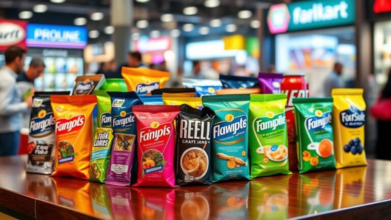
To achieve cohesion across packaging for your product family, start by establishing a strong visual identity that resonates with your target audience. Develop a consistent color palette, typography system, and packaging architecture strategy to create a unified look. Confirm consistent design elements across products, and balance visual hierarchy to guide consumer attention. Furthermore, extend this cohesion across touchpoints, including digital channels, in-store experiences, and advertising. By doing so, you'll build a strong brand presence that drives customer loyalty and trust, and sets you up for success in a competitive market – now, take the next step to make it happen.
Define Your Brand's Visual Identity
With your product family's diverse offerings, establishing a consistent visual identity is crucial to create a cohesive brand image. This visual identity serves as the foundation for your brand's storytelling, conveying your values and personality to customers. By defining your visual identity, you'll guarantee that every product in your family tells a unified story, promoting recognition and loyalty.
To craft a compelling visual identity, focus on developing brand symbolism that resonates with your target audience. This can include icons, patterns, or typography that evoke emotions and create connections. For instance, a nature-inspired brand might incorporate leaf motifs to convey eco-friendliness. Ascertain that these symbols are consistently applied across all products to build a strong brand narrative.
Visual storytelling is key to making your brand identity memorable. By using a mix of imagery, texture, and color, you can create a rich, immersive experience that draws customers in. Consider using bold graphics, custom illustrations, or high-quality product photography to showcase your products in a unique and enthralling way. By doing so, you'll create an emotional connection with your audience, making them more likely to engage with your brand and remember your products.
Establish a Consistent Color Palette
A well-defined color palette is the thread that weaves your product family together, creating an instant sense of recognition and cohesion. It is crucial to establish a consistent color palette that resonates with your brand's visual identity and resonates with your target audience. By doing so, you'll create a visual language that speaks to your customers on an emotional level, driving brand loyalty and recognition.
| Color Emotion | Seasonal Variation | Brand Association |
|---|---|---|
| Warm Neutrals (Beige, Caramel) | Autumn, Winter | Cozy, Inviting, Trustworthy |
| Pastel Hues (Soft Pink, Baby Blue) | Spring, Summer | Playful, Whimsical, Youthful |
| Bold Brights (Electric Blue, Lime Green) | Summer, Autumn | Energetic, Adventurous, Confident |
| Deep Riches (Emerald Green, Navy Blue) | Autumn, Winter | Luxurious, Sophisticated, Professional |
When selecting your color palette, consider the psychological impact of each color on your target audience. Warm neutrals evoke feelings of coziness and trust, whereas bold brights stimulate energy and excitement. You can additionally adapt your color palette to seasonal variations, incorporating softer hues for spring and summer, and richer tones for autumn and winter. By establishing a consistent color palette, you'll create a visual thread that ties your product family together, driving recognition and loyalty. Remember, your color palette is a significant tool that can evoke emotions, convey values, and differentiate your brand in a crowded market.
Select a Unifying Typography System
Typography plays a crucial role in reinforcing your brand's visual identity, and a unifying typography system can instantly improve your product family's cohesion. By selecting a few core fonts that work harmoniously together, you can create a visual thread that ties your products together. This, in turn, helps to build recognition and trust with your customers.
When selecting a unifying typography system, consider the following:
- Stay on top of typography trends: Keep an eye on current design trends and adapt your typography system to guarantee it remains fresh and modern. This will help your brand stay relevant and attractive to your target audience.
- Experiment with font pairing: Pairing fonts can be a strong way to add visual interest to your packaging. Try combining serif and sans-serif fonts or pairing bold and light weights to create contrast.
- Limit your font selection: Although it can be tempting to use a wide range of fonts, limiting your selection to 2-3 core fonts will help to create a cohesive look across your product family. This will likewise make it easier to maintain consistency across different packaging designs.
Develop a Packaging Architecture Strategy
You've established a unifying typography system, now it's time to think about the physical structure of your packaging. A packaging architecture strategy outlines the physical design elements that will be used across your product family. This includes the shape, size, and material of your packaging, in addition to the layout of the labels and branding elements.
To develop your packaging architecture strategy, consider the following key elements:
| Element | Description | Goal |
|---|---|---|
| Packaging Materials | Materials used for packaging, such as paper, plastic, or glass | Sustainable, durable, and cost-effective |
| Structural Design | Shape and size of packaging, including folding, cutting, and creasing | Functional, space-efficient, and visually appealing |
| Label Layout | Placement and organization of branding, product information, and regulatory labels | Clear, concise, and easy to read |
| Closure System | Method of opening and closing packaging, such as zippers, screw-tops, or tear-offs | Convenient, secure, and tamper-evident |
| Special Features | Additional design elements, such as windows, inserts, or dividers | Improve user experience, provide added functionality, or showcase product features |
When developing your strategy, gather customer feedback to understand their needs and preferences. This will help you create packaging that not only looks cohesive but likewise meets the functional needs of your customers. By considering these elements and incorporating customer insights, you can create a packaging architecture strategy that raises your brand and improves the user experience.
Create a Visual Hierarchy of Elements
When creating a visual hierarchy of elements, you'll want to unify your brand visuals by establishing a consistent style for typography, color, and imagery across all products. This helps create a sense of cohesion and makes it easier for consumers to recognize your brand. By balancing the size of elements, such as logos, product names, and imagery, you can guide the consumer's attention and create a clear message.
Unify Brand Visuals
Establishing a cohesive brand identity relies on creating a visual hierarchy of elements, where every design aspect, from logos to labels, works in harmony to reinforce your brand's message. This unity is vital for building brand recognition and creating a lasting impression on your customers.
To unify your brand visuals, focus on the following key elements:
- Consistent Color Palette: Develop a signature color scheme that resonates with your brand's personality and messaging. This will help create instant recognition across all products and packaging.
- Typography: Select a few core fonts that align with your brand's tone and style. This will guarantee consistency in communication and visual storytelling.
- Imagery and Iconography: Establish a distinct visual language through the use of custom illustrations, photography, or icons that reflect your brand's essence.
Balance Element Size
As you work to unify your brand visuals, another important consideration is the balance of element size, which helps create a visual hierarchy of elements. A well-balanced composition guides the consumer's eye through the packaging, emphasizing key information and creating a clear message. To achieve this, pay attention to element proportion – making sure each component is proportional to the others and the overall design. This doesn't mean everything needs to be the same size, but rather that each element should be sized in relation to its importance and the other design elements. Design alignment is likewise essential, as it helps create a sense of harmony and stability. By balancing element size and aligning design elements, you'll create a clear visual flow that communicates your brand's message effectively. This balance will likewise help to eliminate visual noise, making your packaging stand out on crowded shelves. By striking the right balance, you'll create a cohesive look that resonates with your target audience.
Ensure Consistency Across Touchpoints
By extending your visual identity across multiple touchpoints, you create a cohesive brand experience that resonates with your target audience. This is essential for building strong consumer perception and brand recognition. When your visual identity is consistent across all touchpoints, it reinforces your brand's message and values, making it more memorable and trustworthy.
To guarantee consistency across touchpoints, consider the following:
- Digital Channels: Confirm your website, social media, and email marketing campaigns align with your packaging design. This includes using the same typography, color palette, and imagery to create a seamless brand experience.
- In-Store Experience: Extend your visual identity to in-store displays, point-of-purchase materials, and even employee uniforms to create a cohesive brand environment.
- Advertising and Promotions: Align your advertising and promotional materials, such as print ads, billboards, and product demos, with your packaging design to reinforce your brand's message and visual identity.
Frequently Asked Questions
How Do I Balance Brand Consistency With Product Differentiation?
As you navigate the tightrope between brand consistency and product differentiation, bear in mind that your brand is a living, breathing entity – it's not a static identity, but a dynamic evolution. To strike the perfect balance, create a visual hierarchy that showcases your brand's DNA during allowing each product to shine with its unique personality. By doing so, you'll craft a cohesive narrative that tells a story of harmony and distinction, making your products irresistible to customers.
What Is the Ideal Number of Colors for a Palette?
When crafting your color palette, you're not just choosing hues – you're shaping emotions and perceptions. Research suggests 3-5 core colors achieve ideal palette harmony, allowing for visual cohesion without overwhelming the senses. Consider color psychology: warm tones evoke energy, whereas cool tones convey calmness. By limiting your palette, you'll create a focused visual language that resonates with your audience.
Can I Use Different Typography for Digital and Print?
Envision you're at a trendy coffee shop, and the barista hands you a beautifully crafted latte with a font on the cup that's completely different from the sign above the counter. It's jarring, right? Similarly, using different typography for digital and print can create a disjointed brand experience. But, you can make it work if you're intentional about it. Confirm your digital typography is optimized for screens, and your print typography is customized to the physical medium. By doing so, you'll create a cohesive visual language that resonates with your audience across platforms.
How Do I Ensure Packaging Stands Out in a Crowded Shelf?
You want to make your packaging pop in a crowded shelf, right? To grab attention, focus on creating shelf appeal through a clear visual hierarchy. Use contrasting colors, bold typography, and strategic imagery to draw the eye. Don't be afraid to experiment with unique shapes, materials, or finishes that set your brand apart. By balancing creativity with consistency, you'll create a cohesive look that stands out in a sea of sameness and makes your product irresistible to customers.
Can I Update My Packaging Strategy Without Rebranding?
You're stuck between a rock and a hard place – maintaining brand recognition during craving a fresh look. Fear not, updating your packaging strategy doesn't have to mean rebranding. You can refresh your design without losing your identity. Make targeted packaging updates that still feel cohesive with your existing brand. By introducing a unified design language, you'll create a visual thread that ties everything together. It's time to rebirth your brand, not relaunch it.