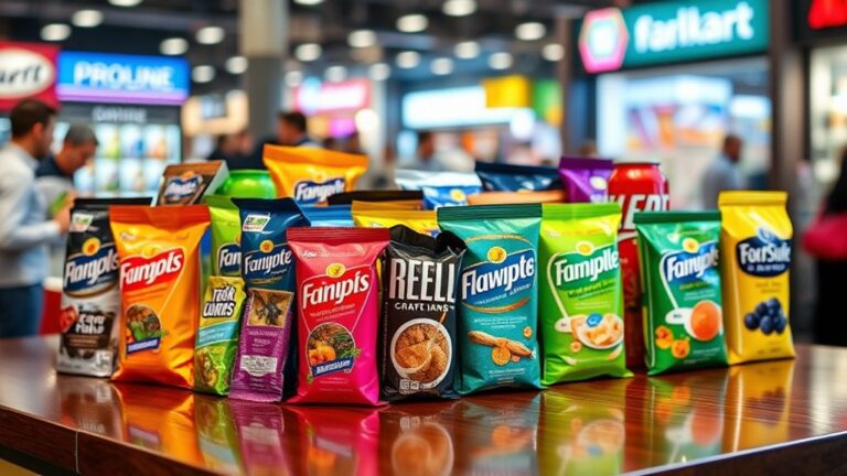
You can make your product stand out on crowded store shelves and online marketplaces by utilizing the emotional impact of bold graphics on packaging. Start by crafting a unique brand visual identity that tells your story and evokes emotions. Choose a bold color palette with contrasting textures to add depth and balance. Select typography that packs a punch, with large, bold fonts and script fonts adding elegance. Relevant, high-quality images will create an emotional connection with your target audience. By combining these elements, you'll create packaging that pops – and now, take it to the next level by exploring the details that will set your brand apart.
Defining Your Brand's Visual Identity
As you commence on crafting your brand's visual identity, consider what sets your product apart from the competition. What makes your brand unique, and how can you convey that through visuals? This is where brand storytelling comes in – it's the narrative that weaves together your brand's values, mission, and personality. Through bold graphics, you can tell a story that resonates with your target audience and sets you apart from the competition.
Visual consistency is key to creating a strong brand identity. Your packaging, website, social media, and advertising should all share a cohesive visual language. This doesn't mean being boring or repetitive; it means using a consistent tone, typography, and color scheme to create a recognizable brand signature. By doing so, you'll build trust and recognition with your audience, making them more likely to engage with your brand.
When developing your visual identity, think about the emotional response you want to evoke in your customers. Do you want to be seen as fun and playful, or sophisticated and luxurious? Your bold graphics should reflect this tone and personality, as well as communicating your brand's values and mission. By marrying brand storytelling with visual consistency, you'll create a strong visual identity that sets your product apart and makes it unforgettable.
Choosing the Right Color Palette
When selecting a color palette for your packaging, you'll want to take into account the basics of color harmony to guarantee your design is visually appealing. You'll furthermore need to decide on bold accent options that'll make your product stand out on crowded shelves. In addition, you should think about neutral backgrounds that'll provide a clean contrast to your bold graphics.
Color Harmony Basics
You're likely familiar with the overwhelming feeling of standing in front of a paint swatch wall, faced with an endless array of colors to choose from. This intimidating task is amplified regarding selecting a color palette for your packaging. Nonetheless, by applying basic color harmony principles, you can create a visually appealing and emotionally resonant design.
Start by grasping the fundamentals of color theory. Identify the colors that evoke the emotional impact you want to achieve with your product. Warm colors like oranges and reds can stimulate excitement, whereas cool colors like blues and greens can convey calmness. Consider the 60-30-10 rule, where a dominant color accounts for 60% of the design, a secondary color accounts for 30%, and an accent color accounts for 10%. This balance creates a harmonious visual flow. Don't be afraid to experiment and adjust your palette until it feels cohesive and aligned with your brand's message. By doing so, you'll be well on your way to crafting a bold and enchanting packaging design that grabs consumers' attention.
Bold Accent Options
Your packaging design's bold accent options can make or break its visual appeal, so it is vital to choose the right color palette that resonates with your target audience. Accent colors can add an extra layer of excitement to your design, but it is important to balance them with your brand's overall aesthetic.
When selecting bold accent options, consider the following:
| Accent Color | Effect on Packaging |
|---|---|
| Bright and bold | Grabs attention, creates energy |
| Deep and rich | Adds sophistication, luxury |
| Pastel and soft | Creates a calming, whimsical feel |
You can likewise experiment with graphic patterns to add visual interest to your packaging. Stripes, polka dots, and geometric shapes can all be used to create a bold, eye-catching design. Remember to choose patterns that complement your accent colors and don't overwhelm the senses. By striking the right balance, you can create packaging that truly pops and resonates with your target audience.
Neutral Backgrounds
Its neutral background sets the tone for your packaging design, providing a clean canvas for your bold accent options to shine. When choosing a neutral color scheme, you're not limited to just white or beige. Consider soft pastels, gentle grays, or creamy whites to create a subtle yet sophisticated look. These hues won't compete with your bold graphics, allowing them to take center stage.
Neutral backgrounds are perfect for minimalist designs, where less is more. By keeping the background simple, you can add visual interest with bold typography, patterns, or graphics. This contrast will make your packaging stand out on crowded shelves. Plus, a neutral background gives you flexibility to experiment with different accent colors and designs, making it easy to refresh your packaging without a complete overhaul. Remember, a neutral background is not about being boring – it's about creating a foundation that lets your brand's personality shine through.
Typography That Packs a Punch
When designing packaging, you'll want to choose bold font choices that grab attention and convey your brand's personality. Don't be afraid to experiment with font sizes, styles, and arrangements to create visual hierarchy and emphasis. By combining bold fonts with careful color contrast, you'll create typography that packs a punch and makes your product stand out on store shelves.
Bold Font Choices
Vibrancy bursts forth from packaging that dares to be different, and bold font choices are a key element in making that happen. You know what grabs attention – modern typography that's not afraid to make a statement. Think impactful lettering that pops, not whispers.
When selecting bold fonts, consider the following:
- Sans-serif fonts: These fonts are clean, modern, and perfect for creating a bold, attention-grabbing look. Try using fonts like Arial, Helvetica, or Futura to add a touch of sophistication to your packaging.
- Script fonts: Script fonts can add a touch of elegance and whimsy to your packaging. Look for fonts like Lobster, Pacifico, or Great Vibes to add a dash of personality to your design.
- Display fonts: Display fonts are designed to be bold, eye-catching, and attention-grabbing. Fonts like Impact, Museo, or Anton can help your packaging stand out on crowded shelves.
Color Contrast Matters
Beyond the bold font choices, it's the strategic use of color contrast that truly makes typography pack a punch. When selecting colors for your packaging, consider the emotional response you want to evoke in your target audience. Color psychology plays a significant role in influencing consumer behavior, so choose colors that align with your brand's personality and values. For instance, blue often conveys trust and reliability, whereas red can evoke feelings of energy and excitement.
To create a visual hierarchy on your packaging, use contrasting colors to draw attention to key information, such as your brand name, product benefits, or calls-to-action. This contrast will guide the consumer's eye through the design, ensuring they focus on the most important details. By balancing contrasting colors, you'll create a visually appealing and harmonious design that resonates with your target audience. Remember, effective color contrast is key to making your packaging stand out on crowded shelves.
Image Selection for Maximum Impact
Selecting the right image for your packaging is crucial, as it can make or break the consumer's decision to buy. The image you choose should not just grab attention but also communicate your brand's message and values. To maximize image impact, you need to take into account the following:
- Relevance: Verify the image is pertinent to your product and target audience. This will help create an instant connection with potential customers.
- Emotional resonance: Choose an image that evokes emotions and creates a sense of nostalgia, excitement, or curiosity. This will make your packaging more memorable and shareable.
- Uniqueness: Avoid clichés and generic images. Instead, opt for something distinctive and creative that sets your brand apart from the competition.
Balancing Boldness With Clarity
Craft a bold visual identity for your packaging by striking the perfect balance between boldness and clarity. You want your design to stand out, but not overwhelm the consumer. To achieve this balance, consider the following principles:
| Design Element | Boldness | Clarity |
|---|---|---|
| Color | Bright, saturated hues | Limited palette, clear contrast |
| Typography | Large font sizes, bold fonts | Clear font hierarchy, legible text |
| Imagery | High-contrast, detailed images | Simple, uncluttered compositions |
| Composition | Dynamic layouts, asymmetry | Visual hierarchy, clear focal point |
| Texture | Embossing, debossing, or spot varnishing | Matte or glossy finishes, subtle texture |
By balancing boldness with clarity, you create a visual identity that's both attention-grabbing and easy to navigate. This balance is essential in establishing a strong brand presence and communicating your product's value to the consumer.
To achieve design simplicity, focus on a clear visual hierarchy and eliminate unnecessary elements. Use bold graphics to draw attention to key information, such as product benefits or brand messaging. By doing so, you create a cohesive design that resonates with your target audience. Remember, the goal is to create a bold design that's not overwhelming, but rather inviting and engaging.
Material Matters: Texture and Finish
Often, the tactile experience of packaging is overlooked, yet it plays a significant role in shaping the consumer's perception of your brand. When you think about it, the feel of a package can evoke emotions and create a connection with the product inside. By incorporating a variety of textures and finishes, you can create a multisensory experience that sets your brand apart.
Here are three ways to make the most of material selection:
- Experiment with texture variety: From rough to smooth, embossed to debossed, the possibilities are endless. Consider how different textures can convey different messages about your brand. For example, a rough texture might evoke a sense of ruggedness, whereas a smooth texture might suggest sophistication.
- Choose finish options that complement your design: Matte, glossy, or metallic – the finish you choose can greatly impact the overall aesthetic of your packaging. Make sure it aligns with your brand's personality and messaging.
- Don't forget about the details: The way a package opens, closes, or is handled can likewise influence the consumer's experience. Consider the weight, flexibility, and durability of your materials to create a cohesive and engaging experience.
Creating Contrast to Stand Out
As you work to make your packaging stand out on crowded shelves, creating contrast becomes a crucial element in your design strategy. You want your product to pop, and contrast is key to making that happen. By incorporating high contrast elements, you can create a visual hierarchy that guides the consumer's eye through your design.
To create contrast, start by choosing a bold, bright color that will draw attention. Then, pair it with a neutral or darker color to create a striking visual effect. You can additionally use contrasting textures, like glossy and matte, to add depth and interest to your design. The key is to make sure your contrasting elements are balanced, so your design doesn't feel overwhelming or chaotic.
High contrast further helps to create a clear visual hierarchy, making it easy for consumers to scan your packaging and quickly understand your brand's message. By using size, color, and texture to create contrast, you can direct the consumer's attention to the most important information, like your brand name or key product benefits. By incorporating contrast into your design, you'll be able to create packaging that truly stands out and grabs attention.
Testing and Refining Your Design
With your bold graphics and contrasting elements in place, it's time to put your design to the test. You've worked hard to create a visually stunning packaging design, but now it's essential to see how it resonates with your target audience. Design testing is a vital step in refining your design, and it's where the magic happens.
- Gather feedback: Share your design with a focus group, online community, or even friends and family to get their honest opinions. Ask open-ended questions to spark meaningful conversations.
- Analyze and iterate: Take the feedback you've collected and identify areas for improvement. Make adjustments, refine your design, and repeat the testing process until you've achieved the desired outcome.
- Create a feedback loop: Establish a continuous cycle of testing, refining, and testing again. This loop will help you fine-tune your design, ensuring it effectively communicates your brand's message and resonates with your target audience.
Frequently Asked Questions
Can I Use Bold Graphics on Packaging for Luxury or High-End Products?
Can you really afford to blend in with the crowd when you're targeting high-end consumers? Probably not. In terms of luxury branding, bold graphics on packaging can be a game-changer. By incorporating striking visuals, you create a visual impact that screams exclusivity and sophistication. Think sleek lines, metallic accents, and lively hues that stop shoppers in their tracks. You're not just selling a product; you're offering an experience that demands attention and commands respect. So, go ahead and make a statement – your luxury customers will appreciate it.
How Do I Ensure Bold Graphics Don't Overwhelm the Product Information?
When incorporating bold graphics into your design, you'll want to guarantee they don't overshadow the product information. To strike a balance, focus on creating a clear information hierarchy. You'll do this by determining the most critical details, like product name and benefits, and making them prominent. Then, use your bold graphics to draw attention to these key points, rather than overwhelming them. By achieving graphic balance, you'll create a visually appealing design that effectively communicates your product's value.
Do Bold Graphics Work Well With Minimalist or Simple Packaging Designs?
When you're considering a minimalist packaging design, you might wonder if bold graphics will clash with the simplicity. But here's the thing: bold graphics can actually improve minimalist aesthetics by creating graphic harmony. By balancing bold elements with clean lines and negative space, you'll create a visually striking contrast that draws the eye to your product. It's all about finding that sweet spot where bold meets simplicity.
Can I Use Bold Graphics on Packaging for Products With Small Surface Areas?
Did you know that 72% of consumers say packaging design influences their purchasing decision? When dealing with products that have small surface areas, you're right to wonder if bold graphics are still an option. The truth is, small surface challenges can actually spark creative design solutions. You can use bold graphics on smaller packaging by focusing on simple, yet impactful designs that make a statement, like a bold color block or a stylized logo. This will help your product stand out, even in a crowded shelf.
Are Bold Graphics Suitable for Packaging That Requires a Lot of Text?
When dealing with packaging that requires a lot of text, you'll want to strike a balance between bold graphics and text readability. You don't want your message to get lost in a sea of visuals. Achieve graphic balance by using clear typography, concise language, and strategically placed graphics that complement your text. By doing so, you'll create packaging that's both informative and attention-grabbing, making your product stand out on crowded shelves.