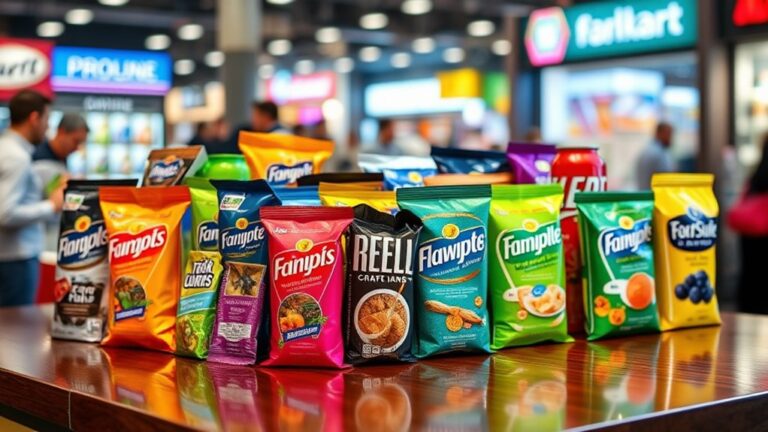
When it comes to packaging design, colors play an essential role in evoking emotions in consumers. Different hues can stimulate excitement, convey trust, or even create a sense of calmness. Bold colors like orange and yellow can energize, while soft hues like blue and green can soothe. Neutral colors, meanwhile, can create stability and trustworthiness. By carefully selecting colors that align with their brand identity and target audience, companies can build a strong emotional connection with consumers. By understanding the psychology behind colors, brands can craft packaging that resonates with their audience and drives sales – and there's more to explore on this journey.
Understanding Color Psychology Basics
Delving into the world of color psychology, researchers have long explored how different hues can influence human emotions and behaviors. It's no secret that colors can evoke feelings, from calmness to excitement, and even affect our purchasing decisions. When it comes to packaging, understanding color psychology basics is vital for creating an emotional connection with consumers.
Color trends play a significant role in evoking emotions, and designers must stay on top of these trends to create impactful packaging. For instance, bold and bright colors like orange and yellow can stimulate emotions like excitement and energy, while softer hues like blue and green can convey feelings of trust and serenity. By incorporating these colors into packaging design, brands can create an emotional resonance with their target audience.
Effective design principles are also essential in harnessing the power of color psychology. Contrast, harmony, and balance are key principles that designers should consider when selecting colors for packaging. By applying these principles, brands can create visually appealing packaging that not only grabs attention but also resonates with consumers on an emotional level. By understanding the basics of color psychology, designers can create packaging that drives consumer engagement, builds brand loyalty, and ultimately, boosts sales.
Choosing Colors for Brand Identity
When choosing colors for brand identity, companies must carefully select a palette that accurately represents their values and resonates with their target audience. The brand color palette plays an essential role in creating an emotional connection with consumers, and it's important to take into account the emotional response desired from customers. By understanding the emotional connection goals, brands can create a cohesive visual identity that effectively communicates their message.
Brand Color Palette
Selecting a brand color palette is an essential step in establishing a brand's visual identity, as it communicates the brand's personality, values, and tone to its target audience. A well-curated palette can evoke emotions, build brand recognition, and create a lasting impression. When building a brand color palette, it's important to take into account the brand's mission, target audience, and industry. A palette that resonates with the target audience can increase brand loyalty and trust.
As a brand evolves, its color palette may need to adapt. This is where color evolution comes in – making subtle changes to the palette to keep it fresh and relevant. Palette expansion is another significant aspect, where additional colors are added to the core palette to provide more design flexibility. This allows brands to create a consistent visual language across various touchpoints, from packaging to marketing materials. By carefully selecting and refining a brand color palette, businesses can establish a strong visual identity that sets them apart from the competition and drives emotional connections with their audience.
Emotional Connection Goals
A brand's emotional connection goals serve as the foundation for choosing colors that authentically represent its personality and values, ultimately influencing how consumers perceive and respond to its brand identity. By defining these goals, brands can create an emotional resonance with their target audience, fostering a deeper connection that drives loyalty and advocacy. Emotional connection goals can be categorized into two primary objectives: empathy building and emotional resonance. Empathy building focuses on creating a sense of understanding and shared values between the brand and its audience, while emotional resonance aims to evoke specific feelings or emotions that align with the brand's personality and message. By prioritizing these goals, brands can select colors that not only appeal to their target audience but also communicate their values and personality. This strategic approach to color selection enables brands to build a strong emotional connection with their audience, ultimately driving business success.
The Psychology of Neutral Colors
Neutral colors, often overlooked in favor of bold hues, subtly influence consumer emotions and purchasing decisions by evoking feelings of calmness, serenity, and balance. These understated shades can be incredibly powerful in packaging design, as they create a sense of stability and trustworthiness. By incorporating neutral backgrounds, brands can effectively communicate a sense of sophistication and luxury, making their products more appealing to discerning consumers.
Color neutrality is key in creating a sense of calmness, allowing the product to take center stage. Neutral colors like beige, gray, and white can help to reduce visual noise, making it easier for consumers to focus on the product's features and benefits. This is particularly important in industries where consumers are overwhelmed by choice, such as in beauty or wellness products. By using neutral colors, brands can create a sense of clarity and simplicity, making it easier for consumers to make informed purchasing decisions.
Furthermore, neutral colors can be used to convey a sense of timelessness and versatility. Unlike bold colors, which can quickly become outdated, neutral colors remain relevant and fresh, even as trends come and go. By incorporating neutral colors into their packaging design, brands can create a sense of continuity and consistency, making their products more appealing to consumers who value longevity and quality.
Energetic Colors for Youthful Brands
When creating packaging for youthful brands, designers often turn to energetic colors to capture the attention of their target audience. Bright and bold hues, such as neon pink and electric blue, can instantly convey a sense of playfulness and energy. By incorporating vibrant color schemes into their designs, brands can effectively communicate their fun and lively personalities.
Bright and Bold Hues
Bright and bold hues, often associated with energy and playfulness, immediately capture the attention of young consumers and align perfectly with youthful brands seeking to evoke excitement and dynamism. These vibrant colors are reminiscent of summer vibes and festival atmospheres, conjuring up feelings of freedom and joy. Brands can leverage these emotions by incorporating bright and bold hues into their packaging, creating an instant connection with their target audience. For instance, a bright orange or yellow can evoke the excitement of a summer music festival, while a bold pink or blue can capture the playfulness of a backyard BBQ. By using these colors, brands can create a sense of urgency and energy, encouraging young consumers to take action and engage with their products. Ultimately, bright and bold hues are a powerful tool for youthful brands looking to make a statement and stand out in a crowded market.
Vibrant Color Schemes
By incorporating vibrant color schemes into their packaging, youthful brands can amplify the emotional connection with their target audience, building on the energy and excitement generated by bright and bold hues. Vibrant colors have the power to evoke feelings of excitement, playfulness, and adventure, making them perfect for brands that want to connect with a younger demographic. Think summer vibes, electric accents, and bold statements that grab attention and refuse to let go.
To create a vibrant color scheme, brands can combine bright, saturated colors with neutral backgrounds to create visual interest. Neon pink, electric blue, and sunshine yellow are all great options for adding a pop of color to packaging. By using these colors strategically, brands can create an emotional connection with their audience, conveying a sense of fun, energy, and excitement. The key is to balance bold colors with neutral elements to avoid overwhelming the senses. When done correctly, vibrant color schemes can be a powerful tool for youthful brands looking to make a statement and leave a lasting impression.
Calming Colors for Wellness Products
Calming colors like light blue and pale green dominate the packaging of wellness products to evoke feelings of serenity and relaxation. These soothing hues are carefully selected to create a sense of calmness, helping consumers unwind and rejuvenate. By incorporating nature-inspired colors, wellness brands can transport their customers to a tranquil state, reminiscent of a peaceful Nature Escapes. The subtle use of pale shades creates a sense of softness, mirroring the Soothing Textures often associated with wellness products.
Light blue, in particular, is a popular choice for wellness packaging as it conveys a sense of trust and stability. It's often paired with creamy whites or beiges to create a calming contrast. Pale green, on the other hand, is reminiscent of nature and growth, evoking feelings of balance and harmony. When used together, these calming colors create a sense of synergy, promoting a deeper connection between the consumer and the product.
Luxury Brands and Sophisticated Hues
Many high-end brands opt for sophisticated hues, such as rich jewel tones and metallic accents, to convey luxury and refinement in their packaging. These colors evoke feelings of exclusivity, opulence, and prestige, making them perfect for luxury brands seeking to create a sense of high-end aesthetics. By incorporating these colors into their packaging design, brands can create a sense of superiority and distinction, setting themselves apart from more affordable options.
Luxury brands often combine rich colors with exclusive materials, such as velvet, leather, or wood, to create a truly premium unboxing experience. The tactile sensation of these materials, paired with the sophisticated colors, creates a sensory experience that's hard to forget. For instance, a luxury perfume brand might use a rich, emerald green color scheme paired with a velvet-covered box to evoke feelings of glamour and sophistication.
High-end brands understand that the packaging is an extension of their brand identity, and that the right colors can elevate their products to new heights. By choosing colors that convey luxury and refinement, these brands can create a sense of exclusivity and prestige, making their products desirable to consumers seeking a high-end experience. Whether it's a premium skincare line or a luxury fashion brand, sophisticated hues and exclusive materials can help create a truly unforgettable packaging experience.
Color Harmony in Packaging Design
Their packaging design's success often hinges on achieving perfect color harmony, as it can make or break the emotional connection consumers form with a product. When colors work together in harmony, they create a visually appealing and cohesive look that draws the consumer in. On the other hand, clashing colors can be jarring and off-putting, causing consumers to quickly lose interest.
To achieve color harmony, designers must strike the right balance between contrasting and complementary colors. This is where color balance comes in – finding the perfect ratio of light to dark, warm to cool, and saturated to muted tones. When done correctly, color balance creates a sense of visual flow, guiding the consumer's eye through the packaging and highlighting key features and benefits.
Color harmony can be achieved through various techniques, including analogous, complementary, and triadic color schemes. Analogous colors, for example, are those that are next to each other on the color wheel, creating a smooth and cohesive look. Complementary colors, on the other hand, are those that are opposite each other on the color wheel, creating a bold and dynamic effect.
Avoiding Cultural Color Misconceptions
Nearly 80% of consumers admit that color plays a significant role in their purchasing decisions, yet cultural color misconceptions can easily derail a product's global appeal. Color stereotypes can lead to a brand's demise in a foreign market, making it essential to understand the nuances of different cultures.
When it comes to global packaging, it's vital to avoid cultural color misconceptions. Here are a few key considerations:
- White is not always pure: In many Asian cultures, white is associated with mourning, making it an inauspicious color for packaging.
- Red is not always energetic: While red is often linked with energy and passion in Western cultures, it's associated with good luck and prosperity in many Asian cultures.
- Green is not always natural: In Islamic cultures, green is a sacred color, while in Mexico, it's associated with independence.
- Black is not always mourning: In many African cultures, black is a symbol of fertility and prosperity.
To avoid cultural color misconceptions, it's essential to conduct thorough market research and understand the global nuances of color. By doing so, brands can create packaging that resonates with their target audience, regardless of their cultural background. By understanding the subtleties of color, brands can tap into the emotions and values of their customers, ultimately driving sales and brand loyalty.
Measuring the Emotional Impact
Eighty-five percent of consumers form an opinion about a product within 90 seconds of seeing its packaging, and a significant portion of that opinion is influenced by the emotions evoked by its colors. This makes it vital for brands to measure the emotional impact of their packaging colors. Emotion tracking is a valuable tool in this regard, allowing brands to gauge how their target audience responds to different colors and color combinations. By analyzing facial expressions, heart rates, and other physiological responses, emotion tracking provides insight into the emotional resonance of a product's packaging.
Impact analysis takes this a step further, examining how the emotional response to packaging colors translates into consumer behavior. Does a particular color scheme increase the likelihood of purchase? Do certain colors drive loyalty or encourage repeat business? By answering these questions, brands can refine their packaging design to maximize its emotional impact. With the right tools and data, brands can create packaging that resonates with their target audience on a deep emotional level, driving sales and building brand loyalty. By measuring the emotional impact of packaging colors, brands can leverage the full potential of their products and gain a competitive edge in the market. Furthermore, incorporating emotional design principles for impact allows brands to craft visually appealing packages that not only attract attention but also evoke specific feelings that align with their brand identity. This strategic alignment ensures that consumers make positive associations with the product, enhancing their overall experience and increasing the likelihood of advocacy. As brands continue to innovate and prioritize psychological insights, they can forge stronger connections with consumers, ultimately leading to lasting success in a competitive landscape.
Frequently Asked Questions
Can I Use My Favorite Color for My Brand's Packaging?
Can she use her favorite color for her brand's packaging? It's a tempting idea, but she must consider the bigger picture. Using a personal favorite might create a personal connection, but it's essential to prioritize brand authenticity. Does her favorite color genuinely align with her brand's values and message? If not, it's important to put the brand's needs above personal preferences to guarantee a cohesive and powerful brand image.
How Do I Ensure Color Consistency Across All Products?
As she gazes at her product lineup, she envisions a cohesive army of packaging, each one a precise reflection of the last. To accomplish this visual harmony, she establishes Color Standards, meticulous guidelines that dictate the exact shade, hue, and saturation of every color. With Digital Proofing, she guarantees accuracy, verifying that each production run meets her exacting standards. This attention to detail yields a brand identity that exudes consistency and power.
Are There Any Colors That Universally Evoke the Same Emotion?
She explores whether colors universally evoke the same emotion. While personal experiences and cultural associations influence emotional resonance, research suggests some colors have universal effects. For instance, red often stimulates feelings of energy and passion, while blue typically evokes calmness and trust. However, it's crucial to take into account the target audience's cultural background to make sure the chosen color resonates with them.
Can I Use Bright Colors for a Luxury Brand's Packaging?
Like a masterful conductor, she orchestrates the harmony of her brand's packaging, questioning the role of bright colors in luxury branding. Can she pull off a high-end surprise, shattering the stereotype that luxury equals muted tones? It's a pivotal move, but contrast statements can be powerful. Bright colors can add a touch of whimsy, making the brand more relatable and human. However, it's essential to balance vibrancy with sophistication to maintain the luxury essence. She must walk the fine line between excitement and elegance.
Do I Need to Consider Colorblind Individuals When Designing Packaging?
She makes sure that her designs cater to all, including the 8% of men and 0.5% of women with color vision deficiency. By considering colorblind individuals, she meets accessibility standards, demonstrating design empathy. Her inclusive approach doesn't compromise aesthetics, as she cleverly uses contrasting colors and clear typography to create a visually appealing and readable design that resonates with everyone.