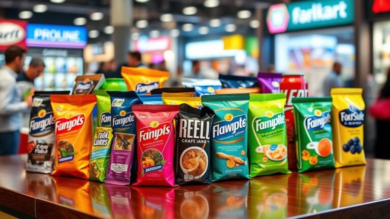
You can create elegant packaging solutions by utilizing the strength of negative space, which guides the viewer's attention, conveys sophistication, and emphasizes product features and brand values. By embracing simplicity, classic typography, and harmonious colors, you can evoke a sense of refinement. Balancing text and imagery, establishing a visual hierarchy, and using contrast and symmetry will further improve your design. Remember to experiment with text alignment, imagery, and color psychology to create a lasting impression. As you master the art of negative space, you'll reveal the mysteries to packaging that truly stands out – and discover how to make your brand truly unforgettable.
Understanding the Power of Negative Space
As you gaze at a beautifully crafted package, your eyes are drawn to the empty areas around and between the design elements – the negative space. This subtle yet influential component of visual communication can raise your packaging design from ordinary to extraordinary. By intentionally incorporating negative space, you can create a sense of sophistication, calmness, and modernity.
Negative space is not just about empty areas; it's about creating a harmonious balance between the design elements and the empty space around them. When done correctly, it guides the viewer's attention to the most important information, making your message more effective. It's crucial to keep in mind that negative space is not just a lack of content, but rather a deliberate design choice that improves the overall visual communication.
In packaging design, negative space can be used to create a sense of luxury, emphasize a product's features, or even convey a brand's values. By thoughtfully using negative space, you can create a design that's both aesthetically pleasing and effective in communicating your message. So, don't underestimate the influence of negative space – use it to your advantage to create packaging that truly stands out on store shelves.
Defining Elegance in Packaging Design
Many packaging designs aim for elegance, but few achieve it. You may wonder what sets apart the elegant designs from the rest. The answer lies in grasping the elegance definition and its application in packaging design.
Elegance is often associated with sophistication, refinement, and a sense of luxury. In packaging design, elegance is achieved when the design elements come together to create a cohesive, harmonious, and visually appealing whole. It's not just about adding ornate details or using high-end materials; elegance is about restraint, simplicity, and attention to detail.
To better comprehend what contributes to elegance in packaging design, let's break it down into key elements:
| Element | Description |
|---|---|
| Simplicity | Uncluttered design, minimal text, and ample negative space |
| Typography | Classic fonts, careful font pairing, and judicious use of font sizes |
| Color Palette | Limited, harmonious colors that evoke a sense of sophistication |
| Imagery | High-quality, thoughtfully selected images that improve the design |
Balancing Text and Imagery
You've mastered the art of simplicity and typography, and selected a sophisticated color palette – now it's time to balance text and imagery. This vital step guarantees your packaging design doesn't feel cluttered or overwhelming. When combining text and imagery, it's important to create a harmonious relationship between the two.
To achieve balance, consider the following strategies:
- Play with text alignment: Experiment with centered, left-aligned, or right-aligned text to create visual interest and guide the viewer's attention.
- Choose typography wisely: Select typography that complements your imagery, and use font sizes, styles, and colors to create a clear hierarchy of information.
- Use imagery to support text: Make certain your imagery reinforces the message conveyed by your text, rather than distracting from it.
- Leave space to breathe: Don't be afraid to leave some negative space around your text and imagery to create a sense of calm and sophistication.
- Create visual flow: Use size, color, and placement to create a visual flow that leads the viewer's eye through your design.
Creating Visual Hierarchy Effect
When designing packaging with negative space, you're likely aiming to create a visual hierarchy effect that guides the consumer's attention. To achieve this, you'll want to balance and harmonize the elements on your packaging to create a clear focal point, drawing the eye to the most important information. By doing so, you'll effectively communicate your brand's message and make your product stand out on crowded shelves.
Balance and Harmony
Beyond the visual appeal of negative space, it likewise plays a crucial role in creating a sense of balance and harmony in packaging design. You can achieve this by cleverly using negative space to create visual symmetry, which is vital for guiding the viewer's attention. By doing so, you'll create a sense of spatial awareness, making your packaging design more engaging and aesthetically pleasing.
Here are some key considerations to keep in mind:
- Visual Symmetry: Use negative space to create a sense of balance by dividing your design into equal parts or using symmetrical elements.
- Spatial Awareness: Create a sense of depth and dimension by using negative space to separate elements and create a clear visual hierarchy.
- Contrast: Use contrasting colors, textures, and shapes to create visual interest and draw attention to specific elements.
- Alignment: Align elements along a central axis or grid to create a sense of harmony and balance.
- Restraint: Don't be afraid to leave some areas blank – restraint is key to creating a harmonious and balanced design.
Focal Point Creation
By incorporating negative space into your packaging design, you're not merely creating balance and harmony, but furthermore crafting a visual hierarchy that directs the viewer's attention. A well-designed visual hierarchy helps create a focal point, drawing the viewer's eye to the most important information. This focal point can be achieved through various techniques, including size, color, and placement.
| Technique | Description | Visual Interest |
|---|---|---|
| Scale | Use larger or smaller elements to create visual hierarchy | High |
| Color | Contrast colors to draw attention to key information | Medium |
| Placement | Strategically place elements to guide the viewer's eye | Low |
Using White Space for Emphasis
When you use white space for emphasis, you're creating a visual hierarchy that guides the consumer's eye to the most important information. By introducing contrast and clarity through strategic blank areas, you're able to break up busy designs and make your message stand out. By embracing the silence of white space, you're giving your packaging a chance to breathe, making it more engaging and effective.
Visual Hierarchy Creation
Effective packaging design relies on creating a visual hierarchy to guide the consumer's attention. By using negative space effectively, you can create a clear order of importance, drawing the consumer's eye to the most critical information. This visual balance is crucial in communicating your brand's message and values.
To create a visual hierarchy, consider the following design principles:
- Size: Use varying font sizes and element dimensions to create a clear order of importance.
- Color: Employ a color hierarchy, with the most critical information standing out through bold or bright colors.
- Position: Place the most important elements in the most prominent positions, such as the top or center of the packaging.
- White Space: Use negative space to create a clear separation between elements and guide the consumer's attention.
- Typography: Choose typography that aligns with your brand's personality and message, and use it consistently throughout the design.
Contrast for Clarity
As you arrange the visual elements on your packaging, contrast becomes a crucial aspect of guiding the consumer's eye. By strategically using contrast techniques, you can create visual interest, draw attention to key information, and improve clarity. One effective way to achieve contrast is by incorporating white space, which serves as a potent tool for emphasis. By placing important elements against a clean, minimalist background, you can make them stand out and increase their visual impact.
To take it a step further, experiment with different typography, color schemes, and image treatments to create contrast. For instance, pair bold fonts with lighter ones, or combine warm colors with cool tones. This visual tension will help capture the consumer's attention and direct it to the most critical information. By balancing contrast with white space, you'll create a harmonious visual experience that's both aesthetically pleasing and easy to navigate. By doing so, you'll effectively improve clarity and make your packaging design more engaging and effective.
Silence Is Golden
By strategically leaving areas of your packaging design empty, you're creating an opportunity to amplify the significance of surrounding elements. This silence is golden, as it allows the viewer's eye to focus on the vital information. In an era where minimalism principles are gaining traction, incorporating white space into your design can uplift your brand's aesthetics and create a sense of sophistication.
Here's how you can leverage the strength of silence in your packaging design:
- Create visual hierarchy: Use empty space to guide the viewer's attention to key elements, such as logos, product names, or calls-to-action.
- Enhance readability: Ample white space makes text easier to read, reducing visual noise and improving the overall user experience.
- Convey luxury and elegance: Minimalist designs often associate with high-end brands, implying quality and refinement.
- Improve navigation: White space helps separate different sections and features, making it simpler for customers to navigate your packaging.
- Encourage engagement: By creating a sense of calm, you're more likely to hold the viewer's attention and encourage them to interact with your product.
Simplifying Complex Designs
When you're tasked with packaging a product that has a multitude of components, features, or intricate details, the design can quickly become overwhelming. The natural inclination is to showcase every aspect of the product, but this approach often results in cluttered and confusing packaging. Instead, consider embracing negative space to simplify complex designs.
By incorporating negative space, you can create a sense of breathing room around the product, allowing the consumer's eye to focus on the vital elements. This minimalist approach not only reduces visual noise but likewise creates a sense of sophistication and elegance. Design psychology plays a significant role in this process, as a clutter-free design can evoke feelings of calmness and serenity, making the product more appealing to the consumer.
To achieve this, start by identifying the vital features of the product and prioritize them. Use negative space to create a clear visual hierarchy, guiding the consumer's attention to the most critical elements. By doing so, you'll create a design that's both visually striking and easy to navigate. Remember, sometimes less is more, and embracing simplicity can lead to a more effective and compelling packaging design.
Highlighting Key Product Features
When designing packaging, you'll want to focus on key elements that showcase your product's unique benefits. By creating a visual hierarchy, you'll guide the consumer's eye to the most important features, making it easier for them to understand what sets your product apart. By balancing text and space, you'll guarantee that these key elements stand out without overwhelming the viewer.
Focus on Key Elements
Effective packaging design should prioritize showcasing your product's unique selling points, and negative space can be a strong tool in doing so. By focusing on key elements, you can create a clean and minimalist design that draws attention to what matters most.
When selecting key elements, consider the following:
- Identify the most important features that set your product apart from the competition
- Use clear and concise language to communicate these benefits
- Confirm that key elements are prominently displayed and easy to read
- Balance text with visuals to create visual interest
- Limit the number of key elements to avoid overwhelming the consumer
Create Visual Hierarchy
Creating a visual hierarchy in your packaging design helps you to strategically organize key product features, guiding the consumer's eye to what's most important. This is essential in creating an elegant packaging solution that effectively communicates your product's value. By establishing a clear visual hierarchy, you're able to prioritize the most significant information, making it easy for consumers to quickly understand your product's benefits.
To achieve visual balance, consider the spatial relationships between elements on your packaging. Use size, color, and typography to create a clear order of importance. For instance, use larger font sizes and bold typography to draw attention to key features, such as product claims or unique selling points. Balance these prominent elements with negative space to avoid visual clutter and create a sense of harmony. By thoughtfully arranging your design elements, you'll create a clear visual flow that guides the consumer's eye through your packaging, ensuring they focus on the most significant information.
Balance Text and Space
By balancing text and space, you can strategically highlight key product features, making them stand out and grab the consumer's attention. This delicate balance is essential in creating elegant packaging solutions that communicate effectively with your target audience. When done correctly, balanced text and space can raise your product's perceived value and differentiate it from competitors.
To achieve this balance, consider the following:
- Text alignment: Experiment with different text alignments to create visual interest and guide the consumer's eye to key product features. Centered text can create a sense of luxury, whereas left-aligned text can create a sense of modernity.
- Font choice: Select fonts that are easy to read and align with your brand's personality. Sans-serif fonts are great for digital products, whereas serif fonts are better suited for luxury or traditional products.
- Contrast: Use contrasting colors and font sizes to draw attention to key product features and create visual hierarchy.
- White space: Don't be afraid to use white space to create a clean and minimalist design that lets your product features shine.
- Typography: Use typography to create visual interest and emphasize key product benefits.
Designing for Shelf Appeal
What catches your eye when scanning a crowded store shelf? It's likely the packaging that stands out from the competition, grabbing your attention with a clever use of negative space. When designing for shelf appeal, you need to take into account how your product will be displayed among numerous others, often with limited space. Effective shelf organization is vital, and negative space can be your secret weapon.
By strategically using empty space, you can create a sense of simplicity and sophistication, making your product more noticeable amidst the clutter. This, in turn, boosts product visibility, drawing consumers in and encouraging them to learn more about your brand. A well-designed package can even influence purchasing decisions, as customers are more likely to trust a product that looks premium and well-crafted.
To maximize shelf appeal, experiment with different layouts, typography, and imagery that incorporate negative space. Reflect on the shape and size of your package, ensuring it stands out without overwhelming the surrounding products. Don't be afraid to leave some areas blank – this empty space can create a significant visual contrast, making your design more memorable and attention-grabbing. By embracing negative space, you can create packaging that truly pops on the shelf, giving your brand a competitive edge in the marketplace.
Combining Negative Space With Color
When you pair negative space with a thoughtful color scheme, the results can be striking. By combining these two design elements, you can create packaging that not just catches the eye but additionally communicates your brand's message effectively.
Color psychology plays a significant role in packaging design, as different colors evoke distinct emotions and associations in consumers. For instance, blue is often associated with trust and reliability, whereas green is linked to nature and freshness. By selecting a color scheme that aligns with your brand's values and personality, you can create an emotional connection with your target audience.
In minimalist design, negative space and color work together seamlessly. By using a limited color palette and strategically incorporating negative space, you can create a clean, sophisticated look that allows your product to take center stage. Here are some ways to combine negative space with color for elegant packaging solutions:
- Use a bold, contrasting color for your branding elements, such as logos or typography, to create visual interest against a negative space background.
- Select a dominant color that resonates with your brand's message and use it sparingly, allowing negative space to provide balance and harmony.
- Experiment with gradient effects or ombre techniques to add depth and visual interest to your packaging design.
- Employ a neutral color palette with pops of bold color to create a modern, sophisticated look.
- Use color blocking to create a sense of hierarchy and organization, guiding the consumer's eye through the packaging design.
Avoiding Clutter and Distractions
A cluttered design can be overwhelming, like a busy city street at rush hour, making it difficult for your product to stand out. You want your packaging to grab attention, not overwhelm it. That's where the strength of negative space comes in. By incorporating empty space into your design, you can create a sense of calm and focus.
To avoid clutter and distractions, adopt a minimalist design approach. Strip away unnecessary elements, and let the fundamental features shine. This clutter reduction strategy will help your product stand out and communicate its value more effectively. Think of it as a breath of clean air amidst the visual noise.
When designing your packaging, ask yourself: what's the minimum amount of information needed to convey the message? What can be removed without compromising the overall impact? By doing so, you'll create a clean and uncluttered design that lets the product speak for itself. Remember, negative space is not just about the absence of elements; it's about creating a sense of harmony and balance.
Establishing Brand Identity
Establish a strong brand identity by leveraging negative space in your packaging design. By incorporating negative space, you can create a visual language that resonates with your target audience and sets your brand apart from the competition.
To establish a strong brand identity, consider the following strategies:
- Simplify your design: Use negative space to eliminate clutter and distractions, allowing your brand's message to shine through.
- Create a visual hierarchy: Organize your design elements in a way that guides the viewer's attention to the most important information, such as your brand's name or logo.
- Use typography effectively: Select font styles and sizes that align with your brand's personality and values, and use negative space to create visual interest.
- Incorporate brand colors: Use your brand's color palette consistently across all packaging designs to reinforce brand recognition.
- Tell a story: Use negative space to create a narrative around your brand, conveying your values and mission through visual storytelling.
Measuring the Impact of Negative Space
When measuring the impact, pay attention to space utilization. Are you using negative space efficiently to create a clean and minimalist design? Is the empty space drawing attention to your brand logo or key messaging? By evaluating the effectiveness of your negative space design, you can refine your approach and make data-driven decisions to optimize your packaging for better brand recognition and customer engagement. By doing so, you'll be able to create a lasting impression on your customers and set your brand apart from the competition.
Frequently Asked Questions
Can I Use Negative Space With Bold or Bright Colors?
You crave a pop of personality in your packaging, and rightfully so. Can you pair bold or bright colors with negative space? Absolutely! In fact, contrasting colors can create a mesmerizing visual tension. Color psychology plays a significant role here, as bold hues can evoke emotions and draw attention. By balancing bright colors with negative space, you'll achieve design contrast that's both striking and sophisticated. So, go ahead and experiment with lively colors – your packaging will thank you!
How Do I Balance Negative Space With Product Photography?
When incorporating product photography into your design, you'll want to balance negative space with visual appeal. To do this, focus on product visibility by using composition techniques like the rule of thirds or leading lines to draw attention to the item. Don't be afraid to experiment with angles and lighting to create depth and interest. By striking a balance between negative space and visual cues, you'll create a visually stunning design that showcases your product in the best possible light.
Can Negative Space Be Used for Food Packaging Designs?
Envision walking into a trendy cafe and spotting a sleek, minimalist coffee cup with plenty of negative space. The design is so striking that it makes you want to 'gram it. That's the strength of negative space in food branding! You can use it to create visually stunning packaging designs that stand out on store shelves. By incorporating plenty of empty space, you can create a clean, sophisticated look that screams high-end quality. So, don't be afraid to get creative with negative space in your food packaging designs – your customers will thank you!
Is Negative Space Only Suitable for Luxury or Premium Products?
You might think that negative space is only reserved for luxury or premium products, but that's not entirely true. Although it's true that minimalist design can raise brand perception, negative space can be used effectively in various product categories. By cleverly using empty space, you can create a clean, modern aesthetic that resonates with any target audience. So, don't limit yourself – explore how negative space can improve your packaging design, regardless of the product's price point.
Can I Use Negative Space in Packaging for E-Commerce Sales?
Are you kidding me? You think negative space is only for upscale boutiques? Think again! You can totally use negative space in packaging for e-commerce sales to enhance your brand's online presence. By incorporating negative space techniques, you'll create a sleek, modern design that screams "premium" – even on a budget. This e-commerce branding hack will set you apart from the competition and make your product stand out in a crowded online market.