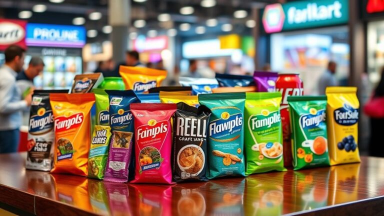
To create eye-catching packaging designs, designers leverage various secrets. They tap into color psychology to evoke emotions and influence purchasing decisions. Strategic typography complements brand personality and messaging, while contrast and harmony balance visual interest and stability. Material selection tells stories, evokes emotions, and appeals to sustainability and luxury. Unconventional shapes and sizes disrupt norms, and messaging techniques craft resonant narratives. Texture, too, plays a pivotal role in sensory storytelling. By balancing creativity and convention, designers can break the rules and create truly attention-grabbing designs. Now, it's time to explore the finer details of these design elements and uncover the secrets to making packaging truly unforgettable.
Color Psychology in Packaging Design
Colors on packaging can instantly evoke emotions, convey brand personality, and even influence purchasing decisions, making color psychology an essential aspect of packaging design. It's no secret that different colors can elicit distinct emotional responses in consumers, and savvy designers know how to harness this power to drive sales. For instance, red is often associated with energy and passion, while blue is linked to trust and reliability. However, it's vital to take into account cultural associations when selecting colors, as meanings can vary greatly across different regions and demographics. What resonates with one audience may not resonate with another.
To maximize the impact of color psychology, designers must also take into consideration contextual relevance. The color palette that works for a premium product may not be suitable for a budget-friendly alternative. Additionally, the colors used on packaging should align with the brand's overall aesthetic and messaging to create a cohesive brand identity. By carefully selecting colors that resonate with their target audience and align with their brand's personality, designers can create packaging that not only grabs attention but also drives conversions. By mastering the art of color psychology, brands can gain a competitive edge in the marketplace and leave a lasting impression on their customers.
Typography That Grabs Attention
As designers leverage the emotional power of color, they must also carefully select typography that complements their brand's personality and messaging, as the right font can make a product stand out on crowded shelves. Typography plays an essential role in communicating a brand's values and resonating with its target audience. To create impactful packaging, designers should focus on crafting a font hierarchy that guides the consumer's attention. This involves selecting a dominant font for headings, a secondary font for body text, and an accent font for emphasis. By establishing a clear font hierarchy, designers can create visual harmony and make sure that key messaging is communicated effectively.
Additionally, designers should pay attention to letter spacing, also known as kerning, to enhance the readability and aesthetics of their typography. Proper letter spacing can make text more legible, especially when used in conjunction with bold or italic fonts. Moreover, designers can use letter spacing to create visual interest and draw attention to specific elements on the packaging. By mastering the art of typography, designers can create packaging that not only grabs attention but also communicates a brand's unique personality and messaging. By combining the right font with clever use of letter spacing, designers can create a visual language that resonates with consumers and sets their product apart from the competition.
The Power of Contrast and Harmony
Harmony and contrast are the dynamic duo of packaging design, working in tandem to create visual interest and draw consumers in. When used effectively, they can elevate a design from mediocre to mesmerizing, making it impossible for consumers to ignore. Harmony refers to the sense of unity and cohesion in a design, achieved through the use of similar colors, shapes, and textures. It creates a sense of visual balance, making the design feel stable and calming. On the other hand, contrast is used to create visual interest by introducing differences in size, color, and texture. It adds depth and dimension to a design, making it more engaging and attention-grabbing.
The key to successfully using harmony and contrast is to strike a balance between the two. A design that's too harmonious can be boring, while one that's too contrasting can be jarring. By incorporating design nuances such as subtle texture variations or clever use of negative space, designers can create a sense of visual tension that keeps consumers engaged. Effective use of harmony and contrast can also help to guide the consumer's eye through the design, drawing attention to key messaging or branding elements. By mastering the art of harmony and contrast, designers can create packaging that truly stands out on crowded shelves, giving their brand the competitive edge it needs to succeed.
Materials Matter in Packaging
Designers who want to create truly show-stopping packaging turn to innovative materials that not only protect the product but also tell a brand's story and evoke an emotional response. The right material can elevate a brand's image, convey its values, and create a lasting impression on customers.
When it comes to making a statement, designers have a wide range of options to choose from. Here are a few:
- Sustainable Options: Eco-friendly materials like recycled paper, bioplastics, and bamboo are not only good for the planet but also appeal to the growing demographic of environmentally conscious consumers. Brands that prioritize sustainability can build a loyal customer base and enjoy a competitive edge in the market.
- Luxury Feelings: High-end materials like velvet, silk, and premium paper can create a sense of opulence and sophistication, making the product feel like a luxury item. This is especially effective for high-end brands that want to convey exclusivity and prestige.
- Tactile Experiences: Materials with unique textures, like embossed paper or soft-touch finishes, can engage customers on a sensory level, making the packaging experience more memorable and shareable.
Messaging That Resonates With Audiences
What sets exceptional packaging apart from the rest is its ability to convey a message that resonates deeply with its target audience. It's not just about slapping a logo on a box; it's about crafting a narrative that speaks directly to the hearts of consumers. Effective packaging messaging is rooted in a deep understanding of the brand's personality and the cultural relevance of its products. It's about identifying what makes the brand unique and amplifying those qualities through every aspect of the design.
When done correctly, packaging messaging can evoke emotions, create connections, and drive loyalty. It's about speaking to the values, desires, and pain points of the target audience in a way that feels authentic and relatable. For instance, a brand that prides itself on sustainability might emphasize eco-friendly packaging materials and production methods. On the other hand, a brand that's all about luxury and exclusivity might opt for premium materials and sleek designs that exude sophistication.
Ultimately, the goal is to create a sense of alignment between the brand's values and those of its target audience. When this alignment is achieved, the results can be astounding. Consumers become brand ambassadors, evangelizing about the products they love and driving business growth through word-of-mouth marketing. By crafting messaging that resonates, brands can break through the noise and establish a lasting connection with their audience.
The Role of Texture in Packaging
When it comes to packaging design, texture plays an essential role in creating a multisensory experience for consumers. By incorporating tactile elements, brands can craft a unique and memorable tactile brand experience that sets them apart from competitors. Additionally, texture can evoke emotional connection points, influencing how consumers perceive and interact with a product.
Tactile Brand Experience
How can a brand's tactile identity be conveyed through the subtle nuances of packaging texture, influencing consumer perception and brand loyalty? By incorporating a tactile brand experience, companies can create a sensory connection with their customers, elevating their brand's luxury feel and telling a story that resonates.
A well-designed packaging texture can evoke emotions, convey values, and even create a sense of nostalgia. Here are three ways to leverage texture in packaging:
- Materiality: Choose materials that align with your brand's personality, such as premium paper, smooth plastic, or rough-hewn wood. This helps create a cohesive brand image and sets the tone for the unboxing experience.
- Tactile Contrast: Combine different textures to create visual interest and depth. For example, pair smooth surfaces with rough or matte finishes to add complexity and intrigue.
- Sensory Storytelling: Use texture to tell a story or evoke a specific emotion. For instance, a soap brand might use a smooth, rounded shape to evoke feelings of pampering and relaxation.
Emotional Connection Points
Texture in packaging taps into consumers' emotional connection points, creating a profound impact on their perception of a brand. By incorporating tactile elements, brands can evoke feelings of Cultural Nostalgia, transporting consumers back to a bygone era. For instance, a matte finish can recall memories of childhood, while a rough, embossed texture can evoke the sensation of holding a vintage book. This emotional resonance fosters a deeper connection between the consumer and the brand, driving loyalty and advocacy.
Moreover, texture can facilitate Personal Reflection, allowing consumers to form a more intimate bond with the product. A soft, velvety surface can convey luxury and sophistication, while a raw, natural texture can convey a sense of earthiness and sustainability. By carefully selecting textures that align with their brand identity, businesses can craft a multisensory experience that resonates with their target audience. By doing so, they can create an unforgettable brand experience that lingers long after the packaging is discarded.
Unconventional Shapes and Sizes
When designing packaging, they know that playing it safe with traditional shapes and sizes won't cut it in a crowded market. To truly grab attention, designers must think outside the box – literally – and embrace unconventional shapes and sizes that stand out on store shelves. By doing so, they can create a visual disruption that stops consumers in their tracks.
Break the Mold
By ditching traditional rectangular or square shapes, brands can create eye-catching packaging designs that stand out on crowded store shelves and capture consumers' attention with unconventional shapes and sizes. This design anarchy is a deliberate move to break the mold and shatter consumer expectations. It's a bold statement that says, "We're not like the others."
To achieve this, designers can experiment with unique shapes, sizes, and structures that add an extra layer of excitement to the product. Here are a few ways to break the mold:
- Asymmetrical designs: Create packaging with irregular shapes that challenge traditional symmetry.
- Curvaceous silhouettes: Use rounded or wavy shapes to add a touch of elegance and sophistication.
- 3D elements: Incorporate raised or recessed elements that add depth and visual interest to the design.
Standout Silhouettes Matter
Designers can further amplify their packaging's standout factor by creating silhouettes that not only defy traditional shapes but also experiment with unexpected sizes, forcing consumers to reevaluate their expectations. This bold approach can transform a product from mere commodity to unique icon, making it impossible to ignore on store shelves. By breaking free from conventional rectangular or square shapes, designers can craft bold outlines that tell a story, evoke an emotion, or convey a brand's personality. Unique silhouettes can also become a hallmark of a brand's identity, making it instantly recognizable and memorable. For instance, a beverage company might opt for a curvaceous bottle that echoes the shape of a wave, while a tech brand might choose a futuristic, angular design. Whatever the approach, the goal is to create a silhouette that's both visually striking and thought-provoking, one that stops consumers in their tracks and makes them take notice.
Unusual Dimensions Work
They're pushing the boundaries of packaging design by experimenting with unusual dimensions that disrupt the status quo and capture attention. Unconventional shapes and sizes can be a game-changer in the world of packaging, making products stand out on crowded shelves and creating an unforgettable brand experience.
To achieve this, designers are leveraging Structural Innovation to create unique and functional packaging solutions. Here are three ways unusual dimensions can work wonders:
- Dimensional Storytelling: Unusual shapes can be used to convey a brand's message or values, making the packaging an integral part of the brand's narrative.
- Functional Differentiation: Unique dimensions can provide functional benefits, such as ergonomic designs that make products easier to hold or use.
- Visual Disruption: Unconventional shapes and sizes can create visual interest, drawing consumers' attention and setting the product apart from competitors.
The Importance of Brand Consistency
A unified visual identity, spanning product lines and marketing channels, fuels brand recognition and customer loyalty. Consistency is key to making a lasting impression, and it all starts with establishing clear Brand Guidelines. These guidelines serve as a roadmap for designers, ensuring that every touchpoint – from packaging to social media – reflects the brand's Visual Identity. By defining the brand's color palette, typography, and imagery, companies can create a cohesive look that resonates with their target audience.
When brand consistency is achieved, customers begin to recognize and trust the brand. This recognition breeds loyalty, as consumers feel a sense of familiarity and comfort with the brand. Moreover, consistent branding helps to build a strong reputation, setting companies apart from their competitors. In today's crowded market, a unified visual identity is no longer a nice-to-have – it's a must-have.
Creating an Emotional Connection
By crafting packaging designs that evoke emotions, brands can build a deeper connection with their audience, driving loyalty and advocacy beyond mere recognition. This emotional connection is key to creating a loyal customer base that will advocate for the brand. To achieve this, brands must tap into the emotional intelligence of their audience, understanding what resonates with them on a deeper level.
One effective way to do this is through personal storytelling. By sharing the brand's story, values, and mission, brands can create an emotional connection with their audience. This can be done through packaging design elements such as imagery, color, and typography that convey the brand's personality and values.
Here are three ways to create an emotional connection through packaging design:
- Use authentic imagery: Use real people, real places, and real stories to create an authentic connection with your audience.
- Tap into nostalgia: Use design elements that evoke a sense of nostalgia, such as vintage-inspired typography or imagery, to create an emotional connection with your audience.
- Create a sense of belonging: Use design elements that convey a sense of community or belonging, such as imagery of people gathering or sharing experiences, to create an emotional connection with your audience.
Breaking the Rules Successfully
When it comes to breaking the rules successfully, designers don't play it safe – they intentionally rebel against norms to stand out in a crowded market. By bending the rules, they're able to create truly unique packaging designs that capture consumers' attention. To disrupt expectations, designers must be willing to take calculated risks and challenge traditional design conventions.
Rebel Against Norms
Designers who dare to disrupt the status quo often stumble upon innovative packaging designs that capture consumers' attention. By rebelling against norms, they create bold statements that challenge cultural expectations and spark curiosity. This approach requires a deep understanding of the target audience and the courage to take risks.
To successfully rebel against norms, designers can:
- Subvert cultural icons: Use familiar symbols or imagery in unexpected ways to create a sense of surprise or irony.
- Challenge traditional typography: Experiment with unconventional font styles, sizes, or arrangements to create a bold visual statement.
- Push color boundaries: Use bright, bold, or clashing colors to create a packaging design that stands out on store shelves.
Bend the Rules
Packaging rebels who bend the rules often achieve a delicate balance between creativity and convention, crafting designs that are both attention-grabbing and strategically sound. These boundary pushers don't just break the rules; they rewrite the rulebook. By challenging traditional design norms, they create packaging that stands out on crowded shelves and resonates with their target audience. To bend the rules successfully, designers must have a deep understanding of the category they're operating in and the audience they're targeting. This allows them to identify areas where they can push boundaries and create something truly innovative. By doing so, they can create a unique visual language that sets their brand apart from the competition. The key is to strike a balance between creativity and convention, ensuring that the design is both attention-grabbing and strategically sound. When done correctly, rule-bending packaging designs can be a game-changer for brands looking to make a lasting impression.
Disrupt Expectations
By deliberately subverting consumer expectations, brands can create a sense of surprise and fascination that captivates their target audience. This bold approach can lead to packaging designs that stand out on crowded shelves and make a lasting impression. To disrupt expectations successfully, brands must be willing to take risks and challenge conventional norms.
Here are three ways to incorporate surprise elements into packaging design:
- Unconventional Materials: Use unexpected materials or textures to create a unique tactile experience. For example, a luxury skincare brand might use a soft, velvety packaging material to evoke feelings of pampering.
- Bold Departures from Tradition: Break away from traditional packaging shapes or structures to create a sense of surprise. A beverage brand might use a triangular or spherical shape to stand out in a sea of rectangular bottles.
- Subversive Messaging: Use humor, irony, or unexpected messaging to challenge consumer expectations and create a sense of intrigue. A food brand might use a playful, tongue-in-cheek tone to appeal to a younger demographic.
Frequently Asked Questions
How Do I Balance Creativity With Cost-Effective Packaging Design?
As she navigates the tightrope between artistry and affordability, she must weigh her creative vision against the harsh realities of Design Constraints. To strike a balance, she prioritizes Budget Priorities, allocating resources where they'll make the greatest impact. By doing so, she's able to craft a design that's both visually stunning and cost-effective, ensuring her product stands out on shelves without breaking the bank.
Are Eco-Friendly Packaging Materials Really Worth the Extra Cost?
She weighs the pros and cons of eco-friendly packaging materials, considering the environmental impact of her choices. Are sustainable options worth the extra cost? She thinks so, as consumers increasingly prioritize brands that share their values. By investing in eco-friendly materials, she not only reduces her carbon footprint but also builds brand loyalty and credibility. It's a smart business move that pays off in the long run.
Can I Use Augmented Reality in My Packaging Design?
As a master builder constructs a majestic castle, she envisions the grandeur that lies beyond the foundation. Similarly, when asking if she can utilize augmented reality in her packaging design, she's not just building a product, she's crafting an experience. With AR, she can activate Virtual Try On, allowing customers to don her brand like a cloak. Interactive Storytelling unfolds, transporting them to a world of wonder, where her product is the hero. The possibilities are endless, and her customers will be the envy of all who lay eyes on them.
How Do I Ensure Packaging Design Consistency Across Different Products?
She maintains packaging design consistency across different products by establishing a strong Brand Unification strategy. This involves creating a visual language that resonates across all products, including a consistent color palette, typography, and imagery. A clear Visual Hierarchy also helps to organize design elements, making it easier to adapt designs to various product sizes and shapes. By doing so, she achieves a cohesive look that reinforces her brand's identity and messaging.
What's the Ideal Packaging Design Process for a New Product Launch?
When launching a new product, she develops a customized packaging design process. First, she identifies her target audience and crafts a detailed design brief, outlining the product’s unique value proposition and brand essence. Next, she brainstorms innovative concepts, refines her designs, and tests prototypes with her target audience to confirm resonance. Finally, she perfects the design and prepares it for production, resulting in a show-stopping package that wows her customers. Throughout this process, she emphasizes the importance of prototyping in design, understanding that tangible models allow for valuable feedback and adjustments. By encouraging her target audience to interact with the prototypes, she gains insights that lead to further refinements and enhancements. This iterative approach not only elevates the final product but also strengthens the connection between the brand and its customers, ensuring the packaging effectively communicates its story and engages the marketplace.