
As you master the art of layering design elements for complex packaging, you'll create a cohesive brand story that grabs attention and communicates essential information. By establishing a visual hierarchy, balancing typography and imagery, and using color contrast effectively, you'll convey sophistication and premium quality. Adding texture and patterns will improve the sensory experience, whilst ensuring compliance with regulatory requirements and embracing eco-friendly design will set your brand apart. As you weave these elements together, you'll craft a compelling narrative that resonates with consumers – and now, you're just one step away from revealing the full potential of your packaging design.
Building a Visual Hierarchy
When designing packaging, you frequently find yourself juggling multiple visual elements, from typography and color to imagery and texture. To create a cohesive and effective design, you need to establish a clear visual hierarchy. This means organizing your design elements in a way that guides the consumer's attention through the packaging.
To build a strong visual hierarchy, start by identifying the most important information you want to communicate. This could be the brand name, product name, or key benefit. Use size, color, and position to create visual cues that draw attention to these critical elements. For example, a larger font size or a bold color can help your brand name stand out.
Next, balance your design elements to create harmony and stability. Avoid overwhelming the consumer with too much information or visual clutter. Instead, use design balance to create a sense of calm and focus. This can be achieved by using negative space, aligning elements, and grouping related information together.
Balancing Typography and Imagery
Among the many visual elements vying for attention on your packaging, typography and imagery are two of the most critical components. When balanced effectively, they can create a visually stunning and communicative design. On the other hand, when typography and imagery clash, the result can be overwhelming and confusing.
To achieve harmony between typography and imagery, consider the following guidelines:
| Typography Styles | Imagery Integration |
|---|---|
| Simple, clean fonts | High-contrast, bold imagery |
| Ornate, decorative fonts | Delicate, subtle imagery |
| Bold, attention-grabbing fonts | Simple, minimalist imagery |
| Script or handwritten fonts | Whimsical, playful imagery |
These guidelines suggest that when you're working with bold or attention-grabbing typography, it's best to balance it with simpler, more minimalist imagery. Conversely, when using simpler typography styles, you can opt for bolder, more high-contrast imagery.
The Power of Color Contrast
You've balanced typography and imagery, but now it's time to think about the colors that will bring your packaging design to life. Colors have the ability to evoke emotions, create brand recognition, and even influence purchasing decisions. It's important to comprehend color psychology and its emotional impact on your target audience. Different colors can evoke different emotions, from calmness to energy, depending on cultural significance and personal experiences.
When selecting colors, consider your brand identity and how you want to be perceived. Do you want to be seen as modern and trendy, or classic and timeless? Color harmony is significant, as it can create visual perception and draw attention to specific design elements. Contrast sensitivity is also fundamental, as it can help or hinder readability.
Seasonal trends can additionally play a role in color selection. For example, pastel colors may be more suitable for spring packaging, whereas bold colors may be more fitting for summer. By comprehending color theory and applying it to your design, you can create a visually appealing and effective packaging design that resonates with your target audience. Remember, colors can make or break your packaging design, so choose wisely to guarantee your product stands out on the shelf.
Adding Texture for Tactile Experience
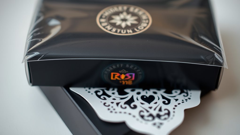
The right texture can improve your packaging design from a purely visual experience to a multisensory one, making your product more memorable and engaging. By incorporating texture innovation into your design, you're creating an opportunity for consumers to form a deeper connection with your brand. As they interact with your packaging, the tactile sensations evoke emotions, spark curiosity, and create a lasting impression.
When done thoughtfully, texture becomes an integral part of your brand's tactile storytelling. It can communicate the quality, luxury, or playfulness of your product, setting it apart from competitors. Consider the rough, earthy feel of a paper-based coffee bag or the sleek, high-gloss finish of a luxury skincare product. These textures not only appeal to our sense of touch but likewise influence our perceptions of the product itself.
To effectively incorporate texture into your design, experiment with different materials, finishes, and embossing techniques. You might likewise consider the weight, flexibility, or even the sound of your packaging. By thoughtfully balancing texture with other design elements, you can create a harmonious, engaging, and memorable packaging experience that resonates with your target audience. By doing so, you'll be well on your way to crafting a truly innovative and effective packaging design.
Creating Harmony With Patterns
When creating harmony with patterns in your packaging design, you'll want to balance pattern placement to avoid overwhelming the senses. You can achieve this by controlling the visual hierarchy, ensuring that the most important elements stand out as less significant ones recede. By doing so, you'll create a cohesive look that guides the viewer's attention.
Balanced Pattern Placement
By incorporating multiple patterns into your packaging design, you're creating a visually appealing and engaging experience for customers – but only if those patterns are thoughtfully arranged. Balanced pattern placement is essential to avoid overwhelming the senses and create a harmonious visual experience.
To achieve balanced pattern placement, consider the following strategies:
- Symmetrical arrangements: Create mirrored patterns on either side of a central axis to evoke a sense of order and stability.
- Asymmetrical dynamics: Introduce deliberate imbalances to add visual interest and energy to your design.
- Visual movement: Guide the viewer's eye through the design by using patterns that create a sense of flow or direction.
- Restraint and editing: Limit the number of patterns and carefully select which ones to feature prominently to avoid visual clutter.
Visual Hierarchy Control
You've achieved balanced pattern placement, but now it's time to take control of your design's visual hierarchy. Visual hierarchy control is essential in creating harmony with patterns, as it guides the viewer's attention through the design. By manipulating visual weight, you can direct the viewer's eye to the most important elements. This is achieved by using size, color, and contrast to create a clear order of importance.
To optimize design flow, consider the visual weight of each element and balance them accordingly. For instance, a bold pattern or bright color can draw attention, whereas a subtle texture or muted tone can recede into the background. By balancing these elements, you create a clear visual path that guides the viewer through the design.
Effective visual hierarchy control enables you to communicate your message efficiently, ensuring the viewer focuses on the key elements. By mastering this technique, you'll be able to create complex packaging designs that are both visually appealing and highly effective. With a clear visual hierarchy, your design will flow seamlessly, engaging the viewer and conveying your message with precision.
Maximizing Negative Space Effectively
Effective packaging design relies on striking a balance between visual elements, and one crucial aspect of achieving this balance is maximizing negative space effectively. By doing so, you'll create a more harmonious and engaging design that communicates your brand's message with clarity.
Maximizing negative space benefits your design in several ways:
- Creates visual breathing room: Negative space gives your design elements room to breathe, reducing visual clutter and making it easier for consumers to focus on your key messaging.
- Guides the consumer's eye: Effective spacing directs the consumer's attention to specific areas of your packaging, ensuring they notice the most important information.
- Enhances brand sophistication: A well-balanced use of negative space conveys a sense of sophistication and premium quality, elevating your brand's perceived value.
- Amplifies design elements: By surrounding design elements with negative space, you create contrast and make them stand out, amplifying their impact on the consumer.
Crafting a Compelling Brand Story
Your brand story is the thread that weaves together every aspect of your packaging design, creating an emotional connection with consumers that goes beyond mere aesthetics. It's the foundation upon which your brand narrative is built, conveying your values, mission, and personality to the world. When crafted correctly, your brand story becomes a significant differentiator, setting you apart from competitors and making your products irresistible to customers.
To craft a compelling brand story, you need to dig deep and identify what drives your brand's purpose. What problems do you aim to solve? What values do you stand for? What makes your brand unique? Answering these questions will help you develop a clear and authentic brand narrative that resonates with your target audience. Remember, your brand story is not just about what you do, but why you do it.
When it comes to packaging design, your brand story should be woven throughout every element, from the color palette to the typography. It's about creating an emotional connection with consumers that goes beyond mere aesthetics. By doing so, you'll build trust, loyalty, and a lifelong connection with your customers. So, take the time to craft a compelling brand story, and watch how it transforms your packaging design into a significant marketing tool that drives sales and growth.
Combining Digital and Physical Elements
As you explore the possibilities of combining digital and physical elements, you'll find that a hybrid design approach can create a seamless brand experience. By incorporating interactive packaging elements, such as QR codes or NFC tags, you can bridge the gap between the physical and digital worlds. This tactile digital fusion has the potential to enhance your brand's storytelling and engage your customers in new and innovative ways.
Hybrid Design Approach
Combining digital and physical elements in packaging design creates a potent hybrid approach that boosts brand messaging and customer engagement. By merging the two, you can create a unique visual language that resonates with your target audience. This hybrid design approach allows you to tap into the strengths of both digital and physical elements, resulting in a more dynamic and engaging packaging design.
To achieve a successful hybrid design, consider the following:
- Balance digital and physical elements: Verify that both components complement each other, rather than competing for attention.
- Emphasize hybrid aesthetics: Combine digital and physical design elements to create a cohesive visual identity that resonates with your brand.
- Foster design synergy: Use digital and physical elements to improve each other's strengths, creating a more engaging and memorable packaging design.
- Experiment with new materials and technologies: Push the boundaries of what's possible by incorporating innovative materials and technologies into your hybrid design.
Interactive Packaging Elements
Packaging design takes a leap forward with the integration of interactive elements, bridging the gap between digital and physical experiences. You're no longer limited to static designs; now, you can create immersive experiences that engage users on multiple levels. By incorporating interactive features, you encourage user engagement and sensory stimulation. Gamified experiences, for instance, can turn packaging into a fun, shareable moment. QR code integration allows users to access exclusive content, as augmented reality brings packaging to life. Social media integration enables users to share their experiences, generating buzz around your brand. Personalized packaging takes it a step further, making users feel seen and valued. Storytelling elements weave a narrative around your product, making it more relatable and memorable. But that's not all – feedback mechanisms allow you to collect valuable insights, refining your design for future iterations. By combining digital and physical elements, you can craft an unparalleled packaging experience that leaves a lasting impression.
Tactile Digital Fusion
Crafting a truly immersive experience means blurring the lines between digital and physical elements, creating a harmonious fusion that tantalizes your senses. You're not just designing packaging; you're crafting an experience that resonates with your audience. Tactile digital fusion is about combining the tangibility of physical elements with the dynamic nature of digital components, resulting in a multisensory encounter that leaves a lasting impression.
To achieve this fusion, consider the following strategies:
- Augmented Reality (AR) Integration: Incorporate AR technology that brings your packaging to life, providing an interactive and engaging experience.
- Smart Labels: Use smart labels that can be scanned to reveal exclusive content, rewards, or information, creating a seamless shift between physical and digital.
- Conductive Ink: Employ conductive ink to create touch-sensitive areas on your packaging, allowing users to interact with your brand in a unique and memorable way.
- Near Field Communication (NFC) Tags: Embed NFC tags that enable users to access digital content, such as videos or tutorials, by simply tapping their device on the packaging.
Designing for Shelf Visibility
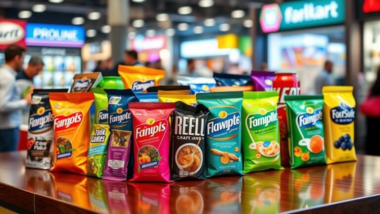
In the midst of a crowded retail environment, your product's packaging has mere seconds to grab attention and entice potential customers. To stand out on the shelf, you need to strategically design your packaging to maximize visibility and appeal. One vital aspect is shelf positioning – where your product sits on the shelf can make or break its chances of being noticed.
| Shelf Positioning Strategies | Benefits |
|---|---|
| Eye-Level Placement | Increases visibility and attention |
| Center Shelf Placement | Maximizes facings and reduces competition |
| Top Shelf Placement | Creates a premium feel and catches the eye |
| Bundle or Stack Products | Creates a larger presence and encourages impulse buys |
In addition to strategic shelf positioning, eye-catching graphics can be a game-changer. High-contrast colors, bold typography, and striking imagery can stop customers in their tracks. Consider using reflective or metallic finishes to add an extra layer of visual interest. By combining clever shelf positioning with show-stopping graphics, you can create a packaging design that truly pops on the shelf. Remember, the goal is to create an instant emotional connection with your target audience, so don't be afraid to think outside the box and experiment with innovative design elements.
Navigating Regulatory Requirements
As you navigate the complex terrain of packaging design, regulatory requirements lurk around every corner, waiting to trip you up. It's vital to stay informed and adapt to the ever-changing environment of regulations to guarantee your packaging design meets the necessary standards.
To avoid costly mistakes and guarantee regulatory compliance, you should:
- Familiarize yourself with packaging standards: Understand the specific regulations governing your industry, from food and beverage to pharmaceuticals and cosmetics.
- Check for updates and revisions: Regulatory requirements can change frequently, so it's critical to stay up-to-date on the latest amendments and revisions.
- Verify labeling and claims: Confirm that your packaging labeling and claims comply with regulations, avoiding false or misleading information.
- Conduct regular compliance audits: Regularly review your packaging design and production process to identify potential compliance issues before they become major problems.
Achieving Sustainability Through Design
As you focus on achieving sustainability through design, you're likely considering eco-friendly material selection and minimal waste design. You'll need to weigh the environmental impact of your packaging materials and optimize your design to reduce waste. By incorporating these strategies, you can create packaging that not just resonates with consumers but additionally supports a more sustainable future.
Eco-Friendly Material Selection
You're tasked with creating packaging that not just safeguards your product but also appeals to environmentally conscious consumers. To achieve this, you'll need to select eco-friendly materials that align with their values. This is where sustainable sourcing comes in. By choosing materials from renewable resources, you'll reduce your carbon footprint and appeal to the growing demographic of eco-aware consumers.
When selecting materials, consider the following:
- Biodegradable options: Look for materials that can easily decompose, reducing waste and minimizing environmental impact.
- Recycled materials: Incorporate recycled materials into your design to reduce the demand on virgin resources and lower greenhouse gas emissions.
- Eco certifications: Confirm your materials meet recognized eco-certifications, such as compostable or biodegradable standards, to assure their environmental credibility.
- Life cycle impact assessment: Evaluate the environmental impact of your materials throughout their entire life cycle, from sourcing to end-of-life disposal or recycling.
Minimal Waste Design
| Design Strategy | Waste Reduction | Sustainable Sourcing |
|---|---|---|
| Right-Sizing | Up to 30% | Optimizing material usage |
| Material Efficiency | Up to 20% | Using recyclable materials |
| Simplified Designs | Up to 10% | Reducing material complexity |
Iterating and Refining the Design
Iterating and refining your design is where the real magic happens. This is where you take your initial concept and transform it into a polished, effective, and engaging packaging design. It's an iterative process that requires patience, creativity, and a willingness to adapt to feedback and new insights.
To refine your design, follow these crucial steps:
- Gather design feedback: Share your concept sketches with stakeholders, colleagues, and potential users to gather valuable insights and identify areas for improvement.
- Conduct user testing: Put your prototype in front of real users to observe their interactions, identify pain points, and refine your design accordingly.
- Engage in collaborative brainstorming: Work with cross-functional teams to generate new ideas, challenge assumptions, and explore innovative solutions.
- Evaluate and refine your prototype: Analyze the results of user testing and feedback, and make creative revisions to improve your design's usability, aesthetics, and functionality.
Through these design iterations, you'll distill your design to its core, ensuring it meets the needs of your target audience and aligns with your brand's vision. Remember, refining your design is an ongoing process that requires flexibility, open-mindedness, and a commitment to excellence. By embracing this iterative approach, you'll create packaging designs that truly stand out and drive business results.
Frequently Asked Questions
How Do I Ensure Design Consistency Across Different Packaging Sizes?
When designing for different packaging sizes, you'll want to guarantee consistency across the board. Start by establishing a core visual identity, including a defined color palette and typography hierarchy. This will help you create a cohesive look that translates seamlessly from small to large formats. By sticking to these design fundamentals, you'll maintain a strong brand presence, regardless of the packaging size.
Can I Use Too Many Design Elements and Overwhelm the Consumer?
You're crafting a design that's as busy as a Manhattan street corner – and that's exactly the problem. When you overcrowd your packaging with too many design elements, you risk creating visual clutter that repels consumers. It's like trying to have a conversation in a loud restaurant – the message gets lost. To avoid overwhelming the consumer, prioritize clarity and balance in your design. By doing so, you'll create a clear visual hierarchy that guides their perception and drives engagement.
How Do I Prioritize Design Elements for Different Target Audiences?
When creating designs for various target audiences, you'll need to prioritize elements that resonate with each group. Start by conducting a thorough target audience analysis to identify their unique preferences and values. Then, create a design preference mapping to visualize their likes and dislikes. By doing so, you'll be able to tailor your design elements to each audience, ensuring your message resonates and drives engagement. This process will help you strike the perfect balance, making your design stand out in a crowded market.
What Is the Ideal Ratio of Design Elements to Negative Space?
You're searching for the holy grail of design ratios – a million to one might not be enough! In terms of the ideal ratio of design elements to negative space, keep in mind that balance is key. Aim for a harmonious blend of 60-70% design elements to 30-40% negative space. This design balance creates a clear visual hierarchy, guiding the viewer's eye through the composition. By striking this balance, you'll create a design that's both visually stunning and easy to navigate.
Can I Reuse Design Elements From Previous Packaging Versions?
Can you reuse design elements from previous packaging versions? Absolutely! In fact, repurposing select elements can improve your brand identity by creating a sense of continuity. Think of it as a design evolution, where you refine and build upon previous concepts. By doing so, you'll create a cohesive visual language that resonates with your audience. Just be sure to update and adapt them to fit your current brand vision, ensuring a fresh and innovative look that still feels authentic.