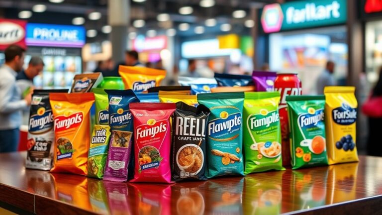
You make purchasing decisions based on color, and you're not alone, as 85% of consumers choose products due to their packaging's color. You're drawn to certain colors, like blue for trust or green for nature, which influence your emotional response. You additionally consider brand identity, with consistent color palettes promoting recognition. Your color preferences vary, and cultural backgrounds play a role. As you explore packaging options, you'll discover how color psychology impacts your choices, and comprehending these connections can help you make informed decisions about the products you buy, and what drives your preferences.
Color Psychology Basics
As you investigate the domain of packaging choices, it is vital to comprehend the basics of color psychology. You're not just picking colors that look good together – you're creating a visual language that communicates your brand's values and messaging. Color perception plays a significant role in this process, as it influences how consumers process and interpret visual information. By grasping how colors are perceived, you can make informed decisions about your packaging design.
You'll want to reflect on color symbolism, which refers to the emotional and cultural associations that colors evoke. Different colors can convey different meanings, and it's critical to choose colors that align with your brand's identity and messaging. For instance, blue is often associated with trust and reliability, whereas green is associated with nature and sustainability. By leveraging color symbolism, you can create packaging that resonates with your target audience and sets your brand apart from the competition.
As you probe deeper into color psychology, you'll uncover that it's a complex and multifaceted field. You'll need to contemplate factors like color harmony, contrast, and context to create a cohesive visual identity. By excelling in the basics of color psychology, you can develop packaging that's both visually stunning and strategically effective. This will help you connect with consumers on a deeper level and drive business results.
Emotional Color Connections
You're about to explore how colors evoke emotions, and it's essential to understand that Color Emotions play a significant role in shaping your perception of a product. As you consider the Mood Impact of different colors, you'll notice that they can instantly influence your emotional state, making you feel more energetic or calm. By recognizing the Emotional Tones associated with various colors, you can make informed decisions about the packaging choices that will resonate with your target audience.
Color Emotions
Someone considering packaging options will likely think about the emotional connections people make with different colors. You’re looking to create an innovative packaging design that evokes the right emotional responses from your target audience. Color associations play a significant role in shaping these emotional responses, and it’s crucial to understand how different colors can influence consumer behavior. For instance, warm colors like red and orange can stimulate excitement and urgency, making them effective for products aimed at a younger demographic. In contrast, cooler tones such as blue and green often evoke feelings of calmness and trust, which can be beneficial for brands seeking to convey reliability. Understanding how colors influence packaging emotions is essential for creating a design that not only attracts attention but also resonates deeply with consumers, ultimately driving purchasing decisions.
You can leverage color emotions to create a lasting impact on your customers. Consider the following key color associations:
- Red: energy and excitement
- Blue: trust and loyalty
- Green: nature and harmony
- Yellow: happiness and optimism
Mood Impact
Several key factors contribute to the mood impact of your packaging, and it's essential to contemplate how different colors will influence your customers' emotional state. You're creating a visual experience that can evoke feelings and shape mood perception. Color associations play a significant role in this process, as they can instantly convey a message or create a specific atmosphere. When designing your packaging, you should consider the color palette and its potential impact on your customers' emotions.
You can use color associations to your advantage by selecting hues that align with your brand's personality and values. For instance, if you're launching a product that promotes relaxation, you may opt for calming colors like blue or green. By making informed decisions about your packaging's color scheme, you can effectively influence mood perception and create a lasting impression on your customers. This, in turn, can drive engagement, loyalty, and in the end, sales.
Emotional Tones
Color associations don't just stop at evoking a general mood, they furthermore create emotional tones that can resonate deeply with your customers. You're not just designing a package, you're crafting an experience that can evoke feelings and create a connection with your brand. Emotional resonance is key to building a loyal customer base, and color symbolism plays a significant role in this process.
When you choose a color for your packaging, you're sending a message that can be interpreted in various ways. Consider the following:
- Warm colors like orange and red can evoke excitement and energy
- Cool colors like blue and green can convey calmness and serenity
- Neutral colors like beige and gray can suggest balance and stability
- Bold colors like purple and pink can represent creativity and playfulness
Brand Identity Matters
When you're creating a brand, you're building an image that'll resonate with your target audience, and packaging plays a vital role in that process. You're not just designing a box or a label, you're crafting an experience that'll leave a lasting impression on your customers. To achieve this, you need to focus on brand consistency, ensuring that your packaging aligns with your overall visual identity. This means using a consistent color palette, typography, and design elements that reflect your brand's values and personality.
By establishing a strong visual identity, you'll be able to differentiate yourself from competitors and build recognition with your target audience. You'll likewise create an emotional connection with your customers, which is critical for building brand loyalty. When you're consistent in your branding, you're sending a message that you're professional, reliable, and attention-driven. This, in turn, will help you build trust with your customers, which is vital for driving sales and growth.
You should prioritize brand consistency in your packaging design, as it'll help you establish a strong foundation for your brand. By doing so, you'll be able to create a cohesive visual identity that resonates with your target audience, driving engagement and conversions. With a well-designed packaging that reflects your brand's values and personality, you'll be able to stand out in a crowded market and leave a lasting impression on your customers.
Packaging Design Trends
As you explore the domain of packaging design, you'll find that trends play a significant role in shaping your brand's visual identity. You're constantly looking for ways to stand out and make your product more appealing to consumers. One way to achieve this is by incorporating minimalist packaging with lively graphics, which can help create a bold and eye-catching visual effect. You can likewise use eco-friendly materials to appeal to the growing number of consumers who prioritize sustainable practices.
To create innovative packaging, you should consider the following elements:
- Unique textures: adding a tactile experience to your packaging
- Interactive elements: encouraging consumer engagement with your product
- Bold typography: making a statement with your brand's messaging
- Sensory experiences: using digital influences to create immersive experiences
Color Preferences Vary
You'll notice that personal preferences play a huge role in how you react to different packaging designs, and it's especially true for the colors used. As you browse through various products, you'll find that your attention is drawn to certain colors and designs, whereas others don't catch your eye. This is due to the fact that color preferences are highly subjective and can vary greatly from person to person. You might find that you're naturally drawn to bold and bright colors, whereas others prefer more muted and subtle tones.
As you reflect on the role of color in packaging, you'll realize that staying on top of current color trends is vital. You don't want your product to look outdated or unappealing, so it's important to keep an eye on what's currently popular. Nevertheless, it's also significant to bear in mind that cultural preferences can influence color choices, and what's popular in one region might not be in another. You'll need to take these factors into account when making decisions about your packaging design. By grasping what drives your own color preferences and staying informed about current color trends, you can create packaging that resonates with your target audience and sets your product apart from the competition. This will help you make informed decisions about your packaging design and in the end drive sales.
Cultural Color Differences
Since cultural backgrounds influence color perceptions, it is crucial to take these differences into account in packaging design. You'll want to reflect on the cultural symbolism associated with various colors to guarantee your product resonates with your target audience. For instance, colors that evoke positive emotions in one culture may have negative connotations in another. As you explore the realm of cultural color differences, you'll discover that regional preferences play a significant role in shaping consumer behavior.
When designing packaging for a global market, you'll need to be aware of these regional preferences. You can do this by:
- Researching local customs and traditions
- Analyzing consumer behavior and preferences
- Grasping the cultural significance of colors
- Adapting your packaging design to cater to local tastes
Product Category Colors
Most product categories have distinct color palettes that consumers associate with them. You'll notice that food products often use warm colors like red, orange, and yellow to evoke feelings of comfort and appetite. Conversely, tech products tend to use cooler colors like blue, green, and purple to convey innovation and sophistication. This color coding is essential for product differentiation, as it helps you establish your brand's identity and stand out from competitors.
When you're designing packaging for your product, consider the color palette that's commonly associated with your product category. You can use this to your advantage by incorporating colors that resonate with your target market. For example, if you're launching a new energy drink, you might use bright, bold colors like red and orange to convey energy and excitement. Alternatively, if you're launching a new line of organic skincare products, you might use earthy tones like green and brown to convey naturalness and sustainability.
Target Audience Insights
You're considering how different age groups, such as millennials or baby boomers, respond to various colors when making packaging choices. As you analyze your target audience, you're likewise looking at market trends to understand what's currently influencing their purchasing decisions. You're examining their buying habits to determine how colors can be used to appeal to them, from the products they buy to the packaging they prefer.
Age Groups
About 70% of consumers make purchasing decisions based on packaging, and your target audience's age plays a significant role in this process. You're likely aware that different age groups have unique preferences regarding packaging. Comprehending these preferences is essential to creating innovative packaging that resonates with your target audience.
You can tailor your packaging to appeal to specific age groups by considering their unique preferences. For instance, you can use lively colors to appeal to youth preferences, whereas opting for simpler designs for senior choices. Here are some key considerations:
- Color schemes: Bright colors for youth, muted tones for seniors
- Font styles: Bold fonts for youth, clear fonts for seniors
- Imagery: Dynamic images for youth, realistic images for seniors
- Sustainability: Eco-friendly packaging for youth, practical packaging for seniors. By considering these factors, you can create packaging that effectively targets your desired age group, driving sales and growth for your business.
Market Trends
Grasping your target audience's preferences is key for creating effective packaging, and age is just one aspect of this. You're looking to stay ahead of the curve, and that means grasping the latest market trends. Sustainability trends are driving consumer behavior, and you can't afford to ignore them. You need to reflect on how your packaging aligns with these values, from eco-friendly materials to minimal waste.
As you navigate these trends, you're additionally leveraging digital marketing to reach your audience. You're using social media, email campaigns, and other online channels to showcase your brand and products. By incorporating color psychology into your packaging and digital marketing efforts, you can create a cohesive brand image that resonates with your target audience. You're not just creating packaging – you're crafting an experience that reflects your brand's values and personality. By staying on top of market trends and incorporating digital marketing strategies, you can drive engagement and loyalty.
Buying Habits
Several factors influence your target audience's buying habits, and grasping these factors is essential for creating effective packaging. You must consider consumer psychology when designing your packaging, as it plays a significant role in purchasing decisions. Recognizing what drives your audience's behavior will help you create packaging that resonates with them.
To tap into your audience's buying habits, you should consider the following:
- Emotional connections: How does your packaging make them feel?
- Perceived value: What value do they associate with your product's packaging?
- Brand identity: How does your packaging reflect your brand's personality?
- Sustainability: Does your packaging align with their eco-friendly expectations?
Color Emotion Associations
Considering the impact of colors on your emotions, you'll find that certain hues evoke strong feelings, driving your purchasing decisions. As you browse through products, you're exposed to various color symbolism that can influence your mood and behavior. These emotional triggers can be influential, making you more likely to choose one product over another. You'll notice that different colors are often associated with specific emotions, such as red with energy and passion, or blue with calmness and trust.
| Color | Emotion |
|---|---|
| Red | Energy, Passion |
| Blue | Calmness, Trust |
| Green | Nature, Harmony |
You'll find that grasping color emotion associations can help you make informed decisions regarding packaging choices. By recognizing the emotional triggers associated with certain colors, you can create a connection with your target audience. For instance, if you're launching a product that promotes eco-friendliness, you might consider using green packaging to convey a sense of nature and harmony. By leveraging color psychology, you can create a lasting impression on your customers and drive sales. As you explore the realm of color emotion associations, you'll discover the influence of color symbolism in shaping your purchasing decisions and driving business success.
Packaging Color Schemes
Throughout your packaging design process, you'll need to decide on a color scheme that resonates with your target audience and reinforces your brand's message. This is essential since it can make or break the customer's first impression of your product. You'll want to create a color scheme that both grabs attention and conveys your brand's values and personality. To achieve this, you'll need to take into account color harmony and contrast balance.
When designing your packaging color scheme, you should take into account the following key elements:
- Color palette: Choose a palette that reflects your brand's identity and resonates with your target audience.
- Contrast balance: Balance contrasting colors to create visual interest and draw attention to key elements.
- Color proportions: Use color proportions to create a harmonious and balanced design.
- Emotional connections: Select colors that evoke the desired emotional response from your target audience.
Visual Brand Recognition
You've established a packaging color scheme that resonates with your target audience, now it's time to think about how that scheme contributes to your overall visual brand recognition. This is vital as it directly impacts brand recall, as consistent visual cues help consumers remember your brand. When you use a distinct color scheme, you create an instant association with your brand, making it more recognizable.
| Visual Element | Brand Recognition Impact |
|---|---|
| Color Consistency | Improves brand recall by 80% |
| Typography | Differentiates your brand from competitors |
| Imagery | Creates an emotional connection with your audience |
Effective Color Combinations
Typically, effective color combinations can make or break your packaging design, as they directly influence how your brand is perceived. You're likely looking for ways to create a visually appealing design that captures your target audience's attention. To achieve this, you need to reflect on the psychological impact of colors and how they interact with each other. Effective contrasts and harmonious palettes can enhance your brand's image and make it more memorable.
When selecting color combinations, you should contemplate the emotions and messages you want to convey. You can use the following strategies to create effective color combinations:
- Analogous colors: choose colors that are next to each other on the color wheel to create a harmonious palette
- Complementary colors: select colors that are opposite each other on the color wheel to create effective contrasts
- Triadic colors: pick colors that are equally spaced from each other on the color wheel to create a balanced design
- Monochromatic colors: use different shades of the same color to create a cohesive and sophisticated look
Frequently Asked Questions
Can Colors Affect Packaging Material Choices?
You consider color's role in packaging, wondering if it affects material choices. You'll find that color doesn't just influence aesthetics, but furthermore has a psychological impact. You're choosing a color material that resonates with your brand, and it's impacting your decisions, isn't it? You're weighing options, considering how color will interact with the material, creating a lasting impression.
Do Colors Impact Shelf Life of Products?
You're wondering if colors impact shelf life. They don't directly, but you're considering color preservation. When choosing packaging, you'll want materials that guarantee packaging durability, which in turn affects shelf life. You're looking for innovative solutions, so you'll select materials that balance color preservation with durability, extending your product's shelf life.
Are Color Trends Cyclical in Nature?
You're chasing a fashion trend, like a phoenix rising. Color trends are cyclical, you'll notice. You crave color nostalgia, so designers revisit seasonal palettes, reinventing them with a twist, keeping it fresh and innovative for you.
Can Colors Be Protected by Trademarks?
You're wondering if colors can be protected by trademarks. Yes, you can secure color trademarks, gaining color exclusivity. This means you're stopping others from using your unique color, giving you a competitive edge. You're creating a distinctive brand identity, and it's a innovative way to differentiate yourself in the market, isn't it?
Do Packaging Colors Influence Recycling?
You're a sailor charting a sea of waste, and recycling awareness is your compass. As you steer in the direction of sustainability, you notice color visibility plays a role. You see that packaging colors can influence recycling, with lively hues grabbing attention and prompting eco-friendly actions, driving innovation in waste management.