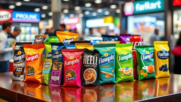
Typography plays an essential role in packaging design, conveying a brand's personality, values, and message to consumers. Fonts evoke emotions, influence purchasing decisions, and communicate brand traits. A perfect balance of aesthetics and readability is vital, as typography impacts consumers' ability to understand product information. By creating a visual hierarchy, designers guide the consumer's eye through packaging, increasing product visibility and driving sales. As typography trends evolve, brands can capture attention and set themselves apart. From luxury to playfulness, the right typography can make all the difference – and that's just the beginning of its fascinating story.
Setting the Tone With Fonts
Fonts are the unsung heroes of packaging design, as they effortlessly convey the brand's personality, values, and intended message to the consumer. By leveraging font psychology, designers can create an emotional resonance with their target audience, influencing purchasing decisions and brand loyalty. The right font can evoke feelings of luxury, playfulness, or sophistication, aligning with the brand's unique identity.
A well-chosen font can also communicate the brand's values and personality traits, such as modernity, elegance, or friendliness. For instance, a bold, sans-serif font may convey confidence and strength, while a script font may suggest creativity and whimsy. By understanding the emotional connotations of different fonts, designers can craft a visual language that resonates with their target audience.
Moreover, font psychology plays an essential role in shaping consumer perceptions. Research has shown that certain fonts can increase feelings of trust, excitement, or nostalgia, depending on the context and audience. By selecting a font that resonates with their target audience, designers can create a powerful emotional connection, driving brand recognition and loyalty. By harnessing the power of font psychology, packaging designers can create a lasting impression, setting the tone for a successful brand-consumer relationship.
Balancing Readability and Aesthetics
While creating visually stunning packaging, designers must strike a delicate balance between aesthetics and readability, ensuring that the chosen font styles and sizes effectively communicate the brand's message without sacrificing legibility. The perfect blend of style and clarity is essential, as it directly impacts the consumer's ability to quickly and easily understand the product's information. When typography is well-executed, it can create optical illusions that draw the consumer's attention to specific areas of the packaging, increasing the chances of a sale.
Moreover, typography can evoke cultural associations that resonate with the target audience. For instance, a serif font may evoke a sense of sophistication and luxury, while a sans-serif font may convey a sense of modernity and simplicity. Designers must be aware of these cultural connotations and choose fonts that align with the brand's personality and values. By doing so, they can create an emotional connection with the consumer, fostering brand loyalty and recognition.
Ultimately, balancing readability and aesthetics requires a deep understanding of the target audience, the brand's message, and the role of typography in packaging design. By striking the perfect balance, designers can create packaging that not only stands out on store shelves but also effectively communicates the brand's message, ultimately driving sales and business growth.
Creating Visual Hierarchy Effectively
By strategically arranging typography, colors, and graphics, designers can create a visual hierarchy that guides the consumer's eye through the packaging, drawing attention to key information and features that drive purchasing decisions. This visual hierarchy is essential, as it influences how consumers scan and perceive the product. Effective visual hierarchy creation involves understanding scanning patterns, which vary depending on the product and audience. For instance, Western readers tend to scan from top-left to bottom-right, while Eastern readers scan from top-right to bottom-left.
Designers can create focal points by using size, color, and typography to draw attention to specific elements. Headlines, for example, can be designed to stand out from the rest of the text using larger font sizes, bolding, or italicizing. This creates a clear visual flow, guiding the consumer's eye to the most important information. By carefully controlling the visual hierarchy, designers can direct the consumer's attention to key selling points, such as product benefits, ingredients, or promotional offers. A well-designed visual hierarchy can greatly increase the chances of a product standing out on crowded shelves and ultimately drive sales. By understanding scanning patterns and creating focal points, designers can craft packaging that communicates effectively and drives consumer engagement.
Communicating Brand Personality
Typography also plays a significant role in conveying a brand's personality, as the deliberate selection of font styles, sizes, and arrangements can evoke emotions and attitudes that resonate with the target audience. By choosing typography that aligns with their values and personality traits, brands can create an emotional connection with their customers, fostering loyalty and trust. For instance, a luxury brand might opt for elegant, serif fonts to convey sophistication and refinement, while a playful brand might choose bold, sans-serif fonts to convey energy and friendliness.
Moreover, typography can also convey a brand's cultural identity, which is essential in today's global market. By incorporating typography that reflects a brand's cultural heritage, they can connect with their target audience on a deeper level. For example, a brand targeting a specific ethnic group might use typography inspired by traditional calligraphy or scripts to create a sense of familiarity and authenticity.
In packaging design, typography is often the first point of contact between the brand and the consumer. By selecting typography that accurately reflects their brand personality, businesses can create a lasting impression and differentiate themselves from competitors. By doing so, they can establish a strong emotional connection with their target audience, ultimately driving sales and brand loyalty. By leveraging typography to communicate their brand personality, businesses can create a powerful and lasting impression that resonates with their customers.
Typography Trends in Packaging
Packaging designers are constantly on the lookout for innovative typography trends that can elevate their designs and make their products stand out on crowded shelves. In today’s competitive market, typography plays an essential role in capturing consumers’ attention and conveying a brand’s message. Current typography trends in packaging design focus on creating an emotional connection with customers, driving cultural impact, and promoting sustainable options. Moreover, designers are increasingly integrating cultural trends in packaging design to resonate with diverse consumer demographics. This approach ensures that the packaging not only reflects the brand’s identity but also aligns with the values and lifestyles of its target audience. By utilizing bold colors, unique fonts, and relatable imagery, packaging can evoke emotions that foster brand loyalty and encourage purchases.
One of the most significant trends is the use of bold, oversized typography to grab attention and create an instant emotional response. This style is particularly effective for brands that want to convey a sense of confidence, energy, or playfulness. Another trend is the incorporation of handwritten or hand-drawn typography, which adds a touch of personality and humanity to packaging designs. This style is ideal for brands that want to convey a sense of authenticity and approachability.
Sustainable typography is also gaining popularity, with designers opting for eco-friendly materials and minimalistic designs that reduce waste and minimize environmental impact. This trend is particularly appealing to consumers who prioritize eco-friendliness and social responsibility. By incorporating these typography trends into their designs, packaging designers can create visually stunning and culturally relevant packaging that resonates with their target audience and sets their brand apart from the competition.
Frequently Asked Questions
Can I Use My Brand's Font for Packaging Design?
She can use her brand's font for packaging design, but it's essential to take into account brand consistency. Will the font translate well to a physical product, or does it need a font evolution to stand out on shelves? If it's not adaptable, it may dilute the brand's identity. She should weigh the benefits of consistency against the need for a unique packaging voice that resonates with her target audience.
How Do I Choose the Right Font for a Specific Product?
As Shakespeare's Hamlet pondered, "to be or not to be," so too must brands deliberate on the perfect font for their product. She chooses a font that embodies the product's personality, evoking the right emotional response. It's not just about aesthetics; it's about cultural association. Does the font scream luxury, or whisper sustainability? She must consider the message she wants to convey, and select a font that resonates with her target audience, ultimately making her product unforgettable.
Are Handwritten Fonts Suitable for Packaging Design?
Handwritten fonts can add a personal touch to packaging design, creating an emotional connection with consumers. They convey a sense of authenticity and uniqueness, making products stand out on crowded shelves. However, it's essential to consider the product's personality and target audience before using a handwritten font. If done correctly, it can evoke feelings of warmth and nostalgia, making customers more likely to engage with the brand.
Do I Need to Consider Font Licensing for Packaging?
When using fonts for commercial purposes, she needs to take font licensing into account to avoid legal issues. Font restrictions can be costly and time-consuming, so it's essential to grasp the terms. Open source options, like Google Fonts, offer flexible and free alternatives. By choosing the right license, she guarantees freedom to use her chosen font without worrying about infringement. This diligence saves her time and resources in the long run.
Can I Use Multiple Fonts on a Single Packaging Design?
She often wonders if using multiple fonts on a single design is a recipe for visual disaster. But, surprisingly, it's a common practice in design. The key is creating a visual hierarchy, where each font serves a purpose. By balancing font harmony with contrast, she can guide the viewer's attention. It's not about using multiple fonts, but about using them intentionally to elevate her design.