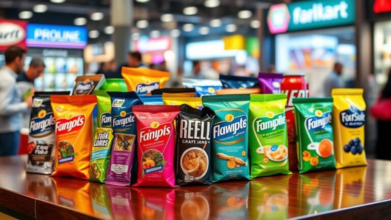

Effective packaging design is a precisely calculated blend of art and science, leveraging psychological triggers, visual cues, and sensory stimuli to influence consumer behavior and drive sales. It involves strategic color choices that evoke emotions, a clear visual hierarchy to direct attention, and typography that creates an emotional connection. The shape, size, and material of packaging also impact consumer perceptions, and sensory triggers like scents and textures can evoke nostalgia and comfort. By understanding these elements, designers can craft packaging that resonates with consumers and sets products apart. As the puzzle pieces of effective packaging design come together, the possibilities for brand differentiation become endless. Additionally, the importance of sustainability in packaging cannot be overlooked, as consumers increasingly favor eco-friendly materials and practices. By incorporating sustainable elements into packaging, brands not only appeal to environmentally conscious shoppers but also enhance their image and reputation. For those looking to create standout products, exploring eyecatching packaging design tips can further elevate a brand’s identity and strengthen market presence.
The Psychology of Color Choices
Colors, an essential aspect of packaging design, profoundly influence consumer emotions and behavior, with different hues evoking distinct reactions and associations in the human brain. Effective packaging designers understand that color choices are not merely aesthetic decisions, but rather strategic moves to elicit specific emotional responses from their target audience. To achieve this, they employ the principles of color harmony, carefully selecting palettes that create balance, contrast, and visual appeal. By doing so, they can direct consumers' attention, stimulate their appetite, or even evoke feelings of trust and reliability.
However, cultural associations must also be considered, as colors can hold vastly different meanings across various cultures. For instance, while white is often associated with purity and innocence in Western societies, it symbolizes mourning in many Asian cultures. Similarly, red, a symbol of passion and energy in the West, represents good luck and prosperity in China. Ignoring these cultural nuances can lead to unintended consequences, such as offending or alienating potential customers. By taking into account both color harmony and cultural associations, packaging designers can create visually stunning and culturally sensitive designs that resonate with their target audience, ultimately driving sales and brand loyalty.
Visual Hierarchy in Packaging Design
Effective packaging designers strategically organize visual elements to create a clear visual hierarchy, guiding consumers' eyes through the packaging and communicating key information in a logical and intuitive sequence. This deliberate arrangement of visual components influences how consumers process information, directing their attention to the most critical details. By orchestrating the visual flow, designers can control the pace and direction of eye movement, ensuring that the consumer's gaze lands on the most important elements.
A well-crafted visual hierarchy is essential in packaging design, as it enables brands to convey complex information in a concise and easily digestible manner. By creating a clear order of importance, designers can draw attention to specific features, such as the product name, logo, or key benefits. This strategic organization of visual elements also helps to reduce visual clutter, making it easier for consumers to quickly understand the product's value proposition.
The Power of Typography and Fonts
Typography and fonts wield significant influence over the emotional resonance and communicative power of packaging design, as they can instantly evoke feelings, convey complex information, and even shape consumer perceptions. A well-chosen font can elevate a brand's image, convey its personality, and create an emotional connection with the target audience. On the other hand, a poorly selected font can confuse, alienate, or even repel customers.
Font legibility is vital in packaging design, as it directly impacts the ease with which consumers can absorb information. A clear, readable font guarantees that essential details, such as product benefits, ingredients, or instructions, are quickly understood. In contrast, an illegible font can lead to frustration, mistrust, and ultimately, a lost sale.
Typographic storytelling is another powerful tool in packaging design. By strategically combining font styles, sizes, and colors, designers can craft a narrative that resonates with their target audience. This narrative can convey the brand's values, personality, and unique selling proposition, setting it apart from competitors and creating a lasting impression. Effective typographic storytelling can transform packaging into a compelling, attention-grabbing experience that drives consumer engagement and loyalty. By harnessing the power of typography and fonts, packaging designers can create a visual language that speaks directly to their target audience, influencing purchasing decisions and shaping brand success.
Shape, Size, and Material Matters
In addition to typography and fonts, packaging designers must also consider the physical attributes of a product's packaging, as the shape, size, and material of a package can profoundly impact consumer perceptions and purchasing decisions. A well-designed package can convey a sense of luxury, sophistication, or playfulness, while a poorly designed one can be overlooked or even rejected.
The shape of a package plays an important role in its overall aesthetic appeal. A unique or innovative shape can grab attention and differentiate a product from its competitors. However, it's vital to make sure that the shape also provides structural integrity, protecting the product during transportation and storage. A package that's too fragile or prone to damage can lead to costly returns and a loss of customer trust.
When it comes to size, packaging designers must strike a balance between functionality and sustainability. A package that's too large can be wasteful and environmentally harmful, while one that's too small may not provide adequate protection. Sustainable options, such as biodegradable or recyclable materials, are becoming increasingly popular as consumers become more environmentally conscious. By considering the shape, size, and material of a package, designers can create a product that not only stands out on store shelves but also resonates with consumers on a deeper level.
Emotional Connections Through Sensory Triggers
Beyond the visual elements of packaging design, sensory triggers can evoke powerful emotional connections with consumers, tapping into their memories, desires, and values. By incorporating sensory experiences, brands can create a deeper, more personal bond with their audience. Scents Matter, for instance, as they have the ability to transport consumers back to a specific moment in time, evoking feelings of nostalgia and comfort. A strategically chosen scent can instantly create an emotional connection, making the product more relatable and desirable.
Texture Storytelling is another essential aspect of sensory packaging design. The tactile experience of holding a product can greatly influence consumer perception and attachment. For example, a premium product with a luxurious texture can convey high quality and sophistication, while a product with a more rustic texture can evoke feelings of naturalness and authenticity. By carefully selecting the texture of their packaging, brands can tell a story that resonates with their target audience, creating a lasting impression and fostering brand loyalty.
Effective packaging design that incorporates sensory triggers can give brands a competitive edge, as it speaks directly to consumers' emotions and subconscious desires. By leveraging the power of scents and textures, brands can create an immersive experience that drives engagement, loyalty, and ultimately, sales. By investing in sensory packaging design, brands can tap into the psychological and emotional connections that drive consumer behavior, ultimately yielding a significant return on investment.
Frequently Asked Questions
How Do I Balance Aesthetics With Functionality in Packaging Design?
She balances aesthetics with functionality in packaging design by establishing a clear visual hierarchy. This guarantees that essential information stands out, guiding consumers' attention. By applying fundamental design principles, such as contrast, alignment, and repetition, she creates a cohesive look that's both visually appealing and functional. It's a delicate dance, but one that pays off in increased shelf impact and brand recognition.
Can I Use Packaging Design to Influence Customer Purchasing Decisions?
She can literally manipulate customers' minds with clever packaging design. It's a psychological game, and she holds the cards. By creating an emotional connection through carefully crafted visuals, she taps into their subconscious, making them crave her product. Color psychology plays a pivotal role, as certain hues evoke specific emotions, influencing purchasing decisions. With the right design, she can make customers beg for her product, and she'll be the one calling the shots.
What Role Does Cultural Background Play in Packaging Design Preferences?
She understands that cultural background has a profound impact on packaging design preferences. Color symbolism, for instance, carries different meanings across cultures; what's auspicious in one culture might be inauspicious in another. Iconic imagery also resonates differently, as cultural references can be lost in translation. Effective packaging design acknowledges these nuances, ensuring that branding resonates with diverse audiences, fostering loyalty and driving sales.
How Do I Ensure Packaging Design Consistency Across Different Products?
She weaves a cohesive tapestry by ensuring packaging design consistency across products. It's like building with LEGOs – each piece fits together seamlessly to form a strong brand identity. She establishes a robust design framework, outlining clear guidelines for typography, color palette, and imagery. This framework serves as a blueprint, guaranteeing consistency and recognition across all products, ultimately strengthening her brand's visual narrative.
Can I Reuse Packaging Design Elements for Different Target Audiences?
She can reuse packaging design elements for different target audiences, but it's important to balance brand recognition with design flexibility. By adapting core design elements, she can maintain a consistent brand image while tailoring the design to resonate with each audience. This approach enables her to efficiently expand her product lines while preserving brand cohesion, ultimately driving business growth and customer loyalty.