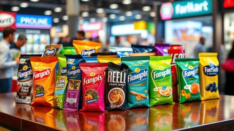
You can enhance your packaging design by strategically incorporating patterns that add depth, visual interest, and emotional connection with your target audience. Start by choosing a pattern type that reflects your brand's personality, such as geometric, organic, or abstract patterns. Balance your pattern with negative space to create a visual hierarchy, and consider layering patterns to create texture and dimension. To create movement, use directional patterns or interrupt pattern continuity to guide the viewer's attention. By combining patterns thoughtfully, you can create a visually engaging design that draws in your audience – and there's more to explore to take your packaging design to the next level.
Understanding Pattern Types and Uses
Explore the domain of patterns in packaging design, and you'll discover a vast array of visual elements that can make or break your brand's identity. Patterns can add depth, create visual interest, and even evoke emotions. To effectively utilize their influence, it is vital to comprehend the different types of patterns and their uses.
Geometric patterns, like chevrons and hexagons, bring a sense of modernity and sophistication to packaging. Organic patterns, such as leaves and branches, can evoke a natural, earthy feel. Abstract patterns, which don't resemble real-world objects, can add a touch of creativity and playfulness. Floral patterns, like roses and daisies, are perfect for feminine or vintage-inspired brands.
Stripe patterns and polka dot patterns are classic choices that can add a sense of fun and energy to packaging. Textured patterns, which mimic the look and feel of materials like wood or fabric, can add a tactile element to your design. Repetitive patterns, where a single element is repeated, can create a sense of rhythm and movement. Symmetrical patterns, where elements are mirrored on either side of a central axis, can create a sense of balance and harmony. Asymmetrical patterns, which break free from symmetry, can add a touch of whimsy and creativity. By comprehending the different types of patterns and their uses, you can unleash the full potential of your packaging design.
Choosing Patterns for Brand Identity
Selecting the right pattern for your brand's packaging is a crucial decision that can make your product stand out on crowded shelves. It's not merely about aesthetics; the pattern you choose can convey your brand's personality, values, and message. When choosing a pattern, consider your brand storytelling. What do you want to communicate to your customers? Do you want to evoke feelings of playfulness, sophistication, or sustainability? The pattern you select should align with your brand's narrative and resonate with your target audience.
Pattern psychology likewise plays a significant role in this decision. Different patterns can evoke different emotions and reactions in consumers. For instance, geometric patterns can create a sense of modernity and dynamism, whereas organic patterns can convey a sense of naturalness and earthiness. Consider the emotional connection you want to make with your customers and choose a pattern that aligns with that goal.
Ultimately, the pattern you choose should be an extension of your brand's identity. It should be unique, yet consistent across all your packaging and marketing materials. By selecting a pattern that accurately represents your brand, you'll create a cohesive visual language that sets you apart from the competition and builds brand recognition. So, take the time to thoughtfully consider your pattern choice, and watch your brand come to life on store shelves.
Balancing Pattern and Negative Space
Among the visual elements that vie for attention on your packaging, pattern and negative space are perhaps the most critical to balance. You want to create visual harmony, not visual chaos.
Balancing pattern and negative space is an art that requires careful consideration of how these two elements interact. When you get it right, your packaging design comes alive. When you get it wrong, it falls flat.
Here's how to achieve the perfect balance:
- Limit pattern placement: Don't overdo it. Choose a few strategic areas to feature your pattern, and leave the rest of the design clean and simple. This creates a sense of visual hierarchy and guides the viewer's eye.
- Use negative space to create contrast: Negative space is not just empty space – it's an opportunity to create contrast and make your pattern pop. Use it to separate different design elements or to draw attention to key information like branding or calls-to-action.
- Consider the pattern's density and scale: A dense, large-scale pattern can overwhelm the senses, whereas a sparse, small-scale pattern can get lost in the noise. Experiment with different densities and scales to find the sweet spot.
- Test and iterate: Balance is a delicate thing, and what looks good on paper may not translate to the physical product. Test your design on different materials, lighting conditions, and backgrounds to verify it holds up.
Creating Texture With Pattern Overlays
You’re likely familiar with the visual interest that patterns can add to your packaging design, but did you know that layering patterns can create a sense of texture that tantalizes the senses? By experimenting with pattern overlays, you can create a tactile experience that invites consumers to touch and explore your product. This texture technique can be particularly effective for packaging that needs to stand out on crowded shelves. Moreover, just as layering patterns in interior design can breathe life into a space, it can similarly transform your packaging into a visually captivating work of art. This approach not only enhances the aesthetic appeal but also communicates your brand’s story and values through carefully chosen motifs. By harmonizing colors and textures through layered patterns, you can create an immersive unboxing experience that leaves a lasting impression on your consumers.
To achieve this effect, try combining different patterns with varying scales, colors, and opacities. For instance, overlaying a geometric pattern with a nature-inspired design can create a sense of depth and visual interest. You can likewise experiment with different overlay effects, such as multiplying or screening patterns, to achieve a unique texture. The key is to balance the patterns so that they don't overwhelm the design.
When applying pattern overlays, consider the product's material and finish. For example, a matte finish can help to subtly suggest texture, whereas a glossy finish can make the design pop. Furthermore, think about how the pattern will interact with the product's shape and form. By carefully considering these factors, you can create a truly immersive experience that engages consumers on multiple levels. By honing the art of pattern overlays, you can take your packaging design to the next level and create a truly unforgettable brand experience.
Adding Movement With Pattern Direction
As you design your packaging, you can create a sense of movement by controlling the visual flow with pattern direction. By using diagonal energy lines, you'll lead the viewer's eye through the design, creating a dynamic visual path. By cleverly directing the pattern, you'll create a sense of energy and movement that engages your audience.
Visual Flow Control
With pattern direction, designers can create a visual flow that guides the viewer's attention through the packaging. By strategically placing patterns, you can control the viewer's gaze and create a sense of movement. This visual flow control is essential in creating an engaging packaging design.
To add movement with pattern direction, consider the following techniques:
- Visual rhythm: Repeat patterns to create a sense of rhythm, guiding the viewer's attention through the packaging. This repetition can create a sense of energy and dynamism.
- Pattern repetition: Repeat patterns in a sequence to create a sense of continuity and flow. This can help to draw the viewer's attention to specific areas of the packaging.
- Directional patterns: Use patterns that have a clear direction, such as chevrons or arrows, to guide the viewer's attention.
- Pattern interruptions: Interrupt patterns to create a sense of surprise or emphasis, drawing the viewer's attention to specific areas of the packaging.
Diagonal Energy Lines
During the creation of a sense of movement with pattern direction, designers often overlook the strength of diagonal energy lines. These lines can add a dynamic, high-energy feel to your packaging design, drawing the viewer's eye through the composition. By incorporating diagonal lines into your pattern, you create a sense of tension and movement, which can be especially effective in grabbing attention on crowded store shelves.
To maximize the impact of diagonal energy lines, experiment with varying angles and thicknesses to create a sense of diagonal line dynamics. This will add depth and visual interest to your design, making it more engaging and memorable. By directing the diagonal lines in the direction of a specific focal point, you can create an energetic visual impact that guides the viewer's eye through the design.
When used thoughtfully, diagonal energy lines can enhance your packaging design from static to dynamic, adding a sense of excitement and energy that will set your product apart from the competition. By incorporating these lines into your pattern direction, you'll create a design that's impossible to ignore.
Dynamic Visual Path
Building on the dynamic energy of diagonal lines, you can create a dynamic visual path that guides the viewer's eye through your packaging design. This visual flow is essential in capturing attention and creating an engaging experience. By directing the viewer's gaze, you can emphasize specific product features, highlight brand messaging, or create a sense of movement.
To create a dynamic visual path, consider the following strategies:
- Directional patterns: Use patterns that flow in a specific direction to guide the viewer's eye.
- Visual anchors: Place visual anchors, such as shapes or icons, to create a clear starting and ending point for the viewer's gaze.
- Rhythmic repetition: Repeat elements in a rhythmic pattern to create a sense of dynamic flow and visual rhythm.
- Contrast and hierarchy: Use contrast and hierarchy to draw attention to specific areas of the design and create a clear visual path.
Establishing Hierarchy With Pattern Size
When selecting pattern sizes, consider the overall aesthetic you want to achieve. Do you want to create a bold, attention-grabbing design or a more subtle, sophisticated look? By adjusting pattern scale, you can fine-tune the visual emphasis and create a design that resonates with your target audience. By establishing a clear hierarchy through pattern size, you can guarantee that your packaging design communicates your brand's message with clarity and impact.
Combining Patterns for Visual Interest
You can add visual intrigue to your packaging design by merging patterns in imaginative ways. Merging patterns can create a visually attractive design that grabs the consumer's attention and conveys your brand's message. When executed correctly, pattern pairing can elevate your packaging design from ordinary to extraordinary.
Here are some ways to combine patterns for visual intrigue:
- Layered designs: Superimpose patterns to create a sense of depth and dimension. This technique is particularly effective when combining contrasting patterns, such as bold stripes with subtle polka dots.
- Pattern fusion: Merge two or more patterns to create a unique design. For example, combining a geometric pattern with an organic pattern can create a visually striking design.
- Rhythm creation: Use repetitive patterns to create a sense of rhythm and movement. This technique can be used to guide the consumer's eye through the packaging design.
- Contrast patterns: Combine patterns with contrasting textures, colors, or scales to create visual intrigue. This technique can add depth and dimension to your packaging design.
When combining patterns, it's crucial to contemplate thematic coherence and visual storytelling. Confirm that the combined patterns align with your brand's message and aesthetic. Texture interplay can additionally amplify the design by adding a tactile element. By experimenting with different pattern combinations, you can create a unique and enchanting packaging design that stands out on the shelves.
Using Patterns to Guide the Eye
Guiding the consumer's eye through your packaging design is crucial, as it directs their attention to the most important information and creates a cohesive visual experience. By using patterns strategically, you can control the flow of the viewer's eye movement and create visual emphasis on key elements.
| Pattern Technique | Effect on Eye Movement |
|---|---|
| Directional patterns | Guides the eye in a specific direction, creating a sense of movement and energy |
| Size gradation | Creates a sense of hierarchy, drawing the eye to larger or smaller elements |
| Contrasting patterns | Creates visual tension, drawing the eye to areas of contrast |
To apply these techniques effectively, consider the following:
- Use directional patterns to lead the eye to your brand name, logo, or key messaging.
- Employ size gradation to create a clear visual hierarchy, with larger patterns or elements drawing the eye first.
- Contrast patterns to create visual interest and draw attention to specific areas of the design.
Considering Pattern and Color Harmony
When you're designing packaging, you'll want to take into account how pattern and color harmony work together to create a visually appealing design. You'll need to balance color contrast to guarantee your design doesn't overwhelm the consumer, whilst additionally creating a visual hierarchy to guide their attention. By striking the right balance, you can create a design that's both aesthetically pleasing and effective at communicating your brand's message.
Color Contrast Balance
Effective packaging design relies on striking a balance between pattern and color harmony to capture consumers' attention. In terms of color contrast balance, you need to evaluate how colors interact with each other and with your pattern. This is where color psychology comes into play. By comprehending how different colors evoke emotions and convey messages, you can create a harmonious palette that resonates with your target audience.
To achieve ideal color contrast balance, follow these guidelines:
- Limit your palette: Stick to 2-3 main colors to avoid visual overload.
- Use contrast techniques: Combine light and dark values, warm and cool tones, or saturated and muted hues to create visual interest.
- Evaluate the 60-30-10 rule: Allocate 60% of your design to a dominant color, 30% to a secondary color, and 10% to an accent color.
- Test and adjust: Experiment with different color combinations and adjust the balance until it feels harmonious and engaging.
Visual Hierarchy Creation
Creating a visual hierarchy in your packaging design is crucial to directing consumers' attention to the most important information, and pattern and color harmony play a significant role in achieving this. By strategically layering visual cues, you can create a clear order of importance, guiding the consumer's eye through the design.
| Visual Cue | Effect | Example |
|---|---|---|
| Size | Draws attention to key info | Large font for brand name |
| Color | Creates contrast and emphasis | Bright color for call-to-action |
| Pattern | Adds texture and interest | Subtle texture for background |
Avoiding Overwhelming Pattern Combinations
In the midst of a design storm, it's easy to get carried away with pattern combinations, but beware: too many clashing patterns can overwhelm the senses and dilute your brand's message. You want your packaging design to stand out, not give consumers a headache.
To avoid overwhelming pattern combinations, focus on achieving pattern balance. This means carefully selecting patterns that complement each other and creating a visual hierarchy. Here's how:
- Limit your palette: Stick to 2-3 patterns that share a common thread, such as similar colors or textures.
- Play with scale: Balance large, bold patterns with smaller, more subtle ones to create visual interest without overwhelming the senses.
- Consider contrast: Pair patterns with contrasting levels of complexity, like pairing a busy geometric pattern with a simple organic one.
- Edit, edit, edit: Don't be afraid to eliminate patterns that don't contribute to the overall design. Remember, less is often more in terms of avoiding visual clutter.
Frequently Asked Questions
Can Patterns Be Used on Packaging for E-Commerce Sales?
You're wondering if patterns can be used on packaging for e-commerce sales. Absolutely! In fact, incorporating pattern trends into your packaging can enhance your e-commerce branding and make your products stand out in a crowded online market. By choosing a unique and consistent pattern, you can create a cohesive visual identity that resonates with customers and sets your brand apart from the competition.
How Do I Ensure Pattern Consistency Across Different Materials?
When applying patterns to different materials, you'll want to guarantee consistency to maintain a cohesive look. Start by testing your pattern on various substrates to identify any variations in color, texture, or scale. Consider material compatibility and adjust your design accordingly. For instance, a pattern that looks great on paper might need tweaking for fabric or plastic. By doing so, you'll achieve a seamless, professional look across all pattern applications, elevating your brand's visual identity.
Can I Use Patterns to Create a Sense of Luxury?
You may think patterns are just for visual interest, but they can actually raise your brand to luxury status. Think about it: high-end designers use patterns to create a sense of sophistication and refinement. You can do the same by leveraging pattern psychology to evoke feelings of opulence and exclusivity. In luxury branding, patterns can be used to convey quality, craftsmanship, and attention to detail, making your product stand out on crowded shelves.
Do I Need to Consider Pattern Legibility on Small Packaging?
When designing for small packaging, you'll want to guarantee your pattern is still visible and doesn't compromise packaging readability. You're aiming for a balance between visual appeal and legibility. Consider the pattern's complexity, color contrast, and scale to guarantee it doesn't overwhelm the packaging. By striking the right balance, you'll create a design that's both visually stunning and functional, making your product stand out on crowded shelves.
Can Patterns Be Used on Packaging for Food Products?
When designing food packaging, you'll want to contemplate using patterns to enhance your brand's visual appeal. Patterns can add a unique twist to your food packaging, making it stand out on crowded shelves. One major pattern benefit is that it can create an emotional connection with customers, making them more likely to grab your product. By incorporating patterns into your design, you'll not just make your packaging more visually appealing but additionally increase brand recognition and customer loyalty.