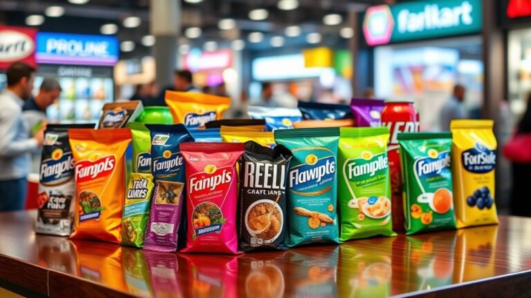
When you design packaging that's inaccessible, you're inadvertently alienating a significant portion of your customer base, leaving revenue on the table and damaging your brand's reputation in the process. By prioritizing accessibility, you can open up new market opportunities, improve customer loyalty, and expand your customer base. Inclusive design considerations can even lead to new revenue streams and cultivate trust with your customers. It's essential to recognize that accessible packaging benefits all users, not just those with disabilities, and can lead to a competitive edge in the market. Now, take a closer look at how you can break down barriers to independence.
The Business Case for Accessibility
Your company's bottom line is directly tied to the accessibility of your packaging design. When you prioritize accessibility, you open up new market opportunities and create a competitive edge. In today's marketplace, consumers expect inclusive design that caters to their diverse needs. By incorporating accessibility into your packaging, you'll attract a broader customer base and increase brand loyalty.
Accessible packaging design can be a key differentiator for your brand, setting you apart from competitors and establishing a reputation for innovation and customer-centricity. When you make it easy for consumers to use your products, you build trust and cultivate long-term relationships. This, in turn, drives consumer loyalty and retention, ultimately impacting your bottom line.
Moreover, accessible packaging can additionally provide market advantages by tapping into underserved markets. For instance, designing products that are easy to use for people with disabilities can expand your customer base and increase sales. By prioritizing accessibility, you'll not only improve the user experience but also reveal new revenue streams.
Common Accessibility Oversights
When designing packaging, you often focus on aesthetics and functionality, but overlook essential accessibility aspects. You might assume that your design is accessible, but inadequate font sizes, insufficient color contrast, and poor tactile indicators can render your product unusable for people with disabilities. By recognizing these common oversights, you can take the first step in the direction of creating more inclusive packaging.
Inadequate Font Sizes
Inadequate font sizes can lead to frustrating experiences for consumers, especially those with visual impairments. You may think that using a small font saves space on your packaging, but it can be a major obstacle for people who struggle to read tiny text. When fonts are too small, they can be difficult or even impossible to read, leading to confusion, frustration, and even abandonment of your product.
To guarantee font readability, you should consider size variability. Using a range of font sizes can help draw attention to important information, like headings and calls-to-action, during still making body text readable. A good rule of thumb is to use a minimum font size of 8 points for body text and 12 points for headings. Moreover, choose fonts that are clear and simple, avoiding ornate or decorative fonts that can be hard to read. By prioritizing font readability, you can create packaging that's accessible and easy to use for everyone.
Insufficient Color Contrast
Colors that blend together can be a significant obstacle for consumers, especially those with visual impairments. As a packaging designer, you might assume that your color scheme is visually appealing, but it is crucial to evaluate how it affects people with color perception issues. Insufficient color contrast can lead to confusion, frustration, and even abandonment of your product.
Here are three ways insufficient color contrast can impact your customers:
- Difficulty reading labels: When the text and background colors are too similar, it becomes challenging for consumers to read vital information, such as instructions, ingredients, or expiration dates.
- Confusion with branding: If your brand's colors are not distinct from the packaging's background, customers might struggle to recognize your product or differentiate it from competitors.
- Inability to distinguish between options: When color options are not clearly distinguishable, customers with visual impairments might find it hard to choose between different flavors, sizes, or varieties of your product.
Poor Tactile Indicators
| Tactile Indicator | Design Considerations | Best Practices |
|---|---|---|
| Braille Labels | Use Grade 1 Braille for simple labels, and Grade 2 for more complex information | Guarantee sufficient spacing between Braille dots and adjacent text |
| Raised Patterns | Use distinct shapes and sizes to differentiate between elements | Avoid using complex patterns that may be difficult to decipher |
| Texture | Use a consistent texture throughout the packaging to create a cohesive sensory experience | Avoid using textures that may be uncomfortable or distracting |
Designing for Diverse Abilities
When designing packaging for diverse abilities, you're likely to immerse yourself in a wide range of needs, from visual impairments to dexterity limitations. As you navigate this complex environment, it is crucial to prioritize inclusive design principles that cater to various abilities.
To create truly accessible packaging, consider the following strategies:
- Incorporate inclusive materials: Select materials that are easy to handle, open, and close, regardless of dexterity or strength. This might include using soft-touch materials, large grips, or easy-twist caps.
- Leverage adaptive technologies: Integrate technologies that assist users with visual impairments, such as audio cues, braille labels, or high-contrast colors. This can include features like voice-assisted packaging or smart labels that provide step-by-step instructions.
- Design for intuitive use: Make sure that your packaging is easy to understand and use, regardless of cognitive abilities. This can be achieved by using clear, simple language, and intuitive design cues that guide the user through the packaging process.
The Role of Clear Labeling
When you pick up a product, you want to know what it is and how to use it. Clear labeling plays an essential role in making this information easily accessible, starting with text that's easy to understand. You'll appreciate instructional text that's concise, straightforward, and free of confusing jargon or complex terminology.
Easy to Understand
Clarity is key in packaging design, and clear labeling plays a vital role in making products accessible to everyone. You want your customers to quickly understand what your product is, what it does, and how to use it. Clear labeling helps to eliminate confusion, making it easier for people of all abilities to navigate your product.
To achieve this, consider the following:
- Use user-friendly terminology: Avoid using technical jargon or complex language that might confuse your customers. Instead, opt for simple, concise language that's easy to understand.
- Prioritize visual clarity: Confirm that your labeling is visually appealing, with clear typography, sufficient white space, and high-contrast colors. This will help draw attention to important information and make it easier to read.
- Highlight critical information: Identify the most significant information your customers need to know, such as ingredients, instructions, or warnings, and make certain it stands out on the label.
Clear Instructional Text
By guaranteeing your product's labeling is easy to comprehend, you've already taken a notable step in the direction of making it accessible. Now, it's time to focus on clear instructional text. This aspect of packaging design is vital, as it directly impacts user perception. When you provide clear instructions, you empower users to effectively use your product, reducing frustration and confusion.
To achieve instructional clarity, use simple, concise language and avoid jargon or technical terms that might alienate your audience. Organize instructions in a logical, step-by-step format, using clear headings and bullet points to break up complex information. Visual aids like diagrams and images can additionally improve comprehension. Remember, the goal is to make your product usable by as many people as possible, so test your instructions with diverse user groups to guarantee they're accessible to everyone. By prioritizing clear instructional text, you can notably enhance the overall user experience and increase customer satisfaction.
Tactile and Sensory Experiences
As you navigate the domain of packaging, your fingertips are constantly gathering information, deciphering textures, and detecting subtle nuances that influence your purchasing decisions. The tactile experience of packaging can be a game-changer, as it provides a sensory connection between you and the product.
Effective packaging design should incorporate tactile feedback to engage you on a deeper level. Here are three ways to achieve this:
- Texture variation: Incorporate different textures to create a multisensory experience. For example, a box with a soft-touch finish can evoke feelings of luxury, whereas a rougher texture can convey a more rugged or eco-friendly vibe.
- Raised patterns and Braille: Use raised patterns or Braille elements to provide crucial information, such as product names or instructions, in a way that's accessible to everyone, regardless of visual abilities.
- Shape and form: Design packaging with unique shapes and forms that invite exploration and interaction. This can create a memorable unboxing experience and make the product more appealing.
Breaking Down Barriers to Independence
Your ability to live independently is deeply tied to the packaging of everyday products. When you can easily open and use the products you need, you feel more confident and self-sufficient. Nevertheless, inaccessible packaging can create unnecessary barriers to independence, making daily tasks a struggle.
Inclusive design is crucial to breaking down these barriers. By incorporating user feedback and accessibility considerations into the design process, packaging can be created that is usable by everyone, regardless of ability. This doesn't just benefit individuals with disabilities; it furthermore improves the overall user experience for everyone.
| Barrier | Solution |
|---|---|
| Difficulty opening packages because of arthritis or limited dexterity | Easy-grip handles or tear-off tabs |
| Inability to read labels because of visual impairment | High-contrast color schemes and large font sizes |
| Struggle to carry heavy or bulky items | Lightweight and compact packaging designs |
| Difficulty distinguishing between similar products | Tactile or sensory cues, such as different textures or scents |
| Inability to access products because of mobility issues | Packaging designed for one-handed use or accessible from a seated position |
Frequently Asked Questions
Can Accessibility Features Increase Packaging Production Costs?
When you consider adding accessibility features to your packaging, you might wonder if it'll break the bank. The good news is that a thorough cost analysis can help you identify areas where accessibility upgrades can actually boost production efficiency. By streamlining your design and manufacturing process, you can offset the initial investment and potentially reduce costs in the long run.
How Do I Ensure Compliance With Accessibility Regulations?
To guarantee you're on the right track, you'll need to familiarize yourself with accessibility guidelines and legal requirements. Start by researching the regulations that apply to your industry and region, then review your packaging design to identify potential barriers. Make certain to test your packaging with users who have disabilities to get their feedback and insights. By taking these proactive steps, you'll not just avoid legal issues but likewise create a more inclusive and innovative packaging design that benefits everyone.
What Are the Most Common Accessibility Packaging Mistakes?
When designing packaging, you'll want to avoid common accessibility mistakes. One major error is neglecting color contrast, making it hard for users with visual impairments to read labels or distinguish between different parts of the design. Another mistake is overlooking tactile elements, such as braille or raised patterns, which are crucial for users who rely on touch. By prioritizing these aspects, you'll create packaging that's inclusive and user-friendly.
Can Accessible Packaging Benefit Non-Disabled Consumers Too?
You might think accessible packaging only caters to people with disabilities, but that's not the case. Universal design principles create products that are intuitive and easy to use for everyone. By considering consumer empathy, you're designing packaging that's more convenient and efficient for all users. Inclusive marketing strategies can similarly boost brand loyalty. When you prioritize user experience, you'll find that accessible packaging benefits non-disabled consumers too, making it a win-win for your business and customers alike.
How Do I Balance Aesthetics With Accessibility in Design?
When designing packaging, you're likely torn between creating visual harmony and prioritizing functional design. To balance these competing demands, you'll need to think creatively. Consider using intuitive design elements, like clear labels and easy-open features, that likewise contribute to a clean aesthetic. By integrating accessibility into your design process, you'll create packaging that's both beautiful and functional, appealing to a wide range of consumers.